Download
1 / 9
90 likes | 234 Views
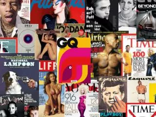
Magazine analysis . By Alice Robbins. C overs. These are five different magazine covers and they all show different types and genres of music and they all have different ways of showing and portraying there music.

E N D
Magazine analysis By Alice Robbins
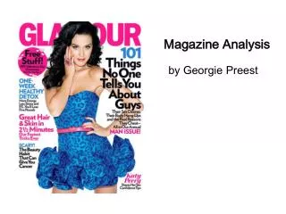
Covers These are five different magazine covers and they all show different types and genres of music and they all have different ways of showing and portraying there music. Nme: shows Noel Gallagher and using the colour scheme Red, Black and white and use’s a shadow on noel to show that the article is centred on him. Kerrang: Shows the band Bring Me The Horizon with all of the band on the front but centring the lead singer Oliver Sykes to show he is lead and the article is more centred on him. The Rolling Stone magazine shows only a picture of David Bowie on the front with a white background with a border to make the reader focus on the picture more. Top Of The Pops: this shows quite a crowded picture on the front but having the main picture on a white background. Smash Hits: this is also a very crowded cover but with only one picture but with a lot of writing over the front.
Contents These are all contents pages of different magazines all with different types of music displayed on it. For Example Top Of The Pops has the page numbers annotated on the front around the picture and section around it talking about what will be in the magazine and the articles, whereas in Kerrang there is one big picture at the top with pictures of the double page spread next to it and saying what pages they are on. Then on smash hits there are more pictures than writing with a little description of what will be in the magazine on the side next to the picture. But both NME and The Rolling Stone have on main picture and then writing around it but NME doesn’t have any more photos than that main one whereas The Rolling Stone contents page has one other picture to show there will be a smaller article inside the magazine as well.
Double Page Spread These are all different double page spreads of different magazines and they all seem to follow the same sort of layout they all have a main image some of the main images cover over the back and the writing goes over the top whereas some just have smaller picture around the outside in the middle of the article. Also some of the interviews are shown as interviews with the questions on top and then their answers underneath but some are just one big article without the questions at the top its just the interviewee talking about why ever they have been brought in to talk about and also they all have white in each article and then they just add different colours to it for example the top of the pops article uses black, white, pink and red.
Cover analysis in detail On the cover of this magazine there is more writing and one main picture in the background and one smaller photo in the top right corner. Also the Masthead is slightly covered by the main picture. The name of the artist is shown in big bold writing to stand out and grab the reader . The Audience for this magazine would be aimed between young adults to older adults. On the cover of The Rolling Stone magazine there isn’t really much on this front cover only the masthead, a boarder and a main title at the bottom but nothing else which maybe seen as boring and plain but it could be quite good and effective because it focus’ a lot more on the picture and could intrigue someone to by it. The audience for this magazine would be for anyone who is a fan of David Bowie but would be aimed more at older people e.g. adults
Continued On the cover of this magazine the splash is of the band ‘Bring Me the Horizon’ also with the size of the writing you can instantly tell this is the main story and interview. The mast head it covered by the main picture, also the picture shows the hierarchy of the band with the main singer at the front and then it leading back with the rest of the band. Also in the bottom right corner it shows the barcode but with no QR code which would help if there were people with smart phones who could access the magazine online. It also shows us different other picture that will be inside in the poster section of the magazine. The tag in the bottom left hand corner has been put in there to engage the reader and get their attention. With the main article there is that one phrase ‘northern uproar’ which is a phrase that would engage the reader to look and read the article in question.
Contents analysis in detail In this contents page there is one main picture at the top from the main article and ten some small photos of the article and arrows coming of it with different quotes and then has the page numbers The target audience for this contents page is for people who listen to this genre of music and that genre of music is heavy metal and rock, also it is aimed at older teenagers and adults. The colour scheme is black white and yellow which is quite a normal and plain but is quite effective. In this contents page there are two main pictures in the middle of the main feature, it has the two main artists in different pictures which could show they do two different things in the band. Also it has a paragraph at the bottom talking about what’s going to be in the magazine and is there to talk to the readers from the editor. The colour scheme is black, red, white works well with the photos of the artist. Also there is a section of advertisement at the bottom of the page to show us other things in the magazine. Also in the paragraph it gives us sections on what will be in the main interview with bits from the artist in this paragraph. this contents page is a very successful page which can be used in a magazine. This contents page, as in the other contents page the colour scheme is black, red and white which shows that magazines can be influenced by each other. This contents page has a simple layout with one main picture at the side of the main feature/ artist. Its also shows us in the bottom left hand side what will be in the magazine every month which gives the reader an idea as what to expect in the next issue. This contents page gives us a simple yet effective idea as to how to set out a good contents page.
Double Page Spread analysis in detail. This double page spread has a main picture on the side of the artist which shows us that most of the focus is to be on her, also the interview is one continuous interview each section isn’t broken up by each question this shows us the editor wants it to flow into one big story. Also the headline is separated with on big bold headline then some writing just to the side of the rest of the headline to show us that the interview is mainly about the bigger headline and smaller headline is just a sub-headline. This double page spread lacks some colour but that makes it a very effective because it is subtle. This double page spread has numerous different pictures and the main headline is a quote from the interview. Compared to the other double page spread this one is a different style and genre and that has an impact on the style shown because the are catering to a different audience. But as like the other interview it uses read and white and black in the colour scheme which shows us that this colour scheme is used often for all different types of magazines. Overall this double page spread is quite a crowed one and has little writing which draws away from the interview because the audience are focusing more on the pictures than anything else.
Continued This double page spread is very different from the others as the headline takes over most of the two pages and it only has one picture that is featured on the right hand side, but unlike the others the interview is separated by each question and has each answer as a separated paragraph. This shows us that overall each double page spread is always going to be different depending the audiences in question.