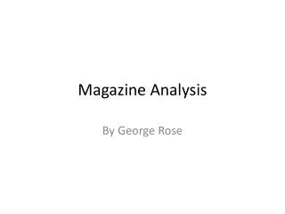
Effectively Attracting Readers: GQ's Cover Strategy Featuring Zach Galifianakis
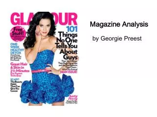
The layout of GQ magazine aims to captivate readers by prominently displaying star Zach Galifianakis on the cover. This strategic choice not only appeals to his fans from hits like "The Hangover" and "Due Date," but also reinforces brand recognition with GQ’s distinct logo in the top left corner. By utilizing vibrant and enhanced imagery alongside compelling subtitles, GQ successfully draws in both new and loyal readers, ensuring the magazine stands out on shelves while conveying the magazine's offerings without overwhelming text.

Effectively Attracting Readers: GQ's Cover Strategy Featuring Zach Galifianakis
E N D
Presentation Transcript
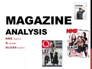
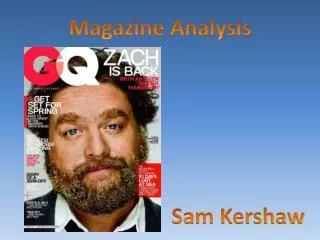
Magazine Analysis Sam Kershaw
Layout The primary aim of the GQ layout is to show the main attraction of the new issue, for example here we see The Hangover and Due Date star “Zach Galifianakis” as the focus model of the GQ cover page. This is so that anyone who is a fan of Zach is instantly drawn to the magazine but, also see that GQ always like to make their logo distinct in the top left corner of every cover page, this is to attract the common buyers of the GQ magazine. These work well together to bring new buyers and attract the previous customers making the consumer range wider and bringing more attention to the magazine using only a picture and a logo. GQ also use subtitles all over the page to give buyers a straight idea of what they are reading. These subtitles aim to grab a wider audience by showing how much the magazine offers.
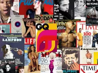
Image GQ use Zach Galifianakis as a set model to represent the current edition of the magazine. In this edition they have his face printed larger than usual across the page which attracts not only GQ’s fans but also Zach’s fans from his recent hits “The Hangover” and “Due Date”. The image is so large because GQ want to draw the buyers in by using his famous face. GQ enhance the photo of Zach. On the left Zach looks quite pale and he has brown facial hair however, on the right we see GQ make his face more peachy and flushed, we also se that they give his facial hair a more vibrant ginger glow. They also make his eyes deeper. They do all of this to make the Magazine more attractive and appealing to the eye. Using a celebrity on the front cover familiarises the buyer with the magazine and brings a wider audience range. GQ use a lot of celebrities to cover as you can see below…
TEXT GQ use their GQ logo in the top left corner. This is the same in every issue and makes it easier to recognise the magazine on the shelf. As well as the logo GQ also use their motto “look sharp, Live Smart” The picture of Zach was taken after the film “The Hangover” and GQ use “Zach is Back, with an even bigger Hangover” as a title in the top right corner. This is distinctive as it is a large font in bright colours it also meets your eye straight away. GQ use colour to make certain titles stand out. On this issue the colours they use are red and white; the font is always the same on the title page and the logo colours vary. They also use subtitles down the sides of the page making sure they don’t cover Zach’s face. It allows GQ to give a small contents on the cover page without making the page too wordy.