Download
1 / 41
410 likes | 472 Views
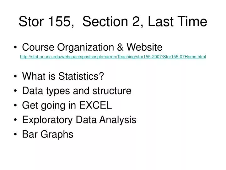
Stor 155, Section 2, Last Time. Course Organization & Website http://stat-or.unc.edu/webspace/postscript/marron/Teaching/stor155-2007/Stor155-07Home.html What is Statistics? Data types and structure Get going in EXCEL Exploratory Data Analysis Bar Graphs. Reading In Textbook.

E N D
Stor 155, Section 2, Last Time • Course Organization & Website http://stat-or.unc.edu/webspace/postscript/marron/Teaching/stor155-2007/Stor155-07Home.html • What is Statistics? • Data types and structure • Get going in EXCEL • Exploratory Data Analysis • Bar Graphs
Reading In Textbook Approximate Reading for Today’s Material: Pages 14-23 Approximate Reading for Next Class: Pages 40-55
Stat 31, Student Poll Results As indicated on “Student Info” form: Big changes from the past: More Public … More diversity
Stat 31, Student Poll Results “Have you taken an AP Exam?” Only ~10% had & grades generally low So don’t worry if you haven’t…
Stat 31, Student Poll Results Female: 48 Male: 53 Interesting Point: Different from all of UNC: ~60 - 40 Lesson about which courses to take???
Major Concept: Distributions “Distribution” = “Patterns of data” = “Way data is spread out” e.g. Bar Graph is visual display of categorical “distribution”
Exploratory Data Analysis 2 Visual Display of Quantitative Distributions: • Stem and Leaf Plots (From last time:) Not Recommended (Main motivation was pencil and paper statistical analysis, but now have better graphical methods readily accessible) A limited special case of….
Visual Disp: Quantitative Dist’ns 2. Histograms Idea: Apply bar graph idea, By creating categories, Called “class intervals” or “classes” or “bins”
Histograms Idea: put numbers into“bins”, bar heights are counts, or “frequencies” 1.3 3.6 1.9 3.1 1.5
Histograms Idea: put numbers into “bins”, bar heights Class Intervals: 1.3 (0,1], (1,2], (2,3], (3,4] 3.6 1.9 3.1 1.5 0 1 2 3 4
Histograms Idea: put numbers into “bins”, bar heights are counts, or “frequencies” 1.3 3.6 1.9 3.1 1.5 0 1 2 3 4
Histograms Idea: put numbers into “bins”, bar heights are counts, or “frequencies” 1.3 3.6 1.9 3.1 1.5 0 1 2 3 4
Buffalo Snowfall Data Buffalo, N. Y. (Annual) Snowfall Data Raw Data: http://stat-or.unc.edu/webspace/postscript/marron/Teaching/stor155-2007/Stor155Eg2Raw.xls 63 years, ranging from ~30 - ~120 (inches) Histogram Analysis (pre-done): http://stat-or.unc.edu/webspace/postscript/marron/Teaching/stor155-2007/Stor155Eg2Done.xls
Buffalo Snowfall Data, I A. EXCEL default (of bin edges) • Unround numbers for bin edges • Harder to interpret • Data “centered around 90” • Most data between 50 and 130 • Assymetric Distribution
Buffalo Snowfall Data, II B. Smaller bins • Chosen by me • Binwidth = 5, << ~13 from EXCEL default • Nicer edge numbers • Data centered around 84 (now more precise) • Bar graph rougher (fewer points in each bin) • Suggests 3 main groups (called “modes” or “clusters”) (can’t see this above: bin width is important)
Buffalo Snowfall Data, III C. Larger bins • Chosen by me • Binwidth = 30, >> ~13 from EXCEL default • Bar graph is “smooth” (since many points in each bin) • Only one mode (cluster)??? • Quite symmetric? (different from above: bin width is important)
Buffalo Snowfall Data, IV • What’s under the hood (how to do this): • Tools Data Analysis Histogram (& Chart Out) (may need Data Analysis “Add-in”) • Massage pic (especially bar width) • Sigma min, max • Bin range: create first two & drag • Histogram, using input bin edges
Histogram HW HW: 1.33 • Use Excel and histograms • Get data from CDrom • Do both: • Excel Default bins • Bins set to: 0,10,20,…,240 • Which gives answers closer to answers in back of book? • Turn in only one page
And now for something completely different Is this class too “monotone”? • Easier to understand? • Calm environment enhances learning? • Or does it induce somnolence? What is “somnolence”? Google definition: Sleepiness, a condition of semiconsciousness approaching coma.
And now for something completely different Recall last class’s Student Questionnaire… I asked you for: • Name • Major • Contact Info • Background…
And now for something completely different One response:
And now for something completely different OK, will try to send your mind in a different direction Hopefully, a mental break … (not on the Homework Assignment!)
And now for something completely different An experiment: • Pull out any coins you have with you • How many of you have: • >= 1 penny? • >= 1 nickel? • >= 1 dime? • >= 1 quarter? • Choose most frequent denomination
And now for something completely different Collect data (into Spreadsheet): • Years stamped on coins (chosen denomination) • Many as person has • Enter into spreadsheet • Look at “distribution” using histogram
And now for something completely different • Predicted Answer • From Text Book, Problem 1.32 • Distribution is Left Skewed • Works out as predicted? • Why? • Note: most skewed dist’ns seem to be: Right Skewed
Histogram Binwidths Nice Example from the Webster West, U.S.C.: http://www.stat.sc.edu/~west/applets/histogram.html Control Binwidth with slider: • Undersmoothing? • About right? • Oversmoothing? (critical to visual impression)
Histogram Binwidth Example Hidalgo Stamp Data From Mexico in 1800s How many sources of paper? How many modes: 1, 2, 5, 7, 10?
Histogram Binwidth Example How many modes (i.e. clusters)? Caution: Answer depends on binwidth (a serious and current statistical research problem) Have seen all of 2,3,5,7,10 in the literature!
Stamps Data Histogram How many modes? 2nd Caution: Answer also depends on bin location (i.e. “shift” of bins)
Histogram Bins For this course: Try several binwidths, to “get the idea” Weakness of EXCEL (we will see several): This process is inconvenient
Comparison of Histograms Class Example: Study Habits Data Idea: Compare Study Habits of Males vs. Females (measured by some “survey score”, perhaps of questionable value?) http://stat-or.unc.edu/webspace/postscript/marron/Teaching/stor155-2007/Stor155Eg4Done.xls
Study Habits Data EXCEL default histograms: • Populations look similar??? • Careful: Binwidth very big… • Careful: Different bin ranges… • Need smaller binwidths, and common scales
Study Habits Data Better Choice: Binwidths = 10, same bins for both • Clear difference, easy to see • Females higher “on average” • Males are “more spread” • 1 “exceptional value”, really true???
Things to look for (in histo’s) • Population Center Point (Study Habits Data) • Population Spread (Study Habits Data) • Shape - Symmetric vs. Skewed Right Skewed: Left Skewed: • Modes - Unexpected clusters • Outliers - “unusual data points”
Histogram Data Examples Textbook Applets: from Publisher’s Website • One Variable Statistical Calculator • Data Set: Service Times at a Call Center • Histogram: (hold mouse button, and slide left-right) • Results: • Broad range of binwdiths (12 – 25 is “best”?) • Single bin is useless • Distribution is Right Skewed • Clear Outlier
Comparison of Histograms HW HW: 1.35b, 1.34, 1.17 • Work in this order • Get data from CDrom • Use EXCEL and histograms • Odd answers in back • You choose the bins (if you miss something in answers, change this) • Turn in at most one page for each 1.31, 1.32
Exploratory Data Analysis 3 “Time Plots”, i.e. “Time Series: Idea: when time structure is important, plot variable as a function of time: variable time Often useful to “connect the dots”
Class Time Series Example Monthly Airline Passenger Numbers http://stat-or.unc.edu/webspace/postscript/marron/Teaching/stor155-2007/Stor155Eg5Done.xls • Increasing Trend (long term growth, over years) • Increasing Variation (appears proportional to trend) • “Seasonal Effect” - 12 Month Cycle (Peak in summer, less in winter)
Airline Passengers Example Interesting variation: log transformation • Stabilizes variation • Since log of product is sum • Shows changing variation prop’l to trend • Log10 is “most interpretable” (log10(1000) = 3, …) • Generally useful trick (there are others)
Airline Passengers Example A look under the hood http://stat-or.unc.edu/webspace/postscript/marron/Teaching/stor155-2007/Stor155Eg5Raw.xls • Use Chart Wizard • Chart Type: Line (or could do XY) • Use subtype for points & lines • Use menu for first log10 • Although could just type it in • Drag down to repeat for whole column
Time Series HW HW: 1.36, 1.37 • Use EXCEL