Layout of Page Elements
Layout of Page Elements. September 28 th , 2009. Patterns. Common ways to use the Layout Elements of Visual Hierarchy, Visual Flow, Grouping and Alignment, and Dynamic Displays. Patterns. Element 1: Visual Hierarchy of Entire Screen Visual Framework Center Stage Element 2: Visual Flow

Layout of Page Elements
E N D
Presentation Transcript
Layout of Page Elements September 28th, 2009
Patterns Common ways to use the Layout Elements of Visual Hierarchy, Visual Flow, Grouping and Alignment, and Dynamic Displays
Patterns • Element 1: Visual Hierarchy of Entire Screen • Visual Framework • Center Stage • Element 2: Visual Flow • Right/Left Alignment • Diagonal Balance • Element 3: Grouping Content within a Screen • Titled Sections • Card Stack • Closable Panels • Movable Panels • Element 4: Dynamic Layout • Responsive Disclosure • Responsive Enabling • Liquid Layout • Other • Property Grid
Visual Hierarchy Patterns Common ways to use the Layout Elements of Visual Hierarchy
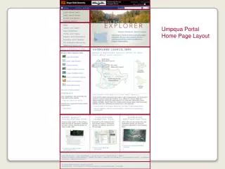
Visual Framework • Use the same basic layout, colors, and stylistic elements across all screens • Design should have enough flexibility to handle varying screen content • Best used in any application or web site that has multiple windows or screens that should mesh together • Makes the user comfortable. Typically is easier to navigate and know context
Visual Framework - Considerations • Colors, backgrounds, text and accent colors • Fonts: title, subtitles, ordinary text and minor text • Writing style and grammar • Signposts: Titles, Logos, Breadcrumbs, Card Stacks • Navigation: Standard links, buttons, back/forward • Spacing and Alignment: margins, line spacing, padding, text and label justification • Overall Layout: placement of things in page, rows, columns, other?
Center Stage • Place the most important UI element into the largest subsection of the window • Arrange secondary content and tools around it in smaller panels • Best used when the application’s primary job is to edit a document or object, perform a certain task or show coherent information • Examples: Spreadsheets, Graphical Editors, Document Editors, etc
Visual Flow Patterns Common ways to use the Layout Elements of Visual Flow
Right/Left Alignment • In two column tables (or portions of tables), right align labels on the left, and left-align the items on the right • Putting text next to the item it labels creates a strong perceptual grouping of that pair • Exceptions to this rule can exist if the labels vary significantly in length, but Items should almost always be left aligned • Adheres to multiple Gestalt principles
Diagonal Balance • Arrange page elements asymmetrically, balancing by putting strong visual weight in the upper left and lower right corners • Best used the content has strong titles and actions, is short enough not to scroll and desires a strong visual flow • Easy flow for user’s eyes - comfortable
Grouping and alignment Patterns Common ways to use the Layout Elements of Grouping and Alignment
Titled Sections • Define separate sections of content by: • Giving each a visual strong title • Organized sections, often uniform in size • Laying them all out on one page, often adjacent • Best used when you have a lot of content to choose from and you want to make it easy for the user to scan and conceptually group • This is neat and comfortable for a user • Human will look for patterns regardless, so why not use them?!
Card Stack • Group content into separate overlaying panels, only one is visible at a time • Best used when too much content exists to display on one page. • And when user’s do not need to see all of the content at one time. • Common Types: Tabs, Vertical Tabs, Column of Names, Drop-Down or alternative selector
Closable Panels • Group content into separate overlaying panels that the user can expand/collapse • Different than a card stack in that multiple panels can be open at once • Best used when a card stack would not be optimal because users would likely like to see multiple sections of content simultaneously
Moveable Panels • Group content into separate panels that the user can move around to customize their view of the application • Best used when content is easily associated into individual groups that do not require spatial recognition to aid the user • Typically used in more complex applications (i.e. power users), however can be used effectively in simple apps
