Download

1 / 6
90 likes | 340 Views
Scatter Plots & Box-and-Whisker Plots. Scatter Plot- another type of visual display used to explore the relationship between two sets of data, represented by unconnected points on a grid. Factory Wages. What does each represent?

E N D
Scatter Plots & Box-and-Whisker Plots
Scatter Plot- another type of visual display used to explore the relationship between two sets of data, represented by unconnected points on a grid. Factory Wages • What does each represent? • Find the hourly pay of an employee with 8 years of experience. • Describe the relationship between experience and pay. 12 10 8 Hourly Pay in Dollars 6 4 2 0 2 4 6 8 10 12 14 16 Years of Experience
A pattern may emerge that shows a relationship between the two sets of data. If data clusters around a line of best fit, or trend line, from the bottom left upward to the top right of the graph, this shows a positive correlation between the sets of data. If the line slopes downward from left to right, it indicates a negative correlation between data.
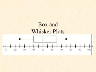
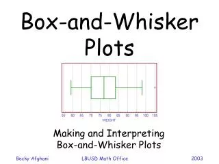
Another way to display data is with a box-and-whisker plot, also known as box plot. This data shows how data are dispersed around a median. By examining a box-and-whisker plot you can tell if data are clustered closely together or spread far apart. A box-and-whisker plot shows both the median and the extremes of a set of data. It also shows the median of the lower half of data called the lower quartile, and the median of the upper half of data called the upper quartile. Range – the difference between the greatest and least values
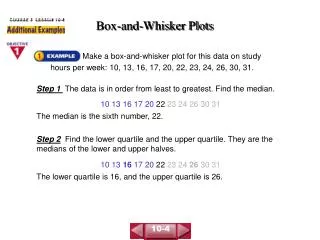
Least value Greatest value Median 12 14 20 21 25 29 30 30 31 32 32 39 46 Lower quartile Upper quartile Example: Joe DiMaggio played center field for the New York Yankees for 13 years. During each year of his career, he hit the following number of home runs: 29, 46, 32, 30, 31, 30, 21, 25, 20, 39, 14, 32, and 12. Make a box-and-whisker plot for this data. Write the data in numerical order. Find the least and greatest values, the median, the lower quartile, and the upper quartile.
12 21 30 32 46 0 5 10 15 20 25 30 35 40 45 50 Draw a number line and mark your points Draw a box that starts and stops at the lower and upper quartiles, and a vertical line at the point for the median. Then draw whiskers, or line segments, from each end of the box to the least and greatest values. Finally, give your graph a title. DiMaggio’s Home Runs