Download
1 / 8
0 likes | 24 Views
Knowing the history of the logo design of a famous company can be interesting. Take a look at the history and evolution of the logo design of Warner Bros.

E N D
November 2023 History And Evolution Of Logo Design Warner Bros Warner Bros Warner Bros By Purpple Designs
Overview Overview Overview The very first logo was designed in 1923 and the name of the company was “A Warner Brothers Productions”. This design only had the massive letters WB on a shield. The whole name was put surrounding the logo which was placed against beautiful scenery. Although it was the time of black and white, the design was still quite distinctive.
The first time this design was revised in 1929 where the letters written on the entire shield. At that time the design was made to include another name of a company which was “The Vitaphone Corp”. This company was known for the production of sound films. It was added to show that Warner Brothers would become involved in sound films instead of only silent films.
The next revision of the logo design came after five years in 1934. Vitaphone was removed from the logo at that time and that was how the logo design we know today came into play. Later on, in 1937, a ribbon was added with the full name.
After that Warner Brothers’ logo design went through a series of changes where their logo designs changed drastically. In 1967, the company was renamed as Warner Bros Seven Arts as it was acquired by Seven Arts, Inc. W and 7 got merged together and the B was dropped. Then again 3 years later in 1970, the film company was taken over by Kinney Services and it was again renamed to Warner Communication. The logo design went back to its WB on the emblem. But the biggest change was that the font was changed and the background was red which was later on changed in the very same year.
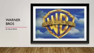
In 1984, the company went back to its classic design which we have seen throughout the last few decades. Against the blue sky a shield with a ribbon and golden WB abbreviation became the most recognised logo as the company produced the most hit movies and series during this period. There has been no change until the last year. In 2019, the logo design got changed in a drastic way to celebrate their anniversary. It is simple with white letters against a blue shield and the design is flat.
Conclusion Conclusion Conclusion Warner Brothers have gone through a lot of changes and developments and that can be seen in its varied logo designs over the years. If you want to do the same, you can get your revised logo design in Kolkata.
November 2023 Thank you! Thank you! Thank you! www.purppledesigns.com