Enhance Your Web Content: Tips for Effective Learning Materials
350 likes | 459 Views
Discover essential strategies to create impactful web content and learning materials in "Don’t Make Me Read!" by Louisa Lambregts. This guide explores how to optimize web design and content delivery by focusing on visual design, usability, and accessibility. It emphasizes the importance of clear messaging, plain language, and effective formatting techniques to enhance user engagement and comprehension. Learn to structure your materials with a strong purpose, utilize visual elements, and align your content with user behavior, making it easier for your audience to grasp essential information.

Enhance Your Web Content: Tips for Effective Learning Materials
E N D
Presentation Transcript
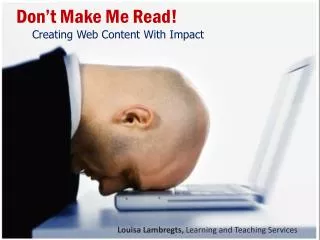
Don’t Make Me Read! • Creating Web Content With Impact Don’t Make Me Read! Tips for Making Web and Learning Materials Impactful • Louisa Lambregts, Learning and Teaching Services Louisa Lambregts, Learning and Teaching Services
How do we process web information? • Visual design of information • Text formatting • Layout • Show vs Tell • Usability and Accessibility • Plain Language • Key design decisions Topics
What ? Why ?Who ?
What do we want to say? Why do we want to say it? Who are we saying it to?
Have a strong purpose and to follow that to the end. http://www.digital-web.com/articles/form_vs_function/
From Don’t Make Me Think :A Common Sense Approach to Web Usability Steve Krug
From Don’t Make Me Think :A Common Sense Approach to Web Usability Steve Krug
Web Behaviours • Scan rather than read • Impatient • Pause at “first reasonableoption”
Web Behaviours Visual scanning moves from general perception of contrast through to finer levelsof attention. Last step is reading of headers.
Reading online can be sore on the eyes. Not to mention, people do not read on the web –they scan the text. Now, more than ever, it is easy for all our electronic correspondence to be misunderstood if we are reading to get the gist of things. We are overloaded with information. It is easier to understand pictures than it isto read a written descriptions. What can we do to get our messages across better? Attempt #1 Don’t Make Me Read! Tips for Making Web and Learning Materials Impactful Louisa Lambregts, Learning and Teaching Services
Don’t Make Me Read! • Creating Web Content With Impact Don’t Make Me Read! Tips for Making Web and Learning Materials Impactful • Louisa Lambregts, Learning and Teaching Services Louisa Lambregts, Learning and Teaching Services
Text as graphical elements Optimize for visual scanning White space Alignment Pattern and repetition Contrast and focus Consistency Visual Design
What is Graphic Design? • Graphic design is visual information management using the tools of layout, typography, and illustration to lead the reader's eye through the page. http://webstyleguide.com/wsg3/7-page-design/3-visual-design.html
Graphic design is • visual information management • uses layout, typography, and illustration • leads the reader's eye through the page. Paraphrased from: http://webstyleguide.com/wsg3/7-page-design/3-visual-design.html
Graphic design is • visual information management using the tools of layout, typography, and illustration to lead the reader's eye through the page. http://webstyleguide.com/wsg3/7-page-design/3-visual-design.html
Line Spacing [Type a quote from the document Or the summary of an interesting point. You can position the text box anywhere in the document. Use the Text Box Tools tab to change the formatting .]
Be Aware of Graphic Distractions • http://www.webdesignhelper.co.uk/design_elements/design_theory/design_theory8/design_theory8.shtml
A Little Bit About Typography Serif Sans-Serif Times Roman Arial Georgia Century Gothic Web-friendly
Content separate from presentation Style sheets Use formatting elements for their true function – not for styling Use bold and italics for emphasis, not styling Use header styles – avoid manual font sizing Formatting and Accessibility
Use styles and headers for visual hierarchy Adjust line and paragraph spacing Reserve underlines for hyperlinks Add links within content to additional information Use bold and italics for emphasis, not styling Left-align paragraphs rather than centre them Formatting Tips
Writing Plain language use Inverted pyramid Use active language Avoid passive voice unless the a polite tone is required From: http://www.bloggingprweb.com/effective-press-release-format-inverted-pyramid
Writing Example #1 When the process of freeing a vehicle that has been stuck results in ruts or holes, the operator will fill the rut or hole created by such activity before removing the vehicle from the immediate area.
Writing Examples #1 Result If you make a hole while freeing a stuck vehicle, you must fill the hole before you drive away.
In response to the concerns, the NCAA announced that the baseball rules committee will recommend a maximum batted-ball exit velocity of 93 mph and a change in the size and weight specs of non-wooden bats beginning with the 1999 season. Writing Example #2
Result • NCAA Suggests Batting Changes Growing concerns over size and weights of bats resulted in the following changes starting with the 1999 season: • Batted-ball exit speed maximum of 93 mph • Change in size and weight specifications for non wooden bats Writing Examples #1
Vigorous writing is concise. • A sentence should contain no unnecessary • words, a paragraph no unnecessary sentences, • for the same reason that a drawing should • have no unnecessary lines and a machine • no unnecessary parts. • William Strunk Jr., in Elements of Style
Contact Me! Louisa LambregtsTwitter #lambrel X-6012 lambrel@algonquincollege.com