Download
1 / 17
170 likes | 192 Views
Learn how to interpret box plots, find quartiles, and compare distributions using box-and-whisker plots. Practice with real-life examples and understand statistical insights.

E N D
Quartiles and box plots A set of data can be summarized using five key statistics: • The median (denoted Q2) – this value is the middle number once the data has been written in order. If there are n numbers in order, the median lies in position ½(n + 1). • The lower quartile (Q1) – this value lies one quarter of the way through the ordered data. It is the median of the lower half of values, or the value in position ¼(n + 1). • The upper quartile (Q3) – this value lies three quarters of the way through the ordered data. It is the median of the upper half of values, or the value in position ¾(n + 1). • The minimum and maximumvalues.
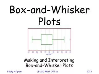
Reading box plots These five numbers can be shown on a simple diagram known as abox-and-whisker plot (or box plot): minimum Q1 median (Q2) Q3 maximum The box width is theinterquartile range (IQR). interquartile range = Q3 – Q1 Box plots are drawn along a number line, so that values can be read from them.
Comparing box plots The (ordered) ages of 15 brides marrying at a city hall one month in 2006 were: 18, 20, 20, 22, 23, 23, 25, 26, 29, 30, 32, 34, 38, 44, 53 The medianis the ½(15 + 1) = 8th number: Q2 = 26 The lower quartileis the median of the lower half of values: Q1 = 22 The upper quartileis the median of the upper half of values: Q3 = 34 The minimumand maximumvalues are18 and 53. Draw a box plot of this data.
Comparing box plots The (ordered) ages of 12 brides marrying at the same city hall in the same month in 2011 were: 21, 24, 25, 25, 27, 28, 31, 34, 37, 43, 47, 61 Q2 is half-way between the 6th and 7th numbers: Q2 = 29.5 Q1 is the median of the smallest 6 numbers: Q1 = 25 Q3 is the median of the highest 6 numbers: Q3 = 40 The minimum and maximum values are 21 and 61. Draw a box plot of this data.Describe the shape of the box plot.
Comparing box plots These box plots compare the ages of brides in 2006 and 2011. When comparing two box plots, it is important that they are labeled and drawn on the same scale. The medians show that the brides in 2006 were generally younger than in 2011. What can you tell from comparing the interquartile ranges?
Comparing incomes Income differences between genders for company x The interquartile range is the same size for males and females. This shows that there is no difference between incomes for different genders. Is this interpretation correct? Explain your reasoning.
378 + 1 2 Lap times James takes part in karting competitions and his mom records his lap times on a spreadsheet. 378 of James’ lap times were recorded. James’ fastest time in a race was 51.8 seconds. In which position in the list is the median lap time? There are 378 lap times and so the median lap time will be the middle value: th value ≈ 190th value
378 + 1 4 Lap times In which position in the list is the lower quartile? There are 378 lap times and so the lower quartile will be the… th value ≈ 95th value In which position in the list is the upper quartile? There are 378 lap times and so the upper quartile will be the… th 378 + 1 3 × value ≈ 284th value 4
Comparing lap times Here are box and whisker plots representing James’ lap times and his friend Kara’s lap times. What conclusions can you draw about James’ individual performance? Who is better, James or Kara? Explain your answer.
Cumulative frequency graphs A box plot can be used as an alternative representation of the data displayed in a cumulative frequency graph. Here is the cumulative frequency table showing the number of seconds 100 people can hold their breath.
100 90 80 70 60 50 Cumulative frequency 40 30 20 10 0 30 35 40 45 50 55 60 Time in seconds Using graphs Here is the cumulative frequency graph showing the number of seconds 100 people can hold their breath. Discuss in groups how you would draw a box plot of this data. Can the median, lower quartile, upper quartile, maximum and minimum values all be found from this graph?
Drawing a box plot from a graph Once the five required statistics are found from the graph, the corresponding box and whisker plot can be drawn. 100 Minimum value = 30 90 80 Lower quartile = 25th value = 42 70 Median = 50th value = 46 60 50 Upper quartile = 75th value = 51 Cumulative frequency 40 Maximum value = 60 30 20 10 0 30 35 40 45 50 55 60 Time in seconds