Download
1 / 15
150 likes | 328 Views
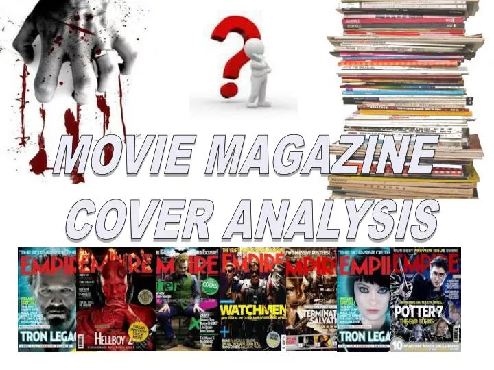
MOVIE MAGAZINE COVER ANALYSIS. WHAT IS A MOVIE MAGAZINE?. A movie magazine is a print media product which focuses specifically on movie content.

E N D
MOVIE MAGAZINE COVER ANALYSIS
WHAT IS A MOVIE MAGAZINE? • A movie magazine is a print media product which focuses specifically on movie content. • Such as reviews of newly released films, what's hot and not behind the scenes articles which look at directors and the cast and general movie gossip. • I wanted to specialise my magazine further by focusing specifically on the horror movie genre
What does it include? • Masthead- identifies the movie genre of the magazine and depending on the choice of font can also identify the specific genre of movie such as Horror. It helps form the magazines identity and brand in order to differ from other magazines. • Lure- attracts attention usually to the main feature, enticing the readers to read on • Headline- Identifies the main feature story and is usually placed in the centre • Main image- relates to the main feature story and is usually large and eye grabbing to attract the readers attention. • Film website- allows readers to get more information about the magazine and its content as well as taking it onto a new interactive level • Cover lines- are about other less important featured storeys • Barcode, price, issue and date- key elements of information that don't take up much space • Strapline – usually found at the top or bottom of the page, it could include an exclusive feature or even a magazine slogan • Puff- encourages the reader to buy the magazine
TOTAL FILM ANALYSIS STRAPLINE MASTHEAD FILM Website PUFF COVERLINES MAIN HEADLINE MAIN IMAGE LURE BARCODE, PRICE, ISSUE AND DATE COVERLINES
The actual magazine title “Total Film” clearly signals to the reader that this is a movie magazine unlike Empire. The word FILM is largest and most significant, once again identifying the genre of the film. By adding total, it suggests that the magazine covers all film news or at least a majority, making it an effective but not particularly original title. By varying the title, it makes the magazine more interesting and eye grabbing but takes away from the house style and so making it less recognizable. • The actual target audience for this product can be extremely varied as the magazine focuses on the most popular films currently out and so any movie buff would take interest. Though it should be noted, unlike empire it tends to focus on a variety of films everything from action films to children’s animations such as Toy Story 3. As in this particular addition the cover would suggest it is aimed at older males but the cover line “Toy story 3 VS Shrek 4” says otherwise. • The tagline “THE MIND BLOWING ISSUE” at the top third of the page, again ties in with the featured film as it is about dreams and mind manipulation, never mind the films complexity. This advertises the film and the article in the magazine to be unmissable mind blowing content, encouraging the reader to buy the magazine. The dark white and red colour scheme once again proves very effective and is very similar to that of Empire. • The cover lines down the right hand side of the magazine are in a very small white simple font, possibly to attract the reader closer to take a better look. It focuses on arrange of content such as “THE GIRLS OF TWILIGHT” which would be focused on female teenagers which contrasts to its cover line on the “ATEAM” which is a violent action film targeted at males. It then gets even more diverse when they include a cover line looking at comedian “CHRIS ROCK” who is not often associated with films. A more conventional cover line placed by itself on the left hand side is that of “FIRST LOOKS! IMORTALS LET ME IN THOR” which is cleverly promoting the film Thor in the kind of language found the film. The use of bolding certain text throughout the magazine, helps divide text to make it clearer and easier to read.
Another advertisement is placed on the left hand side in a circular shape, similar to that of empires article on “Ghostbusters 3”. The cover line is about “Tron” another technological related film which also relates will with this issues theming. By advertising it as “EVERYTHING YOU NEED TO KNOW” makes it seem you have to know this content and for Tron fans it would be a must. Though, I feel that the font design used is too dark and not very clear, similar to other fonts in the magazine. • The headline is placed conventionally in the centre of the page, over lapping the main image. It again sticks to the technological theming, with a dark simple metallic font but isn’t particularly eye catching. The head lure is placed directly underneath in a crisp white font, “INSIDE THE ULTIMATE HEAD TRIP”, again signalling the films content about mind manipulation, this confusing sentence will also spark the reader’s curiosity to read on. • Under that is even more cover lines such as “27 most mind blowing movies ever! These may gather some interest but it seems this magazines content isn’t as up to date as others. As it focuses on older films and old film stars and even aspects hardly to do with film such as “Chris Rock” and “Comic-con”. • The main image is that of the main character in the featured film, also known as the famous star “Leonardo Decaprio”. Even just having this actor on the front cover will generate interest as he is very popular. The characters black shadowy suit and cane signifies he is powerful and mysterious. Though his stiff body language and worried facial expression signifies he is unsettled, sparking the reader’s curiosity what is wrong? • Other elements such as the barcode are placed in the bottom right hand corner while the website is place just under the magazine name in small white font. Over all I do feel the magazine is well made but I can see why empire is more popular as it is specialising to a particular audience rather than a random assortment of content.
EMPIRE ANALYSIS STRAPLINE/ FEATURE MASTHEAD MAIN IMAGE FILM Website PUFF COVERLINES FILM IMAGES MAIN HEADLINE LURE BARCODE, PRICE, ISSUE AND DATE COVERLINES
The magazines title “EMPIRE”, is bold and impacting, to make the magazine seem more important and stand out the shelves. The use of the bright dominant red helps the title shine through the usually dull black images and other content which attempt to block it. The use of capitals and helps the title to stand and out and be clearly seen but the use of the uniquely edged font helps to create a strong house style. The actual title name is very powerful and striking, making the magazine seem more important and impacting like a real empire. Unlike movie magazines such as “Total film”, the title does not suggest that it is a movie magazine rather to do with business. • The actual target audience for this product can be extremely varied as the magazine focuses on the most popular films currently out and so any movie buff would take interest. Though it should be noted, it tends to focus on more male orientated films, full of action and violence. It doesn’t really look at more feminine romance genres or kids films and so it may be directed at but not limited to younger and older males. • The main film being focused on this issue is that of “Public Enemies” starring the talents of the well known actor Johnny Depp. Again the noticeable use of dark colours is used, possibly to help intensify the crime/action genre of the film. The main character is wearing an old-fashioned cop/mafia style trench coat which identifies the crime element of the film and when the film is set. The character has a stern and worried look on his face along with stiff rigid body language, as if someone is after him and so he has to be on guard. The use of mist in top of the character helps to create a more mysterious atmosphere as the readers wonders what they are trying to hide.. Again the use of guns and a mysterious crime/action setting would attract males or anyone who loves this genre of film or even fans of Johnny Depp.
The film name takes up a large percentage of the page and is placed near the bottom centre as not to take away from the main image but still make an impact. The use of the grey news paper block font not only helps tie in with the theme/ genre of the film but also blends in with the ominous fog. Above and below is text connecting to the main title, only they are in a contrasting colour of white which helps it stand out. In the text “JOHNNY DEPP STEALS SUMMER!” it identifies the crime genre through the word “steal” but also claims that it is the best film this summer. By identifying the actor Johnny Depp in particular, it may attract his fans and so gain a higher interest. The other piece of text below the film title “INSIDE MICHAEL MANN’S GANSTER BLOCKBUSTER” attracts fans of both Michael Mann’s previous work as well as people who are interested in the gangster genre. • Along the third right hand side of the magazine there is cover lines identifying other films which they are focusing on in this addition. Again the same type of action/crime/ thriller/sci-fi genres are used which cater more the male audience. Such films as “Iron man 2”, “Robin hood” and “Clash of the titans which are all displayed in a vertical film reel manner which helps the audience identify it as a movie magazine. A dramatic picture is used for each movie such as close up on the face of iron man; these impacting images will encourage the reader to read on. The same red block font is used, to continue the house style; it contrasts nicely against the white block background. To add an element of exclusivity and importance, they add “first look” to make the content seem more special and excusive, something no other magazine can provide. • Another advertisement for the film “Ghostbusters 3” is placed just under the title on the lift hand side. The lure contrasts against the rest of the poster by using a solid black circle to encase the classic Ghostbusters symbol, helping it to stand out. It reads “AYKROYD AND RAMIS SPEAK!” which is referring to the two original actors and writers of the original Ghostbusters movie. It will give an insight to new and old Ghostbusters film fans about the film and since it had a high popularity should be an attractive article. • Just above this advertisement is that of the magazine’s website, an important aspect there readers can find out more and create a more complete promotional experience. By placing it near the top in a basic and clear font, it will help it stand out but not take away from the main image. • Other more technical aspects such as the barcode, price and date are placed in the conventional bottom third right hand corner so that it is again clear but not dominant. Other cover lines are placed in the bottom third in a horizontal fashion using a combination of white and red font to split up the text to make it clearer. Again the same type of film genres is used such as “transformers 2”. A target cross is placed to the side again to demonstrate the crime/action element of the film. At the very top third there is a strapline advertisement for one of the most famous film series Harry Potter using the text “HARRY POTTER 6. ON-SET EXCLUSIVE” again by using the word exclusive, it makes the content seem more special and unique, encouraging it to buy this magazine.
DOODLE & DIE STRAPLINE MASTHEAD FILM Website COVERLINES PUFF/ EXCLUSIVE BLURBS MAIN HEADLINE MAIN IMAGE BARCODE, PRICE ISSUE AND DATE LURE COVERLINES STRAPLINE
My mast head “REEL FILM” is a play on words with real film, I feel that it makes the title more interesting and easier to remember for my readers. The red dominant font makes a nice contrast against the black background, similar to that of Empire magazine. I feel that the red blood like colour helps to identify the horror genre of the magazine as well as the gothic font which helps give it originality. It is placed conventionally at the top, spread across the page for maximum impact • The main images truly shows the horror genre, through the use of blood and scars on the characters face, as well as the artistic effects which ties in with the film title. The red piercing eyes, looks directly at the reader, giving it more of an effective interactive impact on the reader. By darkening the image, it helps it tie in with both the genre and design of the magazine. The other image of the hand sketching which is placed to the right of the main centred image again helps relate back to the film title. • The plain black simple background helps to give the other content more of an effect. It helps give the contrasting colours such as red and white more dominance, to make it clearer. P lain usually dark backgrounds are conventional for this genre of movie magazine. • The main headline (film title) is in a interesting scribbled font which again ties in with the artistic horror theme. It is more eye-catching and unique than the conventional font and so helps give the feature a special edge.
The lure just under the headline again identifies the horror theme through its menacing tone while the play on words with “drawing” again relates back to the title. The same gothic red font is used to continue the house style. • The variation of cover lines and where they are placed helps splits up the magazine and makes it easier to read. All of the cover line look at “behind the scenes” and “exclusive” storeys which will help grab the readers interest. As my movie magazine is totally dedicated to the horror genre, all my articles are based around horror movies such as “BLOOD MOON 2 ANNOUNCED”. I feel that the conventional block of cover lines at the bottom of the page is an effective way of displaying featured storeys. By adding blurbs under the cover line, it helps to give a little more information to attract the readers interest. • The puff again helps attracts the readers gaze and help promote the most exclusive stories. I choose the puff to be about my feature film so that the “exclusivity” element would be more clear. The use of circular shapes helps to make it more clear and dominant. • The strapline at the top of the page relates to the play on words in the mast head. Again using the same font and dominant colour scheme. The strapline at bottom identifies that this magazine is the best in its genre and so making it more attractive to readers. • The barcode, issue, website, date and price are all important basic information that should be on any magazine. I feel that by placing them in the conventional right hand corner, displays theme clearly but doesn't distract from the main content.
COMPARISON • Here I have looked at the similarities and differences between my and the other professional products in order to fully analyse my own product
Masthead- all three products place the headline at the top of the page, spreading all the way across. All use a capital font but use different designs to suite the genre of the magazine. I feel the red font is most impact and ties in well with my horror genre along with the EDO gothic design. • Main image- all three magazines place the main image in the centre, taking up most of the page. Only I used a close up shot of my main characters face rather than a mid shot as her face is the most significant, showing the scars and blood. I also used an artistic sketch effect to give the image more of an impact as well as tie in better with the film title. Some times like in Empire they include smaller images of other featured films. • Colour scheme- again the colour schemes are similar with a common use of black, red and white, although other hints of colours are seen in the other products such as blue and grey. I feel that the red and black contrast is most significant for my genre of movie magazine such as the symbolism of blood. • Strapline- all three have a strapline at the top of the page, only mine is a type of slogan which relates to the masthead while the others relate to the main feature. The slogan adds to the brand identity and house style of my magazine, making it more interesting and easily identifiable. I have also gone against convention by adding a strapline at the bottom, identifying my magazine as the best in its genre as to attract readers interest.
Barcode, issue, website, date and price – Are all important basic information that should be on any magazine. • Headline- The head line for typical movie magazines seems to be the feature film name, followed by a lure underneath, relating to the film. This is shown through all three products. The fonts are designed to relate to the film and so I used a doodle font to relate to the artistic theme. • Puffs- are also a common aspect, usually placed in a shape such as circle and in this case placed on the left hand side on all three products. They are usually about interesting exclusive movie news. • Cover lines- can be placed in any area, usually down one side and a block at the bottom which is similar to these three example. The cover lines are important snappy phrases, showing featured articles and storeys, to help gain the readers interest. The use of the blurb just under the cover lines adds interest by giving a little more info. • House style- the house style is important for setting a magazine apart from the rest and also making it easily recognisable to its readers. Such as the same designs, layout, colour schemes and fonts.