Data Visualization in ArcGIS for Environmental Scientists: Symbology and Labeling
This module introduces ArcGIS concepts crucial for environmental scientists, focusing on symbology and labeling within the context of data visualization. Learners will discover how to define layers and their properties, create quantitative displays, and effectively classify and label features. The chapter addresses the importance of symbology in conveying information, techniques for enhancing raster displays, and various classification methods. It also covers managing labels using the Label Manager, converting labels to annotations, and the impact of map scale on display properties.

Data Visualization in ArcGIS for Environmental Scientists: Symbology and Labeling
E N D
Presentation Transcript
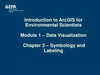
Introduction to ArcGIS forEnvironmental ScientistsModule 1 – Data Visualization Chapter 3 – Symbology and Labeling
Chapter 3 Objectives • Definition of a Layer • Layer properties for symbols and labels • Creating quantitative displays • Classifications • Labeling features • Label Manager • Annotation
What is a Layer? • References a spatial data source – Geographic data is not stored in the map document – Stores the path of the data source • Layers can come from a variety of sources – Vector datasets: coverages, shapefiles, geodatabases, CADD files, ArcSDE – Raster datasets: grids and images – Any geographic dataset that you add to your map
Layer File • Saves symbology and other display properties of a data layer • Saved from within the map document • Saved with .lyr extension on local or network drive • Can be used in other map documents
Broken Data Links • Map documents lose track of data location when data are moved or renamed. • Remember data are only referenced in ArcMap. It does not store data. • To repair broken link: 1) Right click on layer name Properties. 2) Click on Source tab Set Data Source. • Shortcut: Right click layer name go to Data Repair Data Source Repairs all data sources in same directory or geodatabase.
Symbology • Feature information conveyed graphically – Color, shape, size, pattern, orientation, etc. – Natural or conventional – Interpreted with map legend • Change symbology in the Table of Contents or Symbology tab in layer properties
Symbology • Point Markers – Simple, Arrows, TrueType, Pictures • Line Markers – Simple, Cartographic, Hash, Marker • Fill Patterns – Simple, Gradient, Hatched Line
Left mouse click opens the Symbol Selector Changing Symbols in the Table of Contents Right mouse click opens the Color Palette
Raster Symbology • Different methods to improve raster display • Change brightness or contrast • Stretch values to enhance contrast • Group data values into classes • Use red–green–blue (RGB) composite • Display using transparency • Create pyramids for faster drawing
Style References • Set of symbols or elements • Industry specific • Environmental, Conservation, Water, Wastewater,etc • Can create own styles
Display Symbology • Default – single symbol for all features • Display based on attribute – Categories – Quantities – Charts
Display Symbology • Quantities – Graduated symbols • Symbol size reflects class – Graduated colors • Symbol represented by colors – Proportional symbols • Symbol size reflects actual data value – Dot density • Each point represents a count • Charts – Display large amounts of data in “eye–catching” fashion – Pie, bar, stacked
Classification Methods • Classification groups attribute values • Classification Methods –Natural Breaks – Quantile – Equal Interval – Manual – Defined Interval – Geometrical Interval – Standard Deviation
Natural breaks • Default method – Jenks Method • Identifies gaps for breakpoints between values • Good for mapping values that are not evenly distributed – Shows clusters or concentrations of values
Quantile Equal Interval Quantile and Equal Interval • Each class contains the same number of features • Good for mapping evenly distributed data • Good for comparing areas of similar sizes • Divides values into equal ranges • Good for mapping continuous data • Easy to interpret
Standard Deviation • Shows distribution above and below the mean • Easily identify outliers
Exclusions and Sampling • Exclusions • Eliminate features with “no data” • Eliminate outliers • Sampling • Set maximum sample size • Number of records considered in classification
Labels • Label features using attribute values • Displays dynamically in map document • Layer properties • Control placement, size, etc. • Control map scale
Label Properties • Set layer features: • Placement properties • Symbol • Color • Style (bold…) • Size and type • Scale Range • Scale labels visible
Label Manager • On Labeling Toolbar • Access label properties for all layers in active data frame • More efficient
Labels • Independent of layer • Specific scale range to display labels • Right click layer – Properties – Label Tab – Scale Range – set minimum and maximum scale Scale Dependency Features vs. Labels Features • Display layers at specific scale range • Reduces clutter, reduces drawing time • Right click layer – Properties –General Tab – set minimum and maximum scale
Convert Labels to Annotation • Convert labels to annotation – Current scale is used – Options for storage • In map document • In annotation feature class • Fixed location – doesn’t move dynamically in display when zoom in and zoom out • Allows user to control placement and/or change the font type for each individual text element