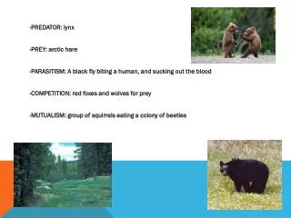
The Lynx and The Hare
90 likes | 276 Views
In this lab assignment, students will learn how to graph predator-prey relationships by plotting hare and lynx population data. Using a ruler, students will create X and Y axes, properly label them, and choose appropriate scales for their data. By visualizing these populations over generations, students will gain insights into the interplay between these species. This hands-on activity emphasizes data analysis skills and enhances understanding of ecological concepts. Submit completed graphs by Thursday, January 31.

The Lynx and The Hare
E N D
Presentation Transcript
The Lynx and The Hare Graph
Do Now • Hand in your HW (Acorn article) • Copy the data from yesterday’s lab into your data table. If you were absent yesterday, use the “Sample Data for Students who were absent.”
How to Graph Your Data: Use a ruler to draw an X axis and a Y axis on your graph paper. Label the X axis “Generations.” Generations 3. Determine how far apart you can scale the numbers on your X axis to include all of the generations you completed in your data table. If you only have 11 generations, then only graph 11 generations. If you have more generations, graph more. 1 2 3 4 5 6 7 8 9 10 11 12 13 Generations
4. Put a title on your Graph. An appropriate title might be “The Relationship between Predator and Prey Populations.” An inappropriate title might be “Squirrel’s favorite winter foods.” 5. Label your Y axis “Hare Population.” 6. Determine the scale for your Y axis. Find the LARGEST number of hares and divide by the number of boxes on the Y axis. Round UP to the nearest 10. That’s what you count by when you label your axis. For example, if 714 is the highest hare population you had, and you have 21 squares, then count by 714/21= 34. Round up to 40. Count by 40’s – 0, 40, 80, 120, 160, etc.
7. Plot the hare population over however many generations you recorded. Connect the dots with a colored pencil. Generation
8. Use a ruler to draw a vertical line on the RIGHT side of the X axis. Generation
9. This will be another Y axis, with a DIFFERENT scale, for the lynxes. Label it. Population of Lynxes Generation
10. Determine the scale for this Y axis. Find the LARGEST number of lynxes and divide by the number of boxes on this Y axis. Round UP to the nearest 2. That’s what you count by when you label your axis. For example, if 32 is the highest hare population you had, and you have 21 squares, then count by 32/21=1.5. Round up to 2. Count by 2’s – 0, 2, 4, 6, 8, 10, etc.
That’s the 1st grade of the 3rd MP! 11. Plot the hare population over however many generations you recorded. 12. Include a key. 13. Staple to your lab and hand in on THURSDAY, JANUARY 31! – click! Population of Lynxes Generation