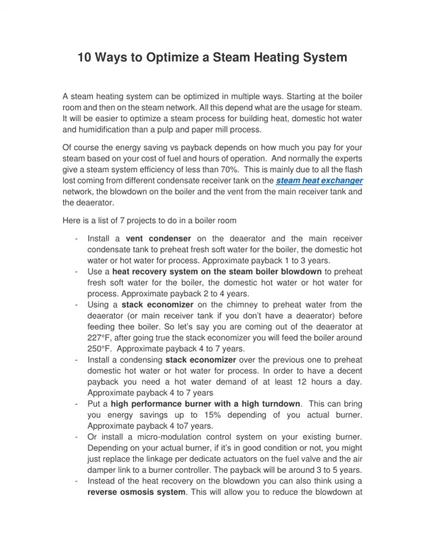
Download
1 / 22
220 likes | 394 Views
The Power of Design 10 ways to optimize your PowerPoints for Distance Learning. Distance Learning and Instructional Media Services Nelson Poynter Memorial Library University of South Florida St. Petersburg. Planning for the Online Student.

E N D
The Power of Design10 ways to optimize your PowerPoints for Distance Learning Distance Learning and Instructional Media Services Nelson Poynter Memorial Library University of South Florida St. Petersburg
Planning for the Online Student • PowerPoints that work well in other settings may need some ‘tweaking’ for online audiences • Your PowerPoints will be shrunken down and harder to read when recorded and put online • Here are some helpful tips
#1 Font Size • Your PowerPoint will be shrunken down when students view them • Small font sizes can be difficult to read • To compensate, use at least size 32 font • May vary depending on font type
#2 Font Type • Stick to standard, legible font types • Maintain consistency throughout all slides • Keep all headings same font type • Keep all body text same font type
#3 Font Color • Use high contrast colors (vs. low contrast) • Maintain consistency • ‘Headings’ and ‘Body Text’ colors consistent throughout presentation
#3 Font Color • Max of 3 different colors (for entire presentation) • When in doubt: Use black and white
#4 Content • Be direct: keep sentences short and to the point • Use bulleted lists of key points when possible • Avoid lengthy descriptions / paragraphs
#4 Content • Leave white space on all sides (edges) of the PowerPoint slides • Can’t fit all of your information onto one slide using the previous tips? Break it up into multiple slides!
#5 Avoid Underlining (if not a link) • Online students associate underlining with hyperlinks • If you want to show emphasis use Bold or Italics • Avoid using only colorto convey meaning, some cannot perceive it
#6 Images • Only use images that directly support, add context to, or help explain a concept • Avoid ‘fluff’ images – these take up valuable slide space and are distracting for some people
#6 Images (Alternative Text) • Alternative (Alt) text is a textual description of the image • Include alt text for all of your images (for students with visual impairments)
#6 Images (Alt Text Process) • Right-click on image and Select “Size and Position” • Select “Alt Text” tab, delete file name, input alt text • Select “Close”
#6 Images (Alt Text Process) • Decorative Images (i.e. borders, dividers) • Insert one blank space for alt text • Long Descriptions (i.e. graphs, charts) • Include within Slide Notes (indicate this within Alt Text)
#7 Graphs and Charts • Include graphs and charts only as necessary • (Do I need this graph/chart to explain the concept?) • Provide title for the chart (main idea) • Don’t overcrowd the slide with text
#7 Graphs and Charts • Graphs and Charts are often very hard to read, so make them as large as possible • Include a description of the graph / chart (and what it is meant to convey) in the notes section of the slide (indicate this within Alt Text)
#8 Hyperlinks • Use descriptive hyperlinks to websites • Instead of… For policy information: http://www.usf.edu/techsupport.alc3/learn.policy • Try… Policy Information Website
#8 Hyperlinks (Process) • Highlight the text you want to make a link • Right-click, select “Hyperlink” • Type / paste the website URL where it says ‘address’ • Click ‘Ok’
#9 Layouts • Use templates / layouts provided by Microsoft • Type in appropriate areas • i.e. Type title in “Click to add title” • i.e. Add body text in “Click to add text”
#10 Slide Transitions • Please don’t use them! • May create problems with Assistive Technology • Cannot be used with our recording software
Example Slide (before) • There are many useful tips that one should follow in order to produce PowerPoint slides that are optimized for a distance learning environment. Although you may be experienced creating presentations on your own for use in classrooms or in other professional settings, and work well in those settings, online students present a unique challenge. In order for slides to be visible, clear, and helpful for online students, we have prepared several guidelines that may help you design slides that are optimized for the world of online learning. • Remember to keep your sentences short, avoid lengthy paragraphs, use images only when appropriate, maintain color consistency, try not to overcrowd a slide, and break up a single, overcrowded slide into two or more slides if necessary. • If you would like more information, please visit: http://www.visitthissite.helppts.learn.usf.edu/hlp/qwe.suggestions.dcl1.forwhepan.3.com
Review • Although the previous slide is okay, let’s apply some of our tips to try and optimize our slide for Online Students…
Example Slide (after) • Tips for PowerPoint development: • Be direct • Be consistent • Avoid information overload • Avoid ‘fluff’ images • For more information, visit the website Help with PowerPoints