Download
1 / 8

E N D
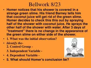
Bellwork 8/23 • Homer notices that his shower is covered in a strange green slime. His friend Barney tells him that coconut juice will get rid of the green slime. Homer decides to check this this out by spraying half of the shower with coconut juice. He sprays the other half of the shower with water. After 3 days of "treatment" there is no change in the appearance of the green slime on either side of the shower. • 1. What was the initial observation? • Identify the-2. Control Group - 3. Independent Variable - • 4. Dependent Variable - • 5. What should Homer's conclusion be?
Bar Graph • A bar graph is best used for comparing data quickly and easily, such as the grade distribution of students enrolled in science class or the growth of plants in different pots.
Line Graph • A line graph is best used for looking at changes over time, such as the number of bathing suits sold each month during the year or the change in your sister’s height throughout the year.
Steps to set-up Bar/Line Graphs • First, set up your graphs with an x-axis and a y-axis. The x-axis is horizontal, and the y-axis is vertical. • The x-axis represents the independent variable. • The y-axis represents the dependent variable. • Choose a scale for each of the axes. Select evenly spaced intervals that include all of your data. Y-AXIS X-AXIS
Steps cont. • Plot your data on the graph. • give your graph a title. A title tells the reader what he or she is studying.
Pie Chart • A pie graph is best used for showing percentages, such as the percentage of the student body who picked certain entrees for lunch or the percentage of your allowance that will go toward purchasing various things.
Practice Graph Example 1 • Determine which type of graph should be used to create the graph using the data below.
For each table (a) identify the independent and dependent variable, (b) determine the type of graph to use, and (c) provide a title. Example 2