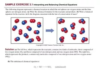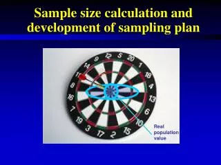
Exercise 19: Sample Size
Exercise 19: Sample Size. Part One. Explore how sample size affects the distribution of sample proportions This was achieved by first taking random samples 20 times when n=10 and then taking 20 random samples where n=40. These random samples were then summarized as sample statistics (p-hat). .

Exercise 19: Sample Size
E N D
Presentation Transcript
Part One • Explore how sample size affects the distribution of sample proportions • This was achieved by first taking random samples 20 times when n=10 and then taking 20 random samples where n=40. These random samples were then summarized as sample statistics (p-hat).
Tally for Discrete Variable : Live Live Count Percent off 223 50.11 on 222 49.89 N= 445 *= 1 This verifies that the proportion of students living on campus and off campus is approximately 50%. This would be the population proportion (p).
Mean, Shape & Standard Deviation • What would you expect if 20 random samples of 10 were taken? • What would you expect if 20 random samples of 40 were taken?
Results from 20 samples where n=10 resulting in phatlive… 0.6000 0.5000 0.5000 0.4000 0.5000 0.5556 0.7000 0.4000 0.6000 0.8000 0.3000 0.4000 0.5000 0.4000 0.5000 0.4000 0.5000 0.3000 0.5000 0.6000
Descriptive Statistics: phatlive=10 Variable N N* Mean SE Mean StDev Phatlive 20 0 0.4978 0.0278 0.1242 Minimum Q1 Median Q3 Maximum 0.3000 0.4000 0.5000 0.5889 0.8000
Let’s Look At A Stem Plot Stem-and-leaf of phatlive=10 (N = 20) Leaf Unit = 0.010 3 00 3 4 00000 4 5 0000000 5 5 6 000 6 7 0 7 8 0
Sample Proportions… • What is the center, spread and shape for this sample proportion? • Center= mean= 0.4978= phat • Spread= st.dev= 0.1242 • Shape= np and/or n(1-p) does not equal atleast 10, therefore guidelines for normality are not met. However, as shown in the stem plot, the results appear relatively normal because of the perfectly balanced population proportions of .5 and .5.
What if the sample size increases… Results from 20 samples where n=40 resulting in phatlive… 0.5750 0.4750 0.4500 0.4250 0.4750 0.3250 0.4250 0.4000 0.4250 0.3500 0.5500 0.5000 0.5385 0.4359 0.4500 0.5000 0.4750 0.4250 0.4500 0.4750
Descriptive Statistics phatlive=40 Variable N N* Mean SE Mean StDev Phatlive=40 20 0 0.4562 0.0137 0.0611 Minimum Q1 Median Q3 Maximum 0.3250 0.4250 0.4500 0.4938 0.5750
Stem-plot for phatlive=40 N = 20 &Leaf Unit = 0.010 3 2 3 5 3 3 4 0 4 22223 4 555 4 7777 4 5 00 5 3 5 5 5 7
Sample Proportions for phatlive=40 • What is the center, spread and shape for this sample proportion? • Center= mean=.4562 • Spread= st. dev. = .0611 • Shape= np and n(1-p) are greater then 10 there normality satisfied.
Let’s compare them simultaneously Descriptive Statistics: phatlive=40, phatlive=10 Variable N N* Mean SE Mean StDev Minimum Q1 Median phatlive=40 20 0 0.4562 0.0137 0.0611 0.3250 0.4250 0.4500 phatlive=10 20 0 0.4978 0.0278 0.1242 0.3000 0.4000 0.5000 Variable Q3 Maximum phatlive=40 0.4938 0.5750 phatlive=10 0.5889 0.8000 How do their centers, spreads and shapes compare?
What does this mean? • The mean for n=40 is more consistent with the population mean. • The spread is smaller for n=40 • The shape is more normal for n=40
As outlined in Chapter 6 • A random variable X for count of sampled individuals in the category of interest is binomial with parameters n and p if… • There is a fixed sample size n • Each selection is independent of the others • Each individual sampled takes just two possible values • The Probability of each individual falling in the category of interest is always p.
However… • The second condition isn’t really met when sampling without replacement. But as long as the population is at least 10n, then approximate independence can still be concluded. • Since the population is greater then 400, both sample sizes of 10 and 40 follow this rule.
Part 2 • Explores how population shape affects the distribution of sample proportion. • First, 20 random samples of 10 were taken and then 20 random samples of 40 were taken. The results were compared.
Handedness Tally for Discrete Variables: Handed Handed Count Percent ambid 13 2.91 left 40 8.97 right 393 88.12 N= 446 • Proportion of ambidextrous is very skewed since only approximately 3% of population is vs. 97% who is not.
For Handedness n=10 Variable N N* Mean SE Mean phathandedn=10 20 0 0.0300 0.0164 StDev Min. Q1 Median Q3 Max. 0.0733 0.00 0.00 0.00 0.00 0.3000
Stem-plot n=10 Stem-and-leaf of phathandedn=10 N = 20 & Leaf Unit = 0.010 0 0000000000000000 1 000 2 3 0
What does this data show? • The center or mean is 0.0300 • The spread is .0073 • The shape is not normal because the guidelines of np and n(1-p) being greater then 10 are not met
Handedness n=40 Descriptive Statistics: phathandedn=40 Variable N N* Mean SE Mean StDev phathandedn=40 20 0 0.04000 0.00612 0.02739 Minimum Q1 Median Q3 Maximum 0.00000 0.02500 0.03750 0.05000 0.10000
Stem-plot n-40 Stem-and-leaf of phathandedn=40 N = 20 Leaf Unit = 0.0010 0 000 1 2 5555555 3 4 5 000000 6 7 555 8 9 10 0
What does this mean? • The center or mean is 0.0400 • The spread is 0.02739 • The shape is normal because the guidelines of np and n(1-p) being greater then 10 are met.
Let’s compare them… Variable N N* Mean SE Mean StDev phathandedn=40 20 0 0.0400 0.00612 0.02739 phathandedn=10 20 0 0.0300 0.0164 0.0733 Minimum Q1 Median Q3 Maximum 0.00000 0.02500 0.03750 0.05000 0.10000 0.0000 0.0000 0.0000 0.0000 0.3000
What does it mean? • By increasing the sample size, the box plot became less skewed. • There was less of a spread and fewer outliers. • The center remained at approximately .03 • The shape became more normal.
Overall • Live seemed to be more normal the handedness. This was because the population was no skewed for the live variable like for handedness. • In both situation, n=40 caused the distributions to be more normal.