Download
1 / 16
160 likes | 370 Views
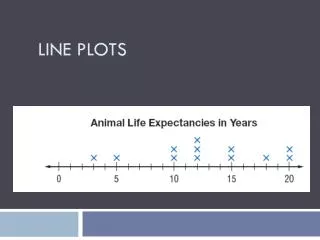
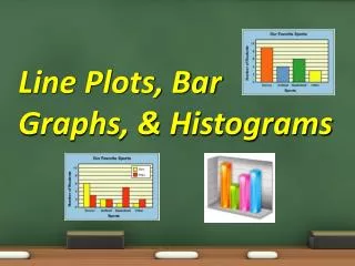
Line Plots and Histograms. Similar but Different. Line Plots. Easy and visual way to organize data. consists of a horizontal number line, each value marked by an x over the corresponding value on the number line.

E N D
Line Plots and Histograms Similar but Different
Line Plots • Easy and visual way to organize data. • consists of a horizontal number line, • each value marked by an x over the corresponding value on the number line. • The number of x's above each number indicates how many times each number occurred.
Watch! Don’t write yet!Data Set58, 30, 37, 36, 34, 49, 35, 40, 47, 47, 39, 54, 47, 48, 54, 50, 35, 40, 38, 47, 48, 34, 40, 46, 49, 47, 35, 48, 47, 46First put them in numerical order.30, 34, 34, 35, 35, 35, 36, 37, 38, 39, 40, 40, 40, 46, 46, 47, 47, 47, 47, 47, 47, 48, 48, 48, 49, 49, 50, 54, 54, 58
Now create your graph. • Find the range of the Data and decide what increments would best show the data. • It would be silly to make a graph in increments of one. • It would be unnecessary to make the graph go to 100. 30 35 40 45 50 55 60
Add the Data • Place an X over the number as it appears in your data set 30, 34, 34, 35, 35, 35, 36, 37, 38, 39, 40, 40, 40, 46, 46, 47, 47, 47, 47, 47, 47, 48, 48, 48, 49, 49, 50, 54, 54, 58
So What? The Line Plot allows us to see some trends more clearly. • Outliers - data points whose values are significantly larger or smaller than other values. • Clusters - isolated groups of points • Gaps - large spaces between points
Which are Outliers? • Which are Clusters? • Where are Gaps? 30 and 58 34-35 and 46-50 Between 40 and 46 Between 50 and 54
Try it ! Data Set 30,36, 74, 36, 77, 80 36, 45, 36, 36, 37, 38, 38, 50, 38, 39, 42, 42, 45, 45, 45, 45, 45, 48, 36, 50, 50, 51,52, 38, 52, 74, 77,
Put in Numerical Order 30,36, 36, 36, 36, 36, 36, 37, 38,38, 38, 38, 39, 42, 42, 45, 45, 45, 45, 45, 45, 48, 50, 50, 50, 51,52, 52, 74, 74, 77, 77,80 • Make a Number Line and Plot
30,36, 36, 36, 36, 36, 36, 37, 38,38, 38, 38, 39, 42, 42, 45, 45, 45, 45, 45, 45, 48, 50, 50, 50, 51,52, 52, 74, 74, 77, 77,80 30 35 40 45 50 55 60 65 70 75 80 Fill in the x’s in your notes. It’s too hard to do it in a PowerPoint!
Histogram • FREQUENCY is the key • Measure Frequency of data • Like a bar graph but measures the number of times the data occurs. • Think of a Connect Four game. • Every time a number is in the data, you drop a checker in the game.
Bar Graph or Histogram? This is a histogram of how many employees make a certain amount of money. Every time there is another employee in a salary category, the histogram gets taller.
Bar Graphs The y axis is showing Dollars not Frequency. This is not a histogram.
Bar Graph or Histogram • We want to compare total revenues of five different companies. Bar graph. Key question: What is the revenue for each company?
Bar Graph or Histogram • We have measured revenues of several companies. We want to compare numbers of companies that make from 0 to 10,000; from 10,000 to 20,000; from 20,000 to 30,000 and so on. Histogram. Key question: How many companies are there in each class of revenues?
Try One • Data for the age of kids going on the merry-go-round. • 2,3,10,5,3,7,9,4,4,10,6,3,4,8,10,