Download
1 / 3
30 likes | 125 Views
Dive into the world of music with the biggest names in the industry featured prominently on every page. From DJs to hip hop icons, explore the stories behind the music. Discover exclusive interviews, latest trends, and more in this colorful and engaging magazine.

E N D
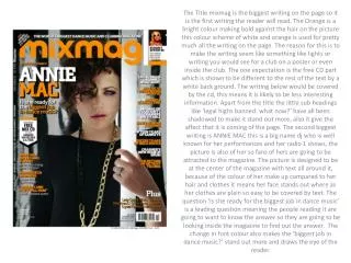
The Title mixmag is the biggest writing on the page so it is the first writing the reader will read. The Orange is a bright colour making bold against the hair on the picture this colour scheme of white and orange is used for pretty much all the writing on the page. The reason for this is to make the writing seem like something like lights or writing you would see for a club on a poster or even inside the club. The one expectation is the free CD part which is shown to be different to the rest of the text by a white back ground. The writing below would be covered by the cd, this means it is likely to be less interesting information. Apart from the title the little sub headings like ‘legal highs banned: what now?’ have all been shadowed to make it stand out more, also it give the affect that it is coming of the page. The second biggest writing is ANNIE MAC this is a big name dj who is well known for her performances and her radio 1 shows, the picture is also of her so fans of hers are going to be attracted to the magazine. The picture is designed to be at the center of the magazine with text all around it, because of the colour of her make up compared to her hair and clothes it means her face stands out where as her clothes are plain so easy to be covered by text. The question ‘is she ready for the biggest job in dance music’ is a leading question meaning the people reading it are going to want to know the answer so they are going to be looking inside the magazine to find out the answer. The change in font colour also makes the ‘biggest job in dance music?’ stand out more and draws the eye of the reader.
This is a cover taken from a 1990s edition of vibe. The big title VIBE is simple and stands out even though the B is slightly covered. The plain back ground from a studio shoot means that all the text stands out. The whole front cover is very basic the type of font with only basic shadowing on the title VIBE. The EAST vs. WEST sub title stands out as the feud would have been a big issue at the time with hip hop fans, this ended in the murder of Biggie Smalls and Tupac to of the best hip hop artist who were around. It would have been seen as major news that biggie and puffy came out to talk about this as it was mainly unspoken at first within the media. The picture its self is also basic both rappers wearing similar clothes and chain however because of biggies frame and puffy’s positioning biggie dominates the picture. The list of artist down the side almost roles in with the sub title and with such big names it would draw in readers to see what had been said. Also ‘juice’ stands out well as it is a light pink which draws the readers eye.
The first thing which hit the reader is clearly the image of Damon Albarn ex Blur singer and currently working with Gorilaz. His agent and Q magazine would want him to portray this image of seriousness, he also looks angry and at the same time almost as if he is questioning something. He looks fairly rough hair uncombed and unshaven making him look like he’s breaking the social norms of how people are expected to look. The tint of the photo is almost black and white giving it even more serious look. The standard Q logo which will be recognized by many readers. Also if people were just skipping through magazine they would notice the casual slogan ‘Britain’s Biggest Music Magazine.’ The brackets used for ‘The 21st Anniversary issue’ makes it seem as it is unimportant almost, such is the confidence of this magazine. The 21st anniversary may seem a strange one to celebrate but 21st is very modern as we are in 21st century. The sub title underneath claims inside the magazine there is a list of 21 people who changed music, this list is below and with such a wide range of big artist people are more likely than not like one of those artist so are going to want to buy the magazine. Apart from the Damon Albarn title there is nothing else advertised about what is inside again relying upon the fact that people know the magazines reputation and are going to buy it because of that.