Download
1 / 8
80 likes | 199 Views
asdfghjksdszxfhdsht

E N D
School Magazine- Steps I did on Photoshop By Niamh Doherty
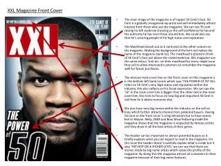
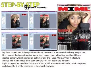
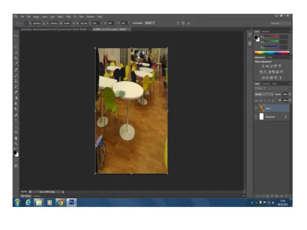
The first thing I did on Photoshop was I changed the background setting to international so that the page was A4. I then uploaded one of the images I took onto Photoshop and cropped it to the size of A4 so that it fit and so that the two people in it were in the centre.
The next thing I did was Insert the title of my magazine in the masthead by using ‘text’ and called the magazine ‘ The Corridor Gazette’. I then changed the colour of it to Pink because that is one of the colours I have chosen for my colour scheme.
Also, for the title of my school magazine I have used the effect of ‘Outer Glow’ so that every letter is outlined and stands out so that it catches the audiences eye.
Then I decided to use an oval shape which inside it has the word ‘free’ which is also a buzz word. I then changed the colour of the oval and ‘free’ to Navy Bluewhich is also another colour which I have chosen for my colour scheme. Also, I have inserted a Main Cover line which reads ‘Life in Sixth Form so far...’ and have changed the colour to white so that it stands out to everything else on the picture.
I then have used the 3D option so that the main cover line again stands out to everything else on the page and catches the audiences attention.
I have also included 4 subheadings which also included a little bit of information about the article the subheading is talking about underneath. I have used pink and navy blue for the text so that it fits in with the colour scheme.
Finally, I have also included a bit of information talking about the main image and cover line. I have done this by inserting it just under the main cover line so that it shows that it is clearly talking about the main article. Initially, I made the font colour pink because it is one of the colours I have chosen for my colour scheme and have also made the size of the font to a size bigger than the size font of the information under the other cover lines so that it stands out and captures the audience attention