Download
1 / 15
150 likes | 153 Views
Learn how to design your web pages for optimal readability on computer screens, taking into account color, layout, and format. Discover how different browsers and displays can impact the look of your page. Based on principles from "Principles of Web Design" by Joel Sklar.

E N D
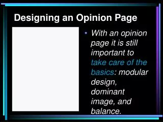
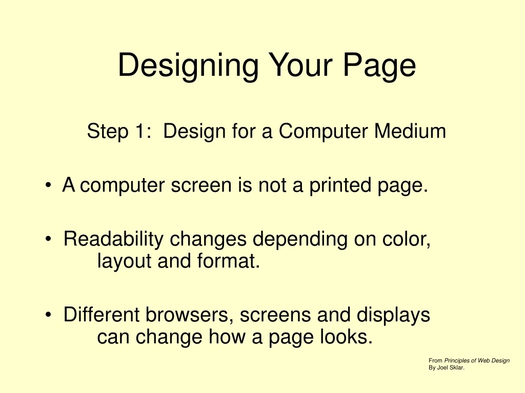
Designing Your Page Step 1: Design for a Computer Medium A computer screen is not a printed page. Readability changes depending on color, layout and format. Different browsers, screens and displays can change how a page looks. From Principles of Web Design By Joel Sklar.
How We Read Text Following normal reading habits, the user’s eye moves from left to right.
How We View Screens Looking at a screen, the user’s eye scans in a more clockwise pattern.
How Will Your User’s Read/View? • If a page uses a lot of text, the user will read in a more traditional, left to right manner. • If a page has more graphical elements, the user is more likely to take in the whole page.
Accepted Relative Areas of Importance 2 5 1 3 4
Questions to Ask Yourself • What is the Purpose of my Website? • What is my Main Audience? My secondary Audience? • What Information do I want to present?
Designing Your Site Step 2: Plan your site’s Hierarchy • How are your pages linked together? • How many links exactly? • Where does the User go next?
A Structure That is More Wide Than Deep Main Work Class Me Play Family Sample
A Structure That is More Deep Than Wide Main Work Me Class Play Sample Family
Designing Your Content Step 3: The “Do’s” of Good Web Design • Use all lower-case and no spaces when naming files. • Keep a Consistent Look and Feel. • Use Colors that are High in Contrast. • Design for Low Bandwidth. • Use a Grid Structure.
Designing Your Content More Do’s • Use Active White Space. • Design for Interaction. • Use Hypertext Linking Effectively. • Design for Accessibility. • Keep Your Site Updated on a Regular Basis
Designing Your Content Step 4: Things to Avoid. aka – The “Don’ts” • Don’t Overuse Media • Don’t Make Your Users Scroll Too Much. • Don’t Flood Your Pages with Content. • Don’t Choose Colors or Images that Make the Page Hard to Read.
Designing Your Content • Don’t Forget to Title Everything: images and pages. • Don’t Assume that Your Users Know Where to Go. • DON’T USE FRAMES!
The Worst of the Worst For a good luck at what not to do, visit www.webpagesthatsuck.com