Download
1 / 7
110 likes | 257 Views
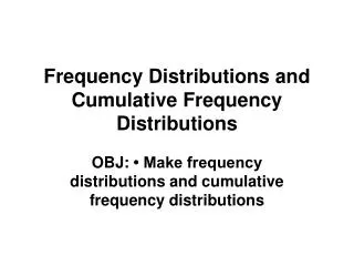
Relative Cumulative Frequency Graphs. AP Statistics. How to construct an ogive (relative Cumulative Frequency Graph).

E N D
Relative Cumulative Frequency Graphs AP Statistics
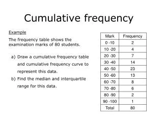
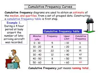
How to construct an ogive (relative Cumulative Frequency Graph) • Step 1: Decide on class intervals and make a frequency table just as in making a histogram. Add three columns to your frequency table: relative frequency, cumulative frequency, and relative cumulative frequency -To get the values in the relative frequency column, divide the count in each class interval by the total number of the frequency. Multiply by 100 to convert to a percentage. -To fill the cumulative frequency column, add the counts in the frequency column that fall in or below the current class interval.For the relative cumulative frequency column, divide the entries in the cumulative frequency column by the total number of individuals. • Step 2: Label and scale your axes and title your graph. Label the horizontal axis “Age at Inauguration” and the vertical axis according to your choice of class intervals and the vertical axis from 0% to 100% • Step 3: Plot a point corresponding to the relative cumulative frequency in each class interval at the left endpoint of the next class interval the last point you plot should be at a height of 100%
How can you do this quickly? Make a histogram on your calculator. We will use yesterday’s histogram. Lets refer back to example 1.6 done yesterday in class.
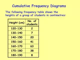
Construct your Table by ANALYZING your Histogram • Class Frequency Relative Frequency Cumulative Frequency Relative Cumulative Frequency • 40-44 2 2/43= 0.047 or 4.7% 2 2/43= 0.047 or 4.7% • 45-49 6 6/43= 0.140 or 14% 8 8/43= 0.186 or 18.6% • 50-54 13 13/43= 0.302 or 30.2% 21 21/43= 0.488 or 48.8% • 55-59 12 12/43 = 0.279 or 27.9% 33 33/43= 0.767 or 76.7% • 60-64 7 7/43= 0.163 or 16.3% 40 40/43= 0.930 or 93% • 65-69 3 3/43= 0.070 or 7% 43 43/43= 1.000 or 100%
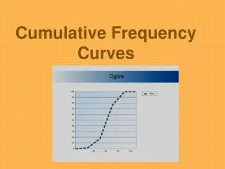
The following is a relative cumulative frequency plot of the US presidents’ ages at inauguration • Class Frequency Relative Frequency Cumulative Frequency Relative Cumulative Frequency • 40-44 2 2/43= 0.047 or 4.7% 2 2/43= 0.047 or 4.7% • 45-49 6 6/43= 0.140 or 14% 8 8/43= 0.186 or 18.6% • 50-54 13 13/43= 0.302 or 30.2% 21 21/43= 0.488 or 48.8% • 55-59 12 12/43 = 0.279 or 27.9% 33 33/43= 0.767 or 76.7% • 60-64 7 7/43= 0.163 or 16.3% 40 40/43= 0.930 or 93% • 65-69 3 3/43= 0.070 or 7% 43 43/43= 1.000 or 100%
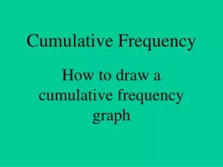
In the following (a) shows how we locate Bill Clinton’s age in the distribution and (b) shows how to determine the 60th percentile and the center of the distribution.
QUIZ REVIEW • Know how to construct Bar Graphs, Dot Plots, Stem Plots, Pie Charts, histograms • Know how to read ogives (relative cumulative frequency graphs). • Know the difference between a categorical variable and a quantitative variable • Be able to describe a distribution (remember this means to give the shape, center AND spread)