Download
1 / 10
110 likes | 227 Views
This blog post analyzes the website www.budlight.com, discussing its audience, purpose, design elements, layout, and images. It explores how color choices, text size, background, and image selection impact user experience. Suggestions for improvements are provided to enhance usability and visual appeal.

E N D
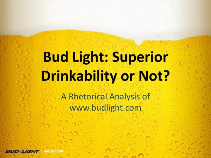
Bud Light: Superior Drinkability or Not? A Rhetorical Analysis of www.budlight.com
Audience Purpose But who actually looks at the web site? College kids trying to decide on which beer to drink this weekend? Someone counting calories Researchers and people seeking information about Anheuser Busch, and/or Bud Light. • Promoting superior drinkability • To inform consumers and researchers about the company and their products.
Thesis • Colors Color theme, Color Choices • TextSize, Spacing, Font choice • Background Distracting, noisy • Images Image choice, Added effects
Colors Vibrant Bright Patriotic Relaxing
Text Text size and spacing Bulleting Professional, clean cut font What could be done to make the font bigger?
Background/ Page Layout Background Theme Distracting What does it accomplish? Sound Blurriness Colors in background Your going to read this first because it is on the left • Layout • Left to right • Visibility with out scrolling • Relevant information is on the right and irrelevant information is on the left causing you to read the irrelevant information first.
Layout Continued Back button in the top left corner The important information on the right is the last thing viewers look at and it is the information most viewers are looking for Less important tabs on the left
Navigation or Navi-guessing? • Descriptive Pictures • Vaguely Worded Descriptions • Together they work well • Pop out menu • Descriptions are clear but where do they take you? • Is not knowing where the tab takes you a good thing?
Images • Credibility/ Ethos? The shadow and the sun are on the same side of the bottle.
Depth of the Web Page Blurry Background makes clear images in front of it pop out at you The back button spins when you move the mouse over it and looks three dimensional The bottle stands out the most on the page due to the contrast in color with the rest of the page. The table, stacked caps, and napkin give the page a three dimensional appearance The Semi Transparent buttons get a glow around them if the mouse moves over them and seem to move toward you