Download

1 / 8
100 likes | 224 Views
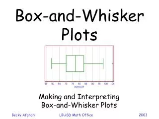
13.8 Interpret Box-and-Whisker Plots. Vocabulary. Box-and-Whisker Plot - a data display that organizes data values into four groups using minimum value, lower quartile, median, upper quartile, and maximum value. Quartile - dividing the data into four equal parts

E N D
Vocabulary • Box-and-Whisker Plot- a data display that organizes data values into four groups using minimum value, lower quartile, median, upper quartile, and maximum value. • Quartile- dividing the data into four equal parts • Interquartile Range- the difference of the upper and lower quartiles of a data set. • Outlier- a value that is widely separated from the rest of the data in a data set.
Example 1 Make a box-and-whisker plot of the heights (in inches) of 7 family members: 34, 67, 70, 62, 46, 75, 54. Step 1: Order the data. Then find the median and quartiles. Step 2: Plot the median, the quartiles, the maximum value, and the minimum value below a number line. Step 3: Draw a _____ from the lower quartile to the upper quartile. Draw a vertical line through the ______. Draw a line segment from the box to the maximum and another from the box to the minimum.
Example 2 Make a box-and-whisker plot of the data. • 10, 8, 2, 4, 3, 8, 6, 4, 5, 5
Example 3 Interpret a box-and-whisker plot • The box-and-whisker plots below show the average high temperature (in degrees Fahrenheit) each month in Atlanta, Georgia and Orlando, Florida. • For how many months is Atlanta’s average high temperature less than 60°F. • Compare the average high temperature in Atlanta with the average high temperature in Orlando. • For how many months was the average high temperature in Orlando more than 84°F.
Example 4 Identify an outlier • The average monthly high temperatures (in degrees Fahrenheit) in Atlanta are:52, 57, 65, 73 80, 87, 89, 88, 82, 73, 63, 55. These data were used to create the box-and-whisker plot in example 2. Find the outlier(s) of the data set, if possible.
Example 5 Find the outlier(s) of the data set, if possible. • 22, 29, 15, 25, 9, 32, 49, 20, 33, 26, 19, 30