Download
1 / 5
50 likes | 73 Views
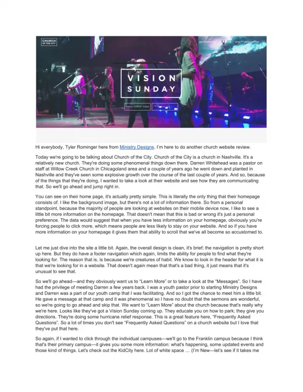
CHURCH OF THE CITY Hi everybody, Tyler Rominger here from Ministry Designs. I’m here to do another church website review. Today we're going to be talking about Church of the City. Church of the City is a church in Nashville. It's a relatively new church. They're doing some phenomenal things down there. Darren Whitehead was a pastor on staff at Willow Creek Church in Chicagoland area and a couple of years ago he went down and planted in Nashville and they've seen some explosive growth over the course of the last couple of years. And so, because of the things that they're doing, I wanted to take a look at their website and see how they are communicating that. So we'll go ahead and jump right in. You can see on their home page, it's actually pretty simple. This is literally the only thing that their homepage consists of. I like the background image, but there's not a lot of information there. So from a personal standpoint, because the majority of people are looking at websites on their mobile device now, I like to see a little bit more information on the homepage. That doesn't mean that this is bad or wrong it's just a personal preference. The data would suggest that when you have less information on your homepage, obviously you're forcing people to click more, which means people are less likely to stay on your website. And so if you have more information on your homepage it gives them that ability to scroll that we've all become so accustomed to. I hope this review was beneficial to you. Again, my name is Tyler Rominger. I'm from Ministry Designs. We'd love the opportunity to take a look at your church website and do a review. Thank you, I hope you’re having a great day, and we'll look forward to seeing you at the next video. Make sure that you subscribe in the link below. Links: YouTube: https://www.youtube.com/watch?v=g1OwBHEXa0I Ministry Designs Website: https://ministrywebsitedesigns.com/church-of-the-city/

E N D
Hieverybody,TylerRomingerherefromMinistryDesigns.I’mheretodoanotherchurchwebsitereview. Todaywe'regoingtobetalkingaboutChurchoftheCity.ChurchoftheCityisachurchinNashville.It'sa relativelynewchurch.They'redoingsomephenomenalthingsdownthere.DarrenWhiteheadwasapastoron staffatWillowCreekChurchinChicagolandareaandacoupleofyearsagohewentdownandplantedin Nashvilleandthey'veseensomeexplosivegrowthoverthecourseofthelastcoupleofyears.Andso,because ofthethingsthatthey'redoing,Iwantedtotakealookattheirwebsiteandseehowtheyarecommunicating that.Sowe'llgoaheadandjumprightin. Youcanseeontheirhomepage,it'sactuallyprettysimple.Thisisliterallytheonlythingthattheirhomepage consistsof.Ilikethebackgroundimage,butthere'snotalotofinformationthere.Sofromapersonal standpoint,becausethemajorityofpeoplearelookingatwebsitesontheirmobiledevicenow,Iliketoseea littlebitmoreinformationonthehomepage.Thatdoesn'tmeanthatthisisbadorwrongit'sjustapersonal preference.Thedatawouldsuggestthatwhenyouhavelessinformationonyourhomepage,obviouslyyou're forcingpeopletoclickmore,whichmeanspeoplearelesslikelytostayonyourwebsite.Andsoifyouhave moreinformationonyourhomepageitgivesthemthatabilitytoscrollthatwe'veallbecomesoaccustomedto. Letmejustdiveintothesitealittlebit.Again,theoveralldesignisclean,it'sbrief;thenavigationisprettyshort uphere.Buttheydohaveafooternavigationwhichagain,limitstheabilityforpeopletofindwhatthey're lookingfor.Thereasonthatis,isbecausewe'recreaturesofhabit.Weknowtolookintheheaderforwhatitis thatwe'relookingforinawebsite.Thatdoesn'tagainmeanthatthat'sabadthing,itjustmeansthatit's unusualtoseethat. Sowe'llgoahead—andtheyobviouslywantusto“LearnMore”ortotakealookatthe“Messages”.SoIhave hadtheprivilegeofmeetingDarrenafewyearsback.IwasayouthpastorpriortostartingMinistryDesigns andDarrenwasapartofouryouthcampthatIwasfacilitating.AndsoIgotthechancetomeethimalittlebit. HegaveamessageatthatcampanditwasphenomenalsoIhavenodoubtthatthesermonsarewonderful, sowe'regoingtogoaheadandskipthat.Wewantto“LearnMore”aboutthechurchbecausethat'sreallywhy we'rehere.Lookslikethey'vegotaVision Sunday comingup.Theyeducateyouonhowtopark;theygiveyou directions.They'redoingsomehurricanereliefresponse.Thisisagreatfeaturehere,“FrequentlyAsked Questions”.Soalotoftimesyoudon'tsee“FrequentlyAskedQuestions”onachurchwebsitebutIlovethat they'veputthathere. Soagain,ifIwantedtoclickthroughtheindividualcampuses—we'llgototheFranklincampusbecauseIthink that'stheirprimarycampus—itgivesyousomemoreinformation:what'shappening,someupdatedeventsand thosekindofthings.Let'scheckouttheKidCityhere.Lotofwhitespace…(I’mNew—let’sseeifittakesme
back—ohittakesmebacktoadifferentpage)…soI'mclickingthroughthiswebsiteinrealtimewithyou,and justmyinitialknee-jerkresponsetothis,ishonestlyit'salittlebitconfusingtonavigateasI'mclickingthrough thewebsiteandkindofanalyzingitforthefirsttime.IfI'maparentwithchildren,orifI'mmaybeafirst-time visitortothechurch,I'mnotgoingtoknowexactlywhattolookfor,orwheretolookforit,andsoImay abandonthiswebsite,justbecauseofthedifficultytonavigate. IlovethattheyhavetheVision Sunday videorighthere—that'salsohelpful.Theytelluswhattoexpectinthe “I'mNew”section…“WhoWeAre”.We'vegotsomegoodinformationhere—the“VisionandValues”—people actuallydolookatthatinformation,soit'sgoodtohave. Withthatsaid,Iwanttogoaheadandjumpoverintosomeofthetechnicalaspects.Soifwelookatthesite speedfromGoogle—themobilesitespeed—itlookslikeitneedsalittlebitofwork.72isbyfarnottheworst I'veseen;it'salsonotthebestthatI'veseen.Theirdesktophowever,it'sprettygood.AndIthinkthatthat's becauseofthelimitedamountofcontentonthehomepagesothere'snotreallyalottooptimizethere. SothisisatoolthatwasproducedbyHubSpot,andbasicallywhatitis,isit'sanoverallwebsitegrader.Andit kindofauditsthingslikeperformance,mobileresponsiveness,theSEOofthesite,liketheon-page optimizationofthesite,andthewebsitesecurity.Soitsays“Thissiteisok”,whichIcanunderstandwhy,and we'lljumpintoalittlebitmoreofthatwhenwegetdowntotheSEOsection.Theperformanceisprettygood, likewealreadysawthankstoGoogle.Acoupleofthingsthattheycouldincreasethere.Noticethatthepage speedisreallygood.Wedon'teverwanttoseethatloadspeedhigherthanaboutfourseconds.Iftheycanget thatdownbetweentwoandthreesecondsthey'dbeinabetterspot.Mobile-friendly:theygeta30outof30so that'sphenomenal. SotheirSEOgradeisalittlebitlacking.I'veactuallynoticedthatwithalotofchurchesthatIreviewtheir websiteon,thatIthinkthere'sjustagenerallackofsearchengineoptimization,andpeopledon'tnecessarily understandthevalueofhavingyourwebsiterankhigherinthesearchengines.Soarealsimplethingthatthey coulddoisjustaddasitemap.Youknow,therearefreesitemapgeneratorsthattheycangeneratethesitemap andthensubmitthattotheirgooglewebmastertools.Andwhatitdoes,isitgivesGoogleamoreclearpicture ofthelayoutoftheirwebsiteandhelpsGooglethenindexthepagesmoreeffectively,thereforethenranking thesitealittlebithigher. TheyhavenoheadersontheirwebsitesotheyneedH1tags/H2tags.AnH1tagwouldbetheprimarygoalof thesite.YoucouldhaveacoupleofH2tagswhichwouldmaybe…SoanexampleofanH1tagwouldbe: “CityChurch—Nashville”andthenanH2tagcouldbesomesubcategoriesinsideofthatwebsite.Theyhaveno headertagsinthathomepagesoit'shurtingtheirSEOgrade.Thesecurityisabigthing,again,there'snoSSL certificateonthissite,justlikeScottsdaleBible.TheyforsomereasonhavenotaddedanSSLcertificate,but thiswillalsohelptheiroverallSEOgrade.BecauseGooglehasnowpubliclycomeoutandsaidthatifasite hasanSSLcertificateit'sgoingtobeviewedmoresecurelyinthesearchengines,thereforerankinghigher. BecauseGooglewantstoproducethemostqualityandsecureresultspossible.SoifIhadtomakea recommendationIwouldsay,“AddsomeheadertagsandaddanSSLcertificate.” Sotothatpoint,therearesomethingsthattheycoulddoagainalittlebitbetterintheirSEO.Youcantellthat they'veprobablyrecentlygivenitsomeattentionbecausetheirsitetraffichasjustjumpedastronomicallyinthe lastyear.Buttherearesomethingsthatthey'remissing,right? SoifIdidasearchforchurchesinNashvilleandIviewtheresultsonthat,they'renotevenonthefirstpage. SoI'mallthewaydownheretoresultnumber14,whichwouldbethefourthresultonthesecondpage.And thishasaprettyhighsearchvolume.Soitlookslikethesearchvolumeforthisparticulartermis720organic searchesamonthinGoogle.Andso,IthinkthatiftheyaddedanSSLcertificateandtheyputsomeheader tags,werestrategicabouttheirpagelinking,createdsomeNashville-specificcontentandaddedittotheir website,theirSEOrankingwouldincreaseprettydramatically,whichwouldthenultimatelyhelpthemleverage thesearchvolumethat'shappeningintheirspecificcityonanygivenmonth. Sojustaquickrecap:we'llgobacktothehomepageofChurchoftheCity.Ilovetheinitialpresentation—it's clean,it'sconcise,it'smodern—butonceIdiveintothenavigation,Istrugglealittlebittofollowthepathofthe
site.It'snotverylogicallyorganized.Iknowthatchurches—largerchurches—strugglewiththisbutthereare moreeffectivewaystolayoutyoursite.SoifIcouldmakearecommendationitwouldbetoaddtheSSLand maybeclarifysomeofthenavigation. Ihopethisreviewwasbeneficialtoyou.Again,mynameisTylerRominger.I'mfromMinistryDesigns.We'd lovetheopportunitytotakealookatyourchurchwebsiteanddoareview.Thankyou,Ihopeyou’rehavinga greatday,andwe'lllookforwardtoseeingyouatthenextvideo.Makesurethatyousubscribeinthelink below. Links: YouTube:https://www.youtube.com/watch?v=g1OwBHEXa0I MinistryDesignsWebsite:https://ministrywebsitedesigns.com/church-of-the-city/