Download
1 / 49
490 likes | 520 Views
Learn how to extract and analyze weather statistics from Weather Underground using Excel. Tutorial includes step-by-step instructions on data manipulation and chart creation.

E N D
Analyzing and Viewing Weather Statistics in Excel Using data from Weather Underground CSC 152 (Blum)
Go to wunderground.com. Use Search locations to search a city (e.g. Philadelphia) CSC 152 (Blum)
Next click on the History tab CSC 152 (Blum)
Next click on Monthly CSC 152 (Blum)
Choose August & monthly then click View CSC 152 (Blum)
Scroll down to the Daily Observations. Highlight the data. Right click and choose Copy CSC 152 (Blum)
Right click/Copy CSC 152 (Blum)
Open a new Excel spreadsheet. Right click in the first cell. Choose Match destination. CSC 152 (Blum)
Replace the date in cell A3 with 8/1/2019 CSC 152 (Blum)
In Cell A4, enter the formula = A3+1 CSC 152 (Blum)
Enter formula, highlight it, move into corner (get thin cross) and double click to copy formula down The ####### Pound signs (hash tags?) arise because the cell is not wide enough to display the date. Place the mouse between A and B, when it becomes a double headed arrow. Either double click (auto spacing) or drag (user spacing). CSC 152 (Blum)
Use File/save As … Give the file a name and location CSC 152 (Blum)
Highlight the first three columns (Two label rows may confuse it) CSC 152 (Blum)
Go to Insert/Line Chart/Lines with Markers CSC 152 (Blum)
Under Chart Tools/Design choose a Quick Layout (e.g. #10) To obtain features like titles and axis labels individually one goes to the Layout tab, but to obtain such features en masse one goes to the Design tab and uses the set Layouts found there. CSC 152 (Blum)
Edit the Chart Title and y-axis label. (I got the degree symbol by using Insert/Symbol). Then delete the x-axis label. CSC 152 (Blum)
Right click on a data point, and choose Select Data CSC 152 (Blum)
Choose Series 1 and click on Edit (on the left!). CSC 152 (Blum)
Give the series a name and click OK. Repeat for Series 2. CSC 152 (Blum)
Right click on the vertical (High-Low) lines and choose Delete from the menu CSC 152 (Blum)
Right click on the dates on the x axis and choose Format Axis. CSC 152 (Blum)
Scroll down, expand Number. Change the Type of date. CSC 152 (Blum)
Next at top of panel choose Text Options on the Format Axis side panel. Then choose Textbox CSC 152 (Blum)
Change the Text direction CSC 152 (Blum)
Right click on the outer part of the Chart and choose Format Chart Area CSC 152 (Blum)
Choose Fill and use the Paint bucket drop-down to change the color CSC 152 (Blum)
Right click on the interior (plot area) and choose Format Plot Area CSC 152 (Blum)
Choose Fill and use the Paint bucket drop-down to change the color CSC 152 (Blum)
On the Home tab, highlight the last row of data and click on the Border control on the Home tab and choose Thick Bottom Border CSC 152 (Blum)
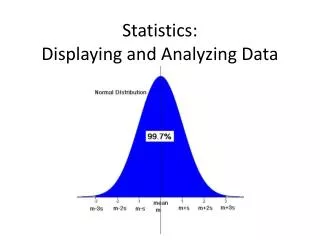
http://www.ltcconline.net/greenl/courses/201/descstat/mean.htmhttp://www.ltcconline.net/greenl/courses/201/descstat/mean.htm The website above (and many others) gives some explanation of why the mean (our usual concept of “average”) can be thrown off by outliers. Were there any temperature outliers in August? CSC 152 (Blum)
In a cell (for me it was B34) enter =AVERAGE( then drag along the column of temperature data from B3 to B33) . Then close the parentheses and click Enter. CSC 152 (Blum)
In the next cell enter the formula =MEDIAN(B3:B33) Be sure to choose the range B3:B33 and not B3:B34. It is a common mistake when you are using a range to calculate several different quantities to include your previous quantities in your range. Be careful. CSC 152 (Blum)
Highlight cell B36 and click on the fx button next to the formula bar. Choose the Statistic category (or All) and scroll to MODE.SNGL. Then click OK. CSC 152 (Blum)
Next Enter the range B3:B33 in the Number Textbox. Then click OK. (You can also click on the right of the input a then drag over the range.) CSC 152 (Blum)
Next we will turn to measures of “spread” in the data like the standard deviation CSC 152 (Blum)
In cell B37 enter the formula =STDEV.S(B3:B33) CSC 152 (Blum)
Enter another version of standard deviation STDEV.P in the next cell CSC 152 (Blum)
Calculate the minimum of the distribution by entering the formula =MIN(B3:B33) CSC 152 (Blum)
Enter the text “Second smallest” into cell A40, then right in the cell and go to Format/Format Cells CSC 152 (Blum)
Under the Alignment tab, check Wrap text CSC 152 (Blum)
In cell B40 enter the formula =SMALL(B3:B33,2) The second “argument” of the function determines which smallest value: 2 for second smallest, 3 for third smallest, etc. CSC 152 (Blum)
Calculate the maximum of the distribution in cell B41 by entering the formula =MAX(B3:B33) CSC 152 (Blum)
Similar to the second smallest, determine the second largest with =LARGE(B3:B33,2) CSC 152 (Blum)
Quartiles are an extension of the concept of median (which is the second quartile). The first and third quartile indicate the data at the 25% and 75% mark if the data were ordered (sorted). CSC 152 (Blum)
Determine the First Quartile by entering the formula =QUARTILE.INC(B3:B33,1) CSC 152 (Blum)
Determine the Third Quartile by entering the formula =QUARTILE.INC(B3:B33,3) CSC 152 (Blum)
http://www.purplemath.com/modules/boxwhisk.htm The Quartiles including the zeroth (minimum) and fourth (maximum) go into making what is called the “box and whiskers” plot. CSC 152 (Blum)
Highlight the formulas in the high temperature column, move to the lower right-hand corner get the “thin cross” and copy the formula to the ave and low temp columns CSC 152 (Blum)
Result of copy CSC 152 (Blum)