Basic Statistics with Excel
Basic Statistics with Excel. Valerie L. Young Chemical & Biomolecular Engineering Ohio University Last updated 01 October 2010. Outline – Excel as a Tool for . . . Summarizing data Fitting data (simple linear regression) Hypothesis testing (t-test).

Basic Statistics with Excel
E N D
Presentation Transcript
Basic Statistics with Excel Valerie L. Young Chemical & Biomolecular Engineering Ohio University Last updated 01 October 2010
Outline – Excel as a Tool for . . . • Summarizing data • Fitting data (simple linear regression) • Hypothesis testing (t-test) This is a tutorial. It consists of both information and exercises to introduce Excel as a basic tool for statistical analysis. It assumes that you are familiar with Excel and can do simple calculations and make plots.
Some Excel Tidbitsuseful for later in the tutorial • Excel can display dates in many formats, but it stores dates as numbers. • 1 = January 1, 1900 • 37622 = January 1, 2003 • A single quote at the beginning forces Excel to treat a cell entry as text, even if it is a number • To “fix” a cell so that the address won’t update when you copy it, put a $ in front of the column letter and/or row number. • Excel can count the number of values in a range • =count(N2:N35) • =countif(N2:N35,“-777”) • =countif(N2:N35,“>-777”)
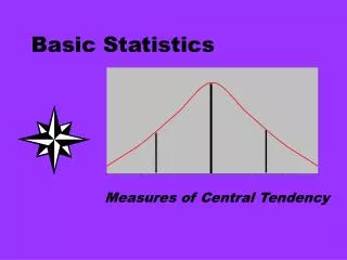
Ways to Summarize Data • Plots = Visual Summaries • Time series (“Scatter” spaces points according to time recorded; “Line” spaces all points evenly,) • y vs. x to investigate correlations (use “Scatter”, not “Line”) • Histogram (column chart) or dot diagram to show distribution • Pie chart (to show proportions) • Descriptive Statistics = Numerical Summaries • Measures of location • Measures of variability
Plots to Summarize Data Dependent variable. Cal Factor depends on sample size. Look! No gray background. Axes scaled so data covers graph. Independent variable Figure 2a. Values measured the first day appear to be lower and more scattered than the rest. Figure 2b. Lower values of “calibration factor” are obtained with smaller amounts of sample. Example of a time-series plot made as a “scatter plot” in Excel so that data from the same day are grouped together. Example of a “y vs. x” plot made as a “scatter plot” in Excel to show how calibration factor depends on sample size.
Dot Diagram A dot diagram shows visually how a small data set is distributed. Data from Table 2-1 in Montgomery, Runger, and Hubele
To make a dot diagram Make a table in Excel with your data in the first column and an arbitrary constant number in the second column.
To make a dot diagram Note that you don’t want a Line plot. “Line” will space your data points evenly across the page. “Scatter” will space the tick marks evenly, then place the data points according to their values. Select both columns of data, then select Insert > Scatter
To make a dot diagram look professional: • Under Chart Tools, select layout. • See the next page for a screenshot of the Chart Layout Screen • Under axes: • Edit the vertical axis so that the data is a little above the horizontal axis (I set the maximum value to 5). • Tell it not to show the vertical axis. • Under gridlines, tell it not to show gridlines • Under legend, tell it not to show the legend • Under axis titles, add a title below the horizontal axis. • Right-click on the data and select “format data series” to change what the markers look like
Histograms When your data set is a single variable measured many times, a histogram is a useful way to show how the values are distributed. About 26% of measurements are between 55 and 56. Indicate total # of values on graph or in caption. This distribution is left-skewed. This is 50 and < 51. Next category is 51 and < 52. No overlap. All categories the same size.
Exercise: Construct a Histogram Now that you have seen a histogram generated by Excel, you should practice by making one yourself. On the next slide, you will be directed to load a data file and make a histogram to display the data. Each bullet on the slide is a hint for what you should do next to complete the histogram. You should be able to figure out how to make Excel do these things.
Exercise: Construct a Histogram • Load calibration.xls • Make a histogram of the “cal factor” data • Count the total number of entries under cal factor • =count(b2:b28) • Set up a list of categories for the histogram • ’46-47 • Note the single quote, which tells Excel to treat this as text • Count the number of entries in each category • =countif(b$2:b$28,”<47”)-countif(b$2:b$28,”<46”) • Note the dollar signs, which allow you to copy the cell without the row numbers being changed to match the location of the new cell • Calculate the fraction of entries in each category • Insert a column chart on a new page, fraction vs. category • Adjust formatting to make your histogram look like the one on Slide 9
How to access statistical functions in Excel 2007 Instead of using the menu, you can type in the functions. So, =average(b2:b16) finds the mean of the values in cells b2 thru b16.
Descriptive Statistics – “Location” • Mean (average) • Strongly affected by unusual points • =average(b2:b28) • Median (50% of data higher, 50% of data lower) • Seldom strongly affected by unusual points • =median(b2:b28)
Descriptive Statistics – “Variability” • Standard Deviation, =stdev(b2:b28) • A measure of how widely the data is spread around the mean • Strongly affected by unusual points • Relative Standard Deviation • =stdev(b2:b28)/average(b2:b28) • Usually given as percentage • Format > Cells > Percent • Variance • =(stdev(b2:b28))^2
Descriptive Statistics – “Variability” • Interquartile range, IQR • Width of the middle 50 % of the data • Seldom strongly affected by unusual points • IQR = q0.75 – q0.25 • q0.75: 75% of data is lower, =percentile(b2:b28,0.75) • q0.25: 25% of data is lower, =percentile(b2:b28,0.25) • Range • Values spanned by the data • = max(b2:b28) – min(b2:b28) • Strongly affected by unusual points
Descriptive Statistics – “Location” and “Variability” • Confidence Interval • Mean +/- Uncertainty covers the confidence interval • Used to quantify your confidence (based on probability) that your reported value (based on your data) is the true value. • “95 % confidence interval” means that if you collected an infinite number of samples, 95% of their means would lie inside this range. Most likely, the population mean (true value) also lies within this range.
Exercise: Summarizing Data Now that you have seen graphical and statistical methods for summarizing data, you should practice. On the next slide, you will be directed to load a data file and generate plots and descriptive statistics. Each bullet on the slide is a hint for what you should do next. You should be able to figure out how to make Excel do these things.
Exercise: Summarizing Data • Load calibration.xls • Construct a time-series plot for the calibration factor. Your plot should look like the one on Slide 5. • Plot calibration factor vs. sample amount. Your plot should look like the one on Slide 5. • Try out the various descriptive statistics to summarize the “location” and “variability” of the calibration factor
Getting more statistics power from Excel To get more statistics power from Excel, you need to add in the Analysis ToolPak For directions to add in the Analysis Toolpack, search for “regression” in Help. You can also refer to the screenshots on the next few pages.
Add in the Analysis ToolPak Click the Microsoft Office button, then Excel Options.
Add in the Analysis ToolPak Click Add ins. In the “Manage” box, select Excel Add ins. Click “Go”
Add in the Analysis ToolPak Click the checkbox for the Analysis ToolPak, then ‘OK’ Install it if it isn’t installed When you have added it in, it will appear on the ‘Data’ page
Fitting Data • For linear regression, use Data > Data Analysis > Regression • Don’t use trendline – not enough analysis • X Variable slope • R2 – Coefficient of Determination • A value near 1.0 means that the value of y depends strongly on the value of x. Does NOT prove the dependence is linear. • Use residual plots to show linearity • If the relationship is linear, then residuals should be random around zero • Use p-values to show significance of linear fit • p = probability that points are arranged like this by chance • p = probability of getting this apparent correlation by drawing values at random from two unrelated, normally-distributed populations • Low value of p means that the fit is significant
Round to appropriate sig figs before reporting these numbers. Linear Regression: Example of Excel Output ~99% of the variation in y is explained by variation in x. The remainder may be random error, or may be explained by some factor other than x. Ratio of variability explained by model to leftover variability. High number means model explains most variation in data. Probability of getting this value of F by randomly sampling from a normally-distributed population. Low value means model (rather than random variability) explains most variation in data. y = (0.58±0.02)x + (0.015±0.010) Probability of getting a slope or intercept this much different from zero by randomly sampling from a normally-distributed population. Confidence limits on slope and intercept.
Residual Plot This plot is as-generated by Excel. Fix the formatting before including this plot in a report. The random distribution of residuals around zero suggests that the model accounts for all predictable variation in y, and all that is left is random uncertainty. A residual for a given value of x is the difference between the measured value of y, and the value of y calculated using the regression model.
Exercise: Linear Regression Now that you have seen the kind of information Excel gives you when you fit a straight line to data, you should practice. On the next slide, you will be directed to load a data file, plot the data, and fit a line to it. Each bullet on the slide is a hint for what you should do next. You should be able to figure out how to make Excel do these things.
Exercise – Fitting Data • Load Jul2627data.xls • Plot i-butane vs. n-butane. Does this plot appear linear? • Perform linear regression on i-butane vs. n-butane. • Are these values strongly correlated? • Are these values linearly correlated? • What is the linear equation relating these values? • What uncertainty would you place on the values of the slope and intercept for this linear relationship?
Hypothesis Testing Can Answer Questions Like . . . • Is this value significantly different from the one I expected? • Is the variability of this data significantly different from what I expected? • Are these two sets of data significantly different from each other? When you say “significant”, back it up with statistics.
Hypothesis Testing • H0 = null hypothesis • There is no significant difference • H1 = alternative hypothesis • There is a significant difference (two-sided) • This is significantly higher / lower (one-sided) • You cannot prove the null hypothesis. You can determine whether the data offer significant evidence against it. • A hypothesis test compares your observed difference to what probability indicates might be observed in the absence of real difference. All hypothesis tests described here assume normally-distributed data.
Testing “Location”: t-test • t (difference between samples) / (variability) • Excel will automatically calculate t-values to compare: • Means of two datasets with equal variances • Means of two datasets with unequal variances • Two sets of paired data • abs(t-score) < abs(t-critical): accept H0 • Insufficient evidence to prove that observed differences reflect real, significant differences
Round to appropriate sig figs before reporting these numbers. t-Test – Independent Samples Change this if you want to know whether the means of the two samples differ by at least some specified amount. Probability of drawing two random samples from a normally distributed population and getting the mean of sample #1 this much larger than the mean of sample #2. The mean of sample #1 is larger at a significance level of =0.02 (or “at the 2 % significance level”), because p < 0.02. t > tcritical(one-tail), so the mean of sample #1 is significantly larger than the mean of sample #2. t > tcritical(two-tail), so the mean of sample #1 is significantly different from the mean of sample #2. p < 0.03, so the means of the two samples are different at the 3 % significance level. Two-tail = two sided.
Testing “Location” using p-value (Significance Level) • Imagine that you and your sibling each have a handful of chocolate covered raisins. You weigh the sweets, and find that yours have a higher average weight. Is this due to random variation among sweets of similar quality? Or is this compelling evidence that mother loves you best? • Excel calculates p as part of a t-test • “Significance level of 5 %” sets 5% probability as the difference between compelling evidence of a real difference, and no compelling evidence. • p > 0.05: accept H0 • Any observed difference is just random variation • There is no compelling evidence of a real difference • p < 0.05: reject H0 • The average weight of your sweets significantly exceeds your sibling’s. • Mother loves you best!
Exercise: Hypothesis Testing Now that you have seen the results of some t-tests in Excel, you should practice. On the next slide, you will be directed to load a data file and make decisions about the data. Each bullet on the slide is a hint for what you should do next. You should be able to figure out how to make Excel do these things.
Exercise - Hypothesis Testing • Load calibration.xls • Calculate the mean, std dev, and variance for only the first day. • Calculate the mean, std dev, and variance excluding the first day. • Use a t-test to learn whether the calibration factor measured the first day differs significantly from the rest • Data > Data analysis > t-Test: Two sample . . . • As a rule of thumb, can use “equal variances” if ratio of variances < 3.