PowerPoint Tips for Trainers
PowerPoint Tips for Trainers. By Karen S. Sieczka founder@growinggreatideas.com. Getting started. I need a presentation to go with my training materials….where do I start? Use your ASTD-provided PP template for consistent look in graphics and colors. The logo is already built in.


PowerPoint Tips for Trainers
E N D
Presentation Transcript
PowerPoint Tips for Trainers By Karen S. Sieczka founder@growinggreatideas.com
Getting started • I need a presentation to go with my training materials….where do I start? • Use your ASTD-provided PP template for consistent look in graphics and colors. The logo is already built in. • Don’t forget to save it with your new presentation name before adding your own information
What next? • Consider: • What are the key points from my workshop handouts I can copy and paste into the presentation? • How can I shorten these points to make them user-friendly? • Do I have any clip art or pictures I would like to include?
Now what? • Take a few moments to review tips for making a great, understandable presentation…
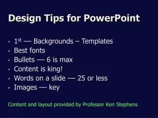
Slide Structure – GOOD • Write in bullet form, key words and phrases only • Include only up to 2-4 points per slide • No large blocks of text
Slide Structure - BAD • This page contains too many words for a presentation slide. It is not written in point form, making it difficult both for your audience to read and for you to present each point. Although there are exactly the same number of points on this slide as the previous slide, it looks much, much more complicated. In short, your audience will spend too much time trying to read this paragraph instead of listening to you. Can you even understand this slide’s point?
Slide Structure – GOOD • Show one point at a time: • Will help audience concentrate • Will prevent audience from reading ahead • Will help keep presentation focused
Slide Structure – GOOD • How do I make one point appear at a time on my slide? • Highlight your point and use custom animation to add an entrance effect • Keep it simple- the appear or ascend are not as distracting as some of the more exciting ones • For more information, check out Microsoft’s training on animations: http://office.microsoft.com/en-us/templates/TC103382651033.aspx?pid=CT103366151033&WT.mc_id=42
Slide Structure - BAD • Don’t use distracting animation • Don’t overdo it • Skip sound effects
Fonts - GOOD • Use at least an 18-point font • this is 18 pt- make sure you can see it from the back of the room! • Use different size fonts for main points and secondary points • this font is 24-point, the main point font is 28-point, and the title font is 36-point • Use a standard font like Times New Roman or Arial
Fonts - BAD • If you use a small font, your audience won’t be able to read what you have written • CAPITALIZE ONLY WHEN NECESSARY. IT IS DIFFICULT TO READ & FEELS LIKE SHOUTING!!!!!! • Don’t use a complicated font. This makes it hard to read
Color - Good • Use a font color that contrasts sharply with the background • Ex: Black or dk. blue font on white background • Only occasionally use color to emphasize a point
Color - BAD • Using a font color that doesn’t contrast • Using colors for decoration is distracting and annoying • Using a different color for each point is unnecessary • Trying tobe creativecan be a bad idea
Background - GOOD • Use attractive, simple backgrounds. Many are built into PowerPoint under the Design Tab & you can download more from Microsoft.com • Use light backgrounds. They are easier on the eyes. • Use the same background consistently throughout your presentation.
Background – BAD • Avoid backgrounds that are distracting or difficult to read • Always be consistent with the background that you use. Don’t use a different one for each slide.
Clip Art & Pictures-GOOD • A picture IS worth a thousand words if used right • Illustrates your point • Replaces text • Makes it easier for audience to visualize
Clip Art & Pictures-GOOD This program saves millions of dollars! Picture matches your point!
Clip Art & Pictures-BAD • Too much of a good thing • Doesn’t have any thing to do with your point • Confusing
Charts - GOOD • Use charts rather than just data and words • Charts are easier to comprehend & retain than raw data • Pictures speak louder than words • Trends are easier to visualize • Always title your charts
Charts - BAD Does anyone know what this data means???? Pretty boring too, huh?
Charts - GOOD Okay—now I understand!
Charts - BAD HUH?????
Charts - BAD • Font is too small • Distracting colors/shading/gridlines • Title is missing • What does it mean?
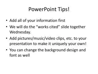
Spelling and Grammar • Proof your slides for: • speling misteakes • the use use of of repeated words • grammatical eras you might have make • Use spell check on Review tab • Not sure?-- please have someone else proof your presentation!
Encourage Input • Questions?? • Use a simple question slide to: • Invite your audience to ask questions • Provide a visual aid during question period • Make sure you leave some time for questions at the end of your presentation
Conclusion • You can use a conclusion slide to: • Summarize/review main points of your presentation • Suggest future avenues of research • Call for a specific “next steps” • Provide contact information, if appropriate