Download
1 / 19
190 likes | 270 Views
Explore Iowa's solar resource potential and energy production with detailed charts and maps. Discover how solar energy can contribute to Iowa's electricity needs efficiently.

E N D
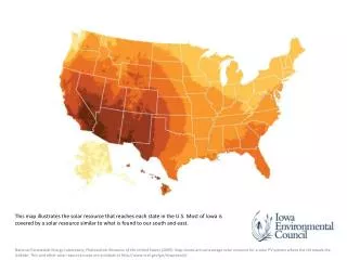
This map illustrates the solar resource that reaches each state in the U.S. Most of Iowa is covered by a solar resource similar to what is found to our south and east. National Renewable Energy Laboratory, Photovoltaic Resource of the United States (2009). Map shows annual average solar resource for a solar PV system where the tilt equals the latitude. This and other solar resource maps are available at http://www.nrel.gov/gis/mapsearch/.
This chart compares the performance of the same solar PV array located in Des Moines and Atlanta, Miami, Houston, Phoenix, Newark, and Chicago Modeled using NREL PV Watts version 1.0. We used a 1 kW AC array (e.g., a 1.265 kW-dc array with a .79 derate factor), fixed, south-facing, and the PV Watts default recommended tilt for each location. NREL PV Watts is available here: http://rredc.nrel.gov/solar/calculators/pvwatts/version1/.
Iowa’s technical potential ranks above many states that are further south. All rankings based data included in NREL’s Renewable Electricity Futures Study (2012).
Iowa’s solar potential far exceeds the amount of energy generated and sold in the state in 2010.
In Iowa, solar PV produces more energy in the summer than in the winter, but the average days in January, April, July, and October are not that different. Modeling conducted using NREL PV Watts version 1.0.
This chart shows the average monthly production of a solar PV array in Iowa throughout the year.
In the summer, about 50% of Iowa’s cooperative utilities and 85% of municipal utilities reach their monthly system coincident peak between noon and 6 p.m., when solar PV is producing energy. These charts include the 36 cooperative utilities and 114 municipal utilities that reported data in 2011. Utility annual reports filed with the Iowa Utilities Board. Municipal utility reports are filed using Form ME-1, cooperative reports are filed using Form EC-1. We compiled data from all reports filed in 2012 for calendar year 2011. Individual reports can be accessed using the IUB’s electronic filing system, https://efs.iowa.gov/efs/.
This chart shows a large amount of solar energy is available when Iowa utilities experience peak demand, shown in the highlighted area. Two strategies exist to help a utility with late afternoon or early evening peak demand succeed with solar. First, a rotating axis array or a southwest facing array would produce more energy at the end of the day than the south-facing array used in this model, allowing solar PV to contribute more energy at 5 or 6 p.m. In addition, demand-side management programs can shift demand so more occurs during peak solar production hours. Currently, these programs shift demand away from those hours.
This chart shows that solar PV systems in Iowa were producing electricity at or above average production for the month on almost every day when power demand was at its highest. Dates are those reported by IPL and MidAmerican in annual energy efficiency reports as triggered by a peak demand condition. Interstate Power and Light Company, Annual Report for 2012 Energy Efficiency Plan, (2013); MidAmerican Energy Company, 2012 Annual Report to the Iowa Utilities Board (2013). Actual output from Farmer’s Electric Cooperative community solar array. A rating of ‘high’ indicates the solar panels were producing at 80% or greater of their monthly maximum daily production.
For most of the year, the trend of monthly solar PV production follows and closely matches the trend of monthly electricity sales for Iowa’s municipal and cooperative utilities. Utility annual reports Form ME-1 and Form EC-1 filed with the IUB.
This graph compares the average summer production from a PV array in Iowa with the hourly changes in wholesale prices in the Midwestern electricity market (MISO) on the hot summer day of July 18, 2012. On these types of days, solar PV production and electricity prices frequently follow a similar trend. MISO data from Real Time Market LMP report of the July-September 2012 quarter using data from the gennode MEC.BEPM.Neal4. We started with the list of dates that Iowa utilities called curtailment events and used MISO Market Subcommittee reports to screen out dates where high prices were the result of generator outages or other events not necessarily related to daily summer peaks caused by high temperatures and resulting air conditioning load.
Solar can realistically provide as much or more electricity to Iowans as natural gas, nuclear, or hydroelectric energy do today.
The three circles above represent the geographical area needed to install enough solar PV to meet 100%, 20%, and 2% of Iowa’s electricity needs. All solar would not be centralized in a single location, so this is just a representative illustration of the land area required.
This graph compares an average day of wind production with an average day of solar production in the months of January, April, July, and October. In each of these months, as wind production declines during the day, solar PV production increases. Shortly after PV declines, wind power picks back up. Note that this figure compares two different types of data sets. We used real historical hourly wind production data from MISO and modeled hourly solar data from NREL’s PV Watts. More research is needed on the interaction of wind and solar in market and non-market conditions. For example, the wind data from MISO may be influenced by curtailments to wind farms caused by market price, congestion, or other factors. For these graphs, we used NREL’s PV Watts version 1.0 to model an average day for solar in January, April, July, and October. We used real historical hourly wind production data available from MISO to create an average day for wind for each of those same months, and then compared the two. MISO wind production data available here: https://www.misoenergy.org/LIBRARY/MARKETREPORTS/Pages/MarketReports.aspx.
Solar production is highest in summer months, when wind production declines. As solar production declines in winter, wind production is at its highest. This chart uses modeled solar PV data from NREL’s PV Watts version 1.0 and modeled wind data from the Iowa Energy Center’s wind energy calculator.
Solar PV prices have come down dramatically in recent years. Chart used with permission from SEIA. SEIA/GTM Research, U.S. Solar Market Insight Q2 2013, and Lawrence Berkeley National Lab, Tracking the Sun IV.
Solar PV capacity nationally has increased dramatically in the past decade. This chart show annual or incremental solar PV capacity added by year from 2001 to 2010. Interstate Renewable Energy Council, U.S. Solar Market Trends 2012 (2013) available at http://www.irecusa.org/publications/.
Solar installations are increasing annually, as measured by interconnection agreements in Alliant Energy and MidAmerican Energy’s service territories from 2009-2012 Based on data utilities file with the Iowa Utilities Board, including bi-annual interconnection reports.
This chart compares the top ten states for solar installations in 2012 with Iowa. Iowa installed approximately 1 megawatt of solar PV in 2012, while California saw over 1,000 MW installed. States with similar electric rates and solar resources as Iowa, such as North Carolina, installed 132 MW or 132 times what Iowa installed. Source: SEIA/GTM Research: U.S. Solar Market Insight®; Iowa Environmental Council Analysis.