Scientific visual presentation
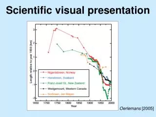
Scientific visual presentation. Oerlemans [2005]. What makes for a good scientific figure?. Accurate Informative Easily understood Appropriate for anticipated audience/medium What’s best for an oral or poster presentation is not necessarily ideal for a manuscript, and vice versa

Scientific visual presentation
E N D
Presentation Transcript
Scientific visual presentation Oerlemans [2005]
What makes for a good scientific figure? • Accurate • Informative • Easily understood • Appropriate for anticipated audience/medium • What’s best for an oral or poster presentation is not necessarily ideal for a manuscript, and vice versa • Has a natural heritage • No fluff
How do you make a good scientific figure? Philosophy • Data visualization is an extension of your scientific self • Accept that making a good figure will require numerous revisions • Good figures, liked good papers, are longer lived • Is the figure a hypothesis test or a summary of data? • Is the figure a cartoon or reality? Technical approach • Have all the data ready to be plotted beforehand • Sketch it • Plan plotting stages • Recognize its heritage and shamelessly appropriate others’ good ideas • Shamelessly re-use your own good ideas • Develop a framework that ensures repeatable figure output • Use an image editor as a last resort only
More direct advice • There is only one font: Helvetica • There is only one font size: bigger • There is only one system of units: S.I. • Plotting defaults are often poor choices • Plan figure and axis size • Produce raster output as a last resort only • Use the breadth of the color palette • Three dimensions only when absolutely necessary
Color choices good and bad • Positive–negative changes warrant a contrasting color palette • Discretize color ranges as often as possible (e.g., cbarf)
Useful figure features that are challenging • Multiple subplots • Multiple axes • Logarithmic or non-linear color maps • Geographically accurate maps • Transparency • Multiple color maps • High-quality animations • GUI elements increasing difficulty
The easiest/best things I can teach you re: Figures • set(0, ‘DefaultFigureWindowStyle’, ‘docked’) always docks figures • set(0, ‘DefaultFigureWindowStyle’, ‘default’) always pop figures • Command–~ switch between current application’s windows • Command–tab switch between applications • epstopdfcommand-line conversion of eps figures to pdf • redbluered/blue color map • ‘CO_2’, ‘SO_4^{2-}’, ‘Temperature (\circC)’ simple LaTeX commands • linkaxes match multiple axes • again with the cells
Multiple subplots x0 y0 w h • subplot(212) • subplot(‘position’, [0.08 0.05 0.90 0.44]) • Most subplots will require manual adjustment
Multiple axes • axes(‘position’, get(gca, ‘position’), ‘color’, ‘none’) • Set(gca, ‘yaxislocation’, ‘right’) • line vs. plot • Avoid the hack that is plotyy
Logarithmic or non-linear color maps • imagesc(x, y, log10(new_climate_mode), [0 1]) colorbar(‘ytick’, 0:0.5:1, ‘yticklabel’, {‘1’ ‘’ ‘10’}) • Cheat
GUI elements • Load data / assign variables • Design figure • Assign behavior, i.e., write sub-functions