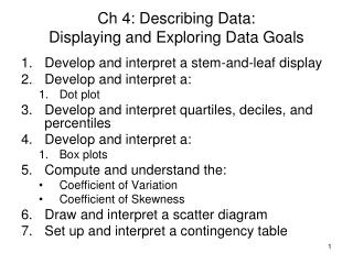
Describing Data: Displaying and Exploring Data
210 likes | 237 Views
Learn to create and interpret dot plots, stem-and-leaf displays, box plots, and scatter diagrams to analyze data. Explore quartiles, skewness, and scatter plots to understand data distribution. Calculate and interpret statistics to compare data sets graphically and numerically.

Describing Data: Displaying and Exploring Data
E N D
Presentation Transcript
Describing Data: Displaying and Exploring Data Unit 1: One Variable Statistics CCSS: N-Q (1-3); S-ID 1
CCSS: • Domain: Quantities N-Q • Cluster: Reason quantitatively and use units to solve problems • Standard: N.Q.1 Use units as a way to understand problems and to guide the solution of multi‐step problems; choose and interpret units consistently in formulas; choose and interpret the scale and the origin in graphs and data displays. N.Q.2 Define appropriate quantities for the purpose of descriptive modeling. N.Q.3 Choose a level of accuracy appropriate to limitations on measurement when reporting quantities.
CCSS • Domain: Interpreting Categorical & Quantitative Data S-ID • Cluster: Summarize, represent, and interpret data on a single count or measurement variable • Standard: • S-ID.1.Represent data with plots on the real number line (dot plots, histograms, and box plots). • S-ID.2.Use statistics appropriate to the shape of the data distribution to compare center (median, mean) and spread (interquartile range, standard deviation) of two or more different data sets. • S-ID.3. Interpret differences in shape, center, and spread in the context of the data sets, accounting for possible effects of extreme data points (outliers).
Mathematical Practice 1. Make sense of problems, and persevere in solving them. 2. Reason abstractly and quantitatively. 3. Construct viable arguments, and critique the reasoning of others. 4. Model with mathematics. 5. Use appropriate tools strategically. 6. Attend to precision. 7. Look for, and make use of, structure. 8. Look for, and express regularity in, repeated reasoning.
GOALS • Develop and interpret a dot plot. • Develop and interpret a stem-and-leaf display. • Compute and understand quartiles • Compute and understand the coefficient of skewness. • Draw and interpret a scatter diagram. • Construct and interpret a contingency table.
Dot Plots • A dot plot groups the data as little as possible and the identity of an individual observation is not lost. • To develop a dot plot, each observation is simply displayed as a dot along a horizontal number line indicating the possible values of the data. • If there are identical observations or the observations are too close to be shown individually, the dots are “piled” on top of each other.
Dot Plots - Examples Reported below are the number of vehicles sold in the last 24 months at Smith Ford Mercury Jeep, Inc., in Kane, Pennsylvania, and Brophy Honda Volkswagen in Greenville, Ohio. Construct dot plots, box plots, and stem- and-leaf plot, report summary statistics for the two small-town Auto USA lots.
Stem-and-Leaf • In Chapter 2, we showed how to organize data into a frequency distribution. The major advantage to organizing the data into a frequency distribution is that we get a quick visual picture of the shape of the distribution. • One technique that is used to display quantitative information in a condensed form is the stem-and-leaf display. • Stem-and-leaf display is a statistical technique to present a set of data. Each numerical value is divided into two parts. The leading digit(s) becomes the stem and the trailing digit the leaf. The stems are located along the vertical axis, and the leaf values are stacked against each other along the horizontal axis. • Advantage of the stem-and-leaf display over a frequency distribution - the identity of each observation is not lost.
Stem-and-Leaf – Example Suppose the seven observations in the 90 up to 100 class are: 96, 94, 93, 94, 95, 96, and 97. The stem value is the leading digit or digits, in this case 9. The leaves are the trailing digits. The stem is placed to the left of a vertical line and the leaf values to the right. The values in the 90 up to 100 class would appear as Then, we sort the values within each stem from smallest to largest. Thus, the second row of the stem-and-leaf display would appear as follows:
Another Measure of Variability The Interquartile Range (IQR) of a numeric data set is the difference between the third and first quartiles. IQR = L75 – L25 This measure of variability tells the range of values of the middle 50% of the data set. The first and third quartiles are sometimes denoted by Q1 = L25 and Q3 = L75.
Example: ATM Usage Let’s look at the spread of the data on Aloha ATM usage using both standard deviation and quartiles. If we use MegaStat, and choose Descriptive Statistics, we may find the quartiles by specifying the Minimum, Maximum, Range and the Median, Quartiles, Mode, Outliers options. Or we may do a stem-and-leaf plot and locate the quartiles on the graph.
Boxplots – Graphical Use of the 5-Number Summary The 5-number summary of a data set consists of the minimum value, the first, second (median) and third quartiles, and the maximum value of the data. We can use these five numbers to construct a simple graph, called a boxplot, of the data. We will compare the characteristics of the boxplot with those of the stem-and-leaf plot for several data sets, including the Whitner Autoplex data and the radio spot data. But first, another example.
Skewness • Another characteristic of a set of data is the shape. • There are four shapes commonly observed: • symmetric, • positively skewed, • negatively skewed, • bimodal.
Skewness - Formulas for Computing The coefficient of skewness can range from -3 up to 3. • A value near -3, such as -2.57, indicates considerable negative skewness. • A value such as 1.63 indicates moderate positive skewness. • A value of 0, which will occur when the mean and median are equal, indicates the distribution is symmetrical and that there is no skewness present.
Describing Relationship between Two Variables • One graphical technique we use to show the relationship between variables is called a scatter diagram. • To draw a scatter diagram we need two variables. We scale one variable along the horizontal axis (X-axis) of a graph and the other variable along the vertical axis (Y-axis).
Describing Relationship between Two Variables – Scatter Diagram Examples