Download
1 / 11
230 likes | 760 Views
Interpreting Bar Charts and Pie Charts. Interpreting Bar Charts and Pie Charts. In this presentation Bar charts Pie Charts Interpretation Guidelines. Bar Charts. Bar Charts are used to display qualitative data Bar charts may display: Counts (or frequencies) Percentages Proportions

E N D
Interpreting Bar Charts and Pie Charts • In this presentation • Bar charts • Pie Charts • Interpretation Guidelines
Bar Charts • Bar Charts are used to display qualitative data • Bar charts may display: • Counts (or frequencies) • Percentages • Proportions • This allows comparison between categories.
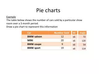
Bar Charts • The vertical scale is the frequency, relative frequency, or percentage. • This is critically important to recognize and should be labeled. • Frequencies are raw counts. That is, how many individuals prefer each of the colors. • Relative frequencies are really proportions (usually decimals). To find the relative frequencies, divide the frequency by the total (for red, 11/25 or .44). • Percentages are relative frequencies expressed as percentages (for red, 44%). • See the example.
Bar Charts • The horizontal scale shows the different categories (sometimes multiple categories are lumped together into an “other” category).. • All bars should have the same width. • There are gaps between the bars (since there is no connection between them) • Categories may be listed in any order. • More complicated bar charts exist (such as stacked or side-by-side).
Bar Chart Example Back to slide 4 on Bar Charts
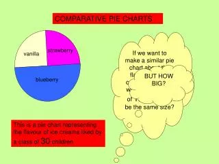
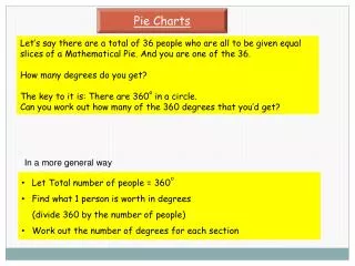
Pie Charts • A circle is divided up proportionately to show what percentage of the total each category represents. • They convey information regarding only the relative size of categories (because of this, they may mislead as totals remain unknown).
Interpretation Guidelines • Carefully read all labels (title, axes, bars, pie segments, etc.) including the units and scale (be sure to note the scale’s starting point). • Identify (if possible) the source of the data. Is there sufficient reason to suspect the source may be attempting to persuade? In what way?
Interpretation Guidelines • Consider and watch for extreme values or other possible anomalies. • Do the bars or pie sections represent counts or relative counts? • If there are multiple displays, are their scales and axes consistent?
Interpreting Bar Charts and Pie Charts • This concludes the presentation