Download
1 / 25
250 likes | 284 Views
If you know how to use pop up forms correctly, the pop up sign up form can be a highly effective way to multiply your list growth. <br><br>This super guide will give you everything you need to know about creating a pop up form that invites people to subscribe to your email list instantly.

E N D
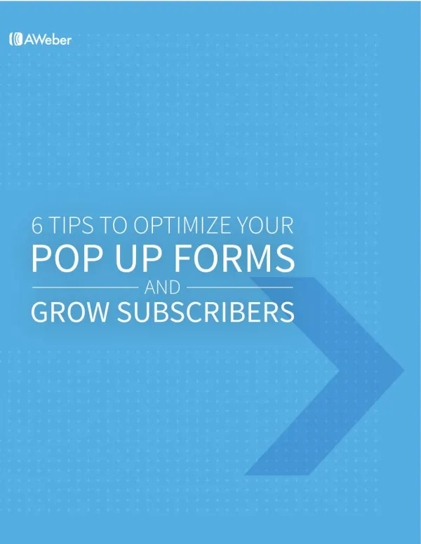
Growing Your Business with Email Marketing TABLE OF CONTENTS The Power of the Pop Glossary 1 2 Optimizing Your Pop Up Forms 4 5 9 Consider the User Experience Pay Attention to Design 11 Be Friendly and Direct in Your Message 15 Choose the Perfect Location 18 Choose the Perfect Time 20 Split Test Your Pop Up Form Start Optimizing Your Pop Up Form Today! About AWeber 22 23
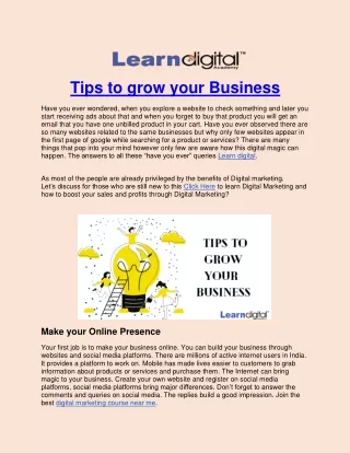
THE POWER OF THE POP Pop up forms are often a popular topic of debate. If you’re reading this guide, chances are you’ve found value in using a pop up sign up form on your website, or you’re interested in learning more about the ways in which it can help with subscriber growth. Well, you’ve come to the right place. The pop up form is one of the most effective ways to quickly and easily boost your subscriber list – as long as you use it the right way. As the saying goes, with great power comes great responsibility. To ensure you get the most out of your pop up sign up form, you’ll want to equip yourself with the know-how and tools to help you get the job done. In the remainder of this guide, you’ll learn all about the pop up form essentials and how you can implement them to increase your email subscribers. 1
6 Tips To Optimize Your Pop Up Forms & Grow Subscribers Glossary Pop Up: An opt-in form that opens up in a new window. Pop up is also used as a ‘catch-all’ phrase for the different types of sign up forms listed below. Pop-Over: Opens up within the web page, but hovers over it. In-line: A sign up form that appears within the body of the web page. Lightbox/Overlay: Similar to the pop-over, but darkens the web page behind it. This removes distractions and allows the pop up to be the only clearly visible element on the page. Exit Pop Up: Pop up that displays when a user clicks the “x” to close out of the website. Exit-intent Pop Up: Opt-in form that tracks a user’s mouse movement and is triggered to display when a user is going to close out of the website. Scrolling Triggered Pop Ups: Displays when a user has scrolled down to a certain extent on a page, giving the user time to browse the site. 2
PUT WHAT YOU LEARN TO THE TEST Get ready – you’re about to learn about the ways in which you can optimize your pop up sign up forms. That’s why we’ve created guides like these, as well as a massive resource of informative blog posts, how-to articles, videos and webinars so business owners like you can continue learning about email marketing. Not to mention, our supportive email marketing experts are here and ready to help you along the way. We’re excited to share this guide with you, and it is our hope that you’ll be able to take what you’ve learned and begin applying it to your email marketing as soon as you’re done reading it. To experience what simple email marketing and great support is really like, give us try. Or, contact one of our email marketing experts to get the conversation started today. Email marketing is our thing, and we want to make sure others understand its value to their businesses, too. I want to try AWeber
OPTIMIZING YOUR POP UP FORMS While there are a number of ways you can optimize the performance of a pop up form, this guide will teach you how to: • Get your pop ups seen, yet remain unobtrusive • Maintain your brand’s reputation • Use design to your advantage • Write effective copy • Keep it simple for website visitors • Choose the right location and timing Let’s dive right in. SHARE THIS GUIDE 4
6 Tips To Optimize Your Pop Up Forms & Grow Subscribers CONSIDER THE USER EXPERIENCE It’s no surprise that pop up forms generally get a bad rep in the digital marketing community. While they can sometimes be perceived as spammy and discourage engagement, they can also help businesses attract a significant amount of email subscribers and bring great value to customers. It all comes down to how you use them. The secret to pop up form success? Wield the power of the pop up form to complement the user experience, rather than hinder it. The best pop up forms are successful because they respect the very people for which they’re intended. In other words, the pop up form should be designed to be as unobtrusive to your visitors as possible. When you’re in the mindset of further engaging your audience, there’s a greater chance visitors will view the form as helpful instead of disruptive. And when that happens, they’ll be even more willing to give you their email address and open up the channels of communication. Wield the power of the pop up form to complement the user experience rather than hinder it. Tweet this 5
6 Tips To Optimize Your Pop Up Forms & Grow Subscribers If someone decides they don’t want to enter their personal information, make sure it’s easy for people to close out of the pop up window. Remember, the goal is to create a pleasant experience for your visitors, so avoid friction by letting them say ‘no’ if they want to. Making it too difficult only influences them to leave your site altogether. Check out the case studies below to see how optimizing your pop up form can encourage more people to sign up to your email list. After that, we’ll take a look at the specific ways you can improve your form. Design the pop up form with the intention of engaging your audience. Tweet this 6
6 Tips To Optimize Your Pop Up Forms & Grow Subscribers Case Study: WPBeginner When you think about a window popping up while someone’s trying to read content on your site, it sounds like it’d just get in the way. And that was a big concern for the team at WPBeginner, an online resource for first-time WordPress users, when they decided to test a pop up form on their website. Although they were already receiving 70 to 80 email subscribers a day (which is pretty good to begin with), they were curious to see if a pop up opt-in form could further boost those numbers. After creating an exit-intent form (a pop up that tracks a user’s mouse and is triggered when he/she is going to leave the site) with the OptinMonster WordPress plugin, they were amazed by the results. For one, bounce rates remained the same and they received no complaints from visitors. Score. But second and best of all, the number of email subscribers jumped 600 percent (that’s up to 470 new subscribers a day)! As it turned out, the pop up window worked much better than expected. PRO TIP Pop ups should bring value to visitors, not interrupt the user experience. Consider using an exit-intent form to catch their interest when trying to leave your site. 7
6 Tips To Optimize Your Pop Up Forms & Grow Subscribers Case Study: Darren Rowse Although professional photographer Darren Rowse was content with gaining about 40 subscribers a day to his blog, Digital Photography School, he wanted to see if there was anything else he could do to give those numbers a nice healthy lift. Despite his reluctance to use an “annoying” pop up form, he decided to give it a go and see what it could do for his email list. The results were positively shocking. After a little less than a month, analytics showed that the pop up form had no effect on bounce rates, nor did it impact page views on his website -- in fact, Rowse found the page views per visitor actually increased as a result of the form. As for his email list? Opt ins jumped from 40 to over 350 a day. That’s 125,000 subscribers a year! PRO TIP To increase engagement and sign ups, your pop up form should emphasize the biggest benefits of your email content. 8
6 Tips To Optimize Your Pop Up Forms & Grow Subscribers PAY ATTENTION TO DESIGN Forget what your mama told you -- when it comes to pop up design (and most marketing elements), appearances are important. While your pop up should be professional and appealing, it should also be consistent with your branding. You may want to go as granular as matching it to the design/color scheme of your website. And don’t forget to make your call to action (CTA) button stand out, too! When it comes to the size of your pop up, note that bigger isn’t necessarily better. Your form should be large enough to get noticed, but not to the point where it’s overwhelming for your visitors. Pop ups that are too wide, for example, may display nicely on a large desktop, but horribly on a small screen device – which means a less than pleasant experience for your visitors. Make sure your pop up form is mobile responsive so that it displays well on all screen sizes. If you don’t, it can make it difficult for users to close out of the form. If a visitor checks out your website on a smartphone or tablet, for example, you want to make sure the pop up box doesn’t take over the screen, forcing them to continuously scroll until they can find the sacred “x” to close the window. Chances are, they’ll be gone before they ever find it. 9
6 Tips To Optimize Your Pop Up Forms & Grow Subscribers Case Study: FaveCraft As an online content resource for crafters, FaveCraft relies heavily on its ability to capture email addresses from first-time website visitors – which means every element on its website must be fully optimized for conversions. After implementing a pop up form that featured brand new design and copy, which led to a 22.3 percent boost in conversions, they recognized that the opportunity to improve their form wasn’t over. According to WhichTestWon, FaveCraft decided to see if the size of the box would further impact conversions. The result? The narrow box brought in 8.8 percent more subscribers than the wider one, proving that size really does matter – it just might not have the impact they would have originally thought. PRO TIP The best pop up forms are designed to be clean, professional, visually engaging and reflective of your brand and/or website. 10
6 Tips To Optimize Your Pop Up Forms & Grow Subscribers BE FRIENDLY AND DIRECT IN YOUR MESSAGE As important as design is, keep in mind that while you could have the coolest looking pop up form in the world, it could be terrible at converting website visitors if it’s unclear as to what people will get from you if they sign up. Messaging Aside from being concise and well-written, another essential factor to consider when crafting the perfect message is the value. Why should your website visitors sign up for your emails? When consuming any piece of branded content, people want to know what value it will bring them. As you write the copy in your pop up form, make sure you explain to visitors what they’ll get in return for signing up to your email list. A Compelling Offer Whether you offer an incentive (i.e. free eBook; complimentary service; professional consultation) or not, include key items that people can expect to take away from your emails and/or newsletter. If you sell products, you might explain that they’ll get updates about new product releases and updates, discounts on featured items, recipes or DIY how-to’s and anything else they might benefit from. 11
6 Tips To Optimize Your Pop Up Forms & Grow Subscribers If you’re in the service or consulting industry, tell your email subscribers they’ll receive exclusive tips, upcoming events, discounts, etc. Just make sure you follow up on this with the content in your emails! Headline A strong headline that compels visitors to read the rest of your amazing copy can make or break a pop up form. While you should ultimately test various versions of your copy to find the sweet spot, don’t be afraid to change things up. As you think of a headline, consider the value you hope to bring to your website visitors. Instead of the standard “Sign Up for Emails,” you may want to use a more specific headline such as “Become a Better Digital Marketer.” By writing a benefits-driven headline, they’ll gain a sense of the value of your emails at first glance. According to SumoMe, the best headlines highlight either social proof (ex: Join 45,000 Other Subscribers!), an incentive (ex: Receive a Free Copy of My eBook), or a discount (ex: Get 50% off Your Next Order). PRO TIP The copy in your pop up should clearly explain exactly what visitors will get when subscribing to your emails. Call To Action Just as your message should detail specific takeaways, the copy in your call to action (CTA) should also reflect a specific action. Instead of settling for the standard “Submit” button, consider changing the copy to a specific action, such as “Send me my newsletter now!” 12
6 Tips To Optimize Your Pop Up Forms & Grow Subscribers The team at AppSumo are big supporters of pop up forms and they aren’t afraid to show it, as you can tell in the example above. The form they use on their own site provides a great example of how you can get creative with your CTA button. The use of “Gimme” instead of “Sign Up” or “Enter” is different, yet personable and inviting. PRO TIP When it comes to crafting the perfect message and CTA, creativity is encouraged! Just make sure it’s relevant to your brand and offer. 13
6 Tips To Optimize Your Pop Up Forms & Grow Subscribers Case Study: Social Media Examiner Social Media Examiner may be one of the top business blogs on the Internet, but like every site, it started without an audience. To get more people reading his blog, Social Media Examiner’s founder Michael Stelzner recognized that something had to be done – and that something started with his email list. By focusing on this important communication channel, Stelzner implemented a number of tactics to boost his subscriber base. One of the most effective tactics he used? A pop up form. After carefully crafting the design, copy and call to action, Stelzner and his colleagues achieved what they were hoping to do and more. After a single year, Social Media Examiner’s email list grew by 234 percent. To this day, Stelzner maintains that 70 percent of their email subscribers results from the pop up form. While Social Media Examiner’s pop up form has changed over the years to stay relevant, it remains a great example of how a good pop up form should look. It is effective because it has a specific headline and message that tells the reader exactly what he will get for signing up (the compelling incentive). 14
6 Tips To Optimize Your Pop Up Forms & Grow Subscribers CHOOSE THE PERFECT LOCATION Where Should Your Pop Up Go? The type of pop up you choose will determine where it will appear on your website, so be sure to keep this in mind. A lightbox form, for example, will appear in the middle of your screen and black out the page behind it so only your form is clearly visible. A slide in form, on the other hand, stays on the bottom or side of the web page. While many will say pop ups that minimize distractions (such as a lightbox) is the ideal way to go, every website and its visitors are different. Testing out different types of forms in an A/B test can help determine which works best for you and your visitors. What Page Should The Pop Up Go On? Generally, pop ups appear on home pages, blog pages, or thank you pages after a customer makes a transaction. Instead of adding it to every page on your site, try testing one or two most trafficked pages first, and based on results, adapt and expand your testing. SHARE THIS GUIDE 15
6 Tips To Optimize Your Pop Up Forms & Grow Subscribers Case Study: Nikki, In Stitches Crafter and blogger Nikki McGonigal exemplifies what it means to do what you love for a living, and it shows both on her website and how she interacts with her website visitors and email subscribers. For Nikki, email is an essential way to communicate with loyal fans who can’t get enough of fun craft ideas, new products and free items. As a result, getting people to sign up to her newsletters is extremely important for both maintaining communication and delivering valuable information to her customers. Originally, Nikki used a static sidebar form to collect subscriber emails. However, she decided to compare its effectiveness with a lightbox pop up that appeared after two seconds. After just eight months, she found that the lightbox drove 1,375 percent more sign ups than the sidebar form. 1,375 percent! The results were clear, and while she still leverages the sidebar form, the pop up can still be found on her site today. PRO TIP Consider your end goal when determining where to place your pop up form. Want to increase your subscribers? Add the form to a highly trafficked area, such as the homepage. If you already have a substantial subscriber list and simply want to maintain a steady growth, have it appear at the end of your blog posts. 16
6 Tips To Optimize Your Pop Up Forms & Grow Subscribers Case Study: VWO After noticing that many of their homepage visitors left the site without checking out the sign up form, the team at VWO decided it was time to optimize the page to increase conversions. To do so, they changed the CTA to be more actionable and urgent. They also added a pop up form to appear whenever someone clicked through. The result? Sign ups increased 50 percent. VWO believes that the pop up form was more appealing to website visitors for a few different reasons. For one, it reduced the distractions of the page behind it, so all eyes were on the form. Two, the form only asked for a couple of items from the user, so filling it out wasn’t time consuming. Lastly, the form opened up within the same page as the homepage, so it didn’t feel as “spammy” as other pop up windows. Although VWO has made some changes to the elements of their pop up form today, they continue to leverage it as a key driver of subscribers. Here’s what it looks like now: 17
6 Tips To Optimize Your Pop Up Forms & Grow Subscribers CHOOSE THE PERFECT TIME Now, for the big question. When is the best time for your pop up to appear on your site? According to SumoMe’s founder, Noah Kagan, the best time is five seconds. Trends from WhichTestWon, on the other hand, suggest 15 to 30 seconds. And Unbounce says 60 seconds. So, which one is right for you? Best practices for timing and duration vary, which is why testing is so critical. You’ll want to determine if the delay you put in place impacts visits to your site. The best way to determine if you should set a delay of five seconds or 30? Test the times. While these delay times provide a good starting point, the only way to know for sure what your visitors prefer is if you give them a chance to tell you. Although a difference of ten seconds may seem insignificant to you now, it can have a huge impact on your visitors and ultimately your subscriber list. To get started, try testing the times recommended by the experts. By comparing the winning time with another time frame and repeating this process until a “sweet spot” is confirmed, you’ll feel confident in your delay. The same can also be said about the repetition of your pop up. General consensus says pop ups should appear to the same user no more than once a week or even once a month, but you might want to test this to be sure. 18
6 Tips To Optimize Your Pop Up Forms & Grow Subscribers Case Study: Ask-Leo.com After a long time of collecting only 10 to 15 signups a day to his newsletter, Leo Notenboom, owner of Ask-Leo.com, had had enough. Notenboom’s website received well over 44,000 visitors a day, but he was frustrated over his low conversion rates. It was time to start collecting serious subscribers and leveraging his email list to better boost his business. Digging into the analytics, he found that most visitors left his site as soon as they obtained the specific information they needed (which averaged about 66 seconds). To combat this issue, he decided to utilize a delayed slide in form to retain visitors and bring them back to his site through email. To determine how long the delay should last, he tested various times to find the right one. During the first test, he compared a 30-second delay versus a 60-second delay. With 60 seconds as the winner, he then tested this against a delay of 45 seconds and found the 60-second delay won again. To make sure this was the right one, he then tested it against a greater delay of 75 seconds. The winner? 60 seconds. This time frame led to a 1000 percent increase in daily subscriptions. PRO TIP Testing your delay time is key to determining which works best for your audience. Setting up an A/B split test for the first time? Click here for tips on how to do it right. 19
6 Tips To Optimize Your Pop Up Forms & Grow Subscribers SPLIT TEST YOUR POP UP FORM If you’re not confident that changing certain elements of your pop up form will help boost subscriber growth, split testing the original against a new version can reveal whether or not it’s effective. If the new form converts more email subscribers than the original, you’ll know the specific change made an impact. While you can test a number of different details on your form (such as content, design, and CTA), test one change at a time. This will allow you to identify exactly what helps increase conversions, or if there are other areas that should be improved. If you want to find the perfect delay time for your form, for example, you might test the delay times mentioned in the previous chapter. Or, check out your analytics to determine the average amount of time a visitor spends on your page, which might be more relevant to your specific audience. 20
6 Tips To Optimize Your Pop Up Forms & Grow Subscribers With that information, you can test forms with delays equal to that amount of time against those with shorter and longer delays (you might start with 15 to 20 seconds on either side of your average visit length). Once you have a winning form, consider setting a calendar reminder in a few months to see if there are new ways you can update your form (such as tweaking the design or offering a new incentive). What works today might not work as well six months from now, so be sure to stay ahead of the curve. PRO TIP Want more testing tips? Read all about it in this testing checklist. 21
START OPTIMIZING YOUR POP UP FORM TODAY! You just finished reading the key tricks to optimizing your pop up forms – way to go! We covered a lot of information in this guide, so here are a few key highlights to keep in mind: • Use pop ups to bring value to your audience’s experience with your website • Be clear about what subscribers will get out of your emails • Pop up forms should be designed with your brand in mind • Get creative with your CTA! • Conduct an A/B test to determine the best location and timing of your pop up Now that you’re ready to begin maximizing the effectiveness of your pop up forms, it’s time to put what you’ve learned into practice. If you find that you need a little help along the way, our team of email experts is here to not only support you with your sign ups, but your overall email marketing campaigns as well. Sign up for AWeber for free to start sending emails and creating pop up forms. Log into your account and start creating a pop up form now Sign Up Log In
6 Tips To Optimize Your Pop Up Forms & Grow Subscribers ABOUT AWEBER AWeber is an easy-to-use email marketing tool that allows business owners and entrepreneurs to cultivate relationships with their customers. Since 1998, AWeber has been the email engine powering the growth of organizations around the world, including leading sites like Social Media Examiner and ProBlogger and industry influencers such as Peter Shankman and Ann Handley. Today, more than 120,000 small- and midsize-businesses, entrepreneurs, agencies and nonprofits are making the most of AWeber’s sophisticated segmentation and analytics capabilities, split testing applications, extensive template libraries and industry-leading deliverability and live support. For digital marketing advice, examples, and inspiration, follow us here: Facebook Twitter Pinterest Blog SHARE THIS GUIDE 23