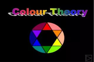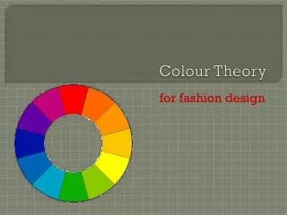
Colour Theory
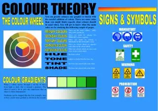
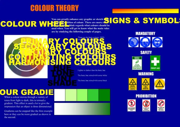
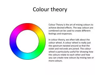
Colour Theory. The Colour Wheel. Harmony. (Close on the Colour Wheel). Go well together. Contrast. (Opposite sides of the Colour Wheel). Stand out. Contrasting and Harmonising Colours. Harmonising Colours Close on the wheel:. Contrasting Colours Opposite sides of the wheel:.

Colour Theory
E N D
Presentation Transcript
Harmony (Close on the Colour Wheel) Go well together
Contrast (Opposite sides of the Colour Wheel) Stand out
Contrasting and Harmonising Colours Harmonising Colours Close on the wheel: Contrasting Colours Opposite sides of the wheel:
Colour Motion REDS ORANGES YELLOWS GREENS BLUES VIOLETS Advancing Colours Receding Colours
Colour Emotion REDS ORANGES YELLOWS GREENS BLUES VIOLETS Warm Colours Cool Colours
Colour Emotion RED Warm Active Passionate Festive Exciting Vibrant
RED YELLOW Warm Warm Glowing Active Passionate Sunny Easily Seen Festive Exciting Happy Vibrant
YELLOW BLUE Warm Cool Glowing Classy Sunny Sophisticated EasilySeen Happy Formal Elegant
BLUE GREEN Cool Cool Classy Calm Soothing Sophisticated Natural Formal Fresh Elegant Restful
GREEN VIOLET Cool Cool Calm Soothing Peaceful Natural Fresh Restful Solitary
VIOLET ORANGE Cool Warm Happy Refreshing Peaceful Cheerful Energetic Solitary
ORANGE GREY Warm Dignified Happy Natural Refreshing Elegant Cheerful Boring Energetic Calm
GREY BLACK & WHITE Dignified Natural Sophisticated Elegant Elegant Opposing Boring Calm Dramatic
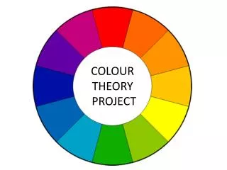
1. The primary colours are: ____________, ____________, and ____________. 2. Explain how you make a secondary colour. _________________________________________________________________. 3. Explain what is meant by CONTRASTING COLOURS, and give an example of two colours that contrast. _________________________________________________________________ _________________________________________________________________. 4. Explain what is meant by HARMONISING COLOURS, and give an example of two colours that harmonise. _________________________________________________________________ _________________________________________________________________. 5. Give two words to describe how each of these colours make you feel. a) RED ________________________________________________ b) BLUE ________________________________________________ c) YELLOW ________________________________________________ d) ORANGE ________________________________________________ e) VIOLET ________________________________________________ f) GREEN ________________________________________________ 6. What colour might you use to paint a room to make it look bigger? Explain why. _________________________________________________________________ _________________________________________________________________. 7. What is meant by an advancing colour? _________________________________________________________________ _________________________________________________________________. Render the colour wheel above using colour pencils. Start with the Primary Colours in the middle circle, then move out and do the Secondary Colours, then the Tertiary Colours. Name: _________________________________
Colour Theory : The Colour Wheel 1. The primary colours are: RED, BLUE, and YELLOW 2. Explain how you make a secondary colour. MIXING TWO PRIMARY COLOURS IN EQUAL QUANTITIES PRODUCES A SECONDARY COLOUR. 3. Explain what is meant by CONTRASTING COLOURS, and give an example of two colours that contrast. CONTRASTING COLOURS ARE COLOURS THAT STAND OUT AGAINST EACH OTHER, THEY ARE COLOURS ON OPPOSITE SIDES OF THE COLOUR WHEEL. RED AND GREEN IS AN EXAMPLE OF TWO CONTRASTING COLOURS. 4. Explain what is meant by HARMONISING COLOURS, and give an example of two colours that harmonise. HARMONISING COLOURS ARE COLOURS THAT GO TOGETHER WELL, THEY ARE COLOURS CLOSE TO EACH OTHER ON THE COLOUR WHEEL. RED AND ORANGE IS AN EXAMPLE OF TWO HARMONISING COLOURS. 5. Give two words to describe how each of these colours make you feel. a) RED PASSIONATE, ROMANTIC b) BLUE COLD, SOPHISTICATED c) YELLOW WARM, SUNNY d) ORANGE HOT, VIBRANT e) VIOLET RELAXED, PEACEFUL f) GREEN SAFE, NATURAL 6. What colour might you use to paint a room to make it look bigger? Explain why. BLUE, IT IS A RECEDING COLOUR WHICH WOULD MAKE THE WALLS LOOK LIKE THEY ARE FARTHER AWAY THAN THEY ACTUALLY ARE. 7. What is meant by an advancing colour? AN ADVANCING COLOUR IS A COLOUR THAT APPEARS TO BE COMING TOWARDS YOU, AN EXAMPLE IS RED. Render the colour wheel above using colour pencils. Start with the Primary Colours in the middle circle, then move out and do the Secondary Colours, then the Tertiary Colours. Name: _________________________________
RENDER THESE CUBES AND BACKGROUNDS Cube Advancing Cube Receding Cube and Background Harmonious Cube and Background Contrasting Name: _________________________________
RENDER THESE CUBES AND BACKGROUNDS Cube Advancing Cube Receding Cube and Background Harmonious Cube and Background Contrasting
USING COLOUR PENCILS, RENDER THESE COSMETICS BOTTLES APPROPRIATELY. For Men For Women Name: _________________________________
USING COLOUR PENCILS, RENDER THESE COSMETICS BOTTLES APPROPRIATELY. For Men For Women Name: _________________________________
USING COLOUR PENCILS, RENDER THIS TORCH AND THE BACKGROUND. JUSTIFY YOUR CHOICE OF COLOURS: I chose the colour(s) for the torch because __________________________________________ I chose the background colour(s) because ___________________________________________ Name: _________________________________
USING COLOUR PENCILS, RENDER THIS TORCH AND THE BACKGROUND. JUSTIFY YOUR CHOICE OF COLOURS: I chose the colours for the torch because I wanted to give the torch a cool, masculine look. I chose the background colour because it contrasts with blue and makes the torch stand out on the page.