Download
1 / 15
150 likes | 286 Views
The use of color is fundamental in illustration and graphic design, influencing mood and realism. This guide covers the basics of the color wheel, including primary (Red, Blue, Yellow), secondary (Violet, Orange, Green), and tertiary colors, as well as the effects of color combinations. Explore concepts like harmony, contrast, and the significance of warm and cool colors. Discover how tint and shade alter colors and the psychological impact colors have in design contexts, helping to inform product selection based on intended function and market.

E N D
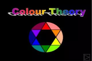
Colour Theory Graphic communication Name: ………………………………………………………… Class:……………… Teacher:…………………………………………..
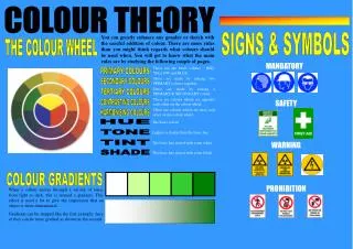
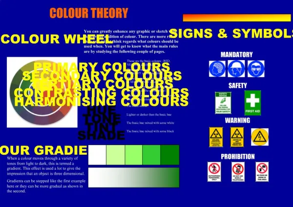
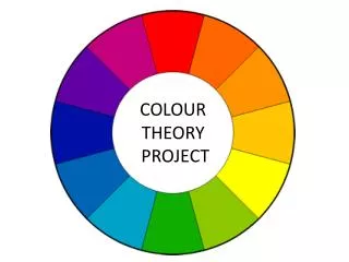
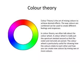
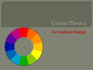
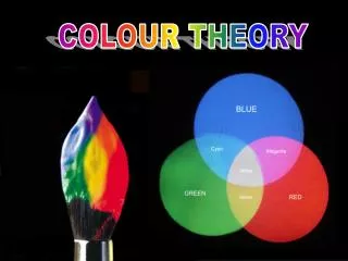
Colour Wheel The use of colour is an important part in illustration and graphic design. Colour is used to create certain moods or feelings as well as helping to make an image look more realistic. In S1, you would have completed a copy of the colour wheel. Here is a small refresher of what else was covered: Primary colours (Red, Blue and Yellow) are the three main colours which when mixed together can produce any other colour. Secondary colours (Violet, Orange and Green) are created when two primary colours are mixed together in equal quantities. (eg, yellow and blue make green) Tertiary colours are made when a primary colour is mixed with a secondary colour in equal quantities, eg, red-orange or blue-violet.
Skoosh! Skoosh! Colour Effects There are many different effects and moods that can be achieved by using carefully selected colour combinations. Harmony is created when colours close to each other on the outside of the colour wheel are used together. Harmony is easy on the eye and can be used to create a relaxed and elegant ambiance (eg blue and blue-green). Contrast is created when colours far apart on the colour wheel are used together. Contrast is vibrant, eye catching, bold and exciting (eg blue and orange) Warm colours such as reds, orange and yellows all give a sense of heat and warmth. They are also known as advancing colours as they appear closer to the viewer than other colours. Cool colours such as blues, greens and violets do the exact opposite. They give a feeling of being cold and are also known as receding colours as they appear more distant and further away. When WHITE is added to a colour, it is called a TINT of that colour. When BLACK is added to a colour, it is called a SHADE of that colour. + + = = eg
Colour and its meaning Colour selection for a product is guided by the function of the product, the environment in which the product will be used and the market for which the product is intended. Red: Great power of attraction. Hot, bold, exciting, festive, passionate and positive. Can be associated with rage, aggression, danger, courage and speed. Yellow: Most easily seen, luminous, bright, pleasant, happy, sunny, lively and cheerful. Blue: Formal, cool, sophisticated, aristocratic, serene, passive, elegant and reliable. Orange: Sunny, cheerful, warm and happy. Green: Restful, fresh, cool, soothing, natural and informal. Violet: Rich, pompous, impressive and regal. Cool, negative, retiring subdued and solemn. Grey: Neutral, sedate, dignified and inconspicuous. White: Luminous, positive, light delicate and clean. Black: Subdued, solemn and profound, Brown: Safe, reliable and earthy natural.
Five Flat Tones Graded Tone Tone Tone is the term used to describe how weak or strong a colour is. Surface Tones Surface tones on 3D objects change depending on the way light falls on the surface On flat sided objects the surface facing the light source in pale, while the opposite surface is dark or strong. Objects with curved surfaces reflect light differently. The tone changes from dark to light as the surface curves towards the light source. This is called graded tone. Each surface has a flat tone.
Question 1 Question 3 • Listed below are some colours you would find in a colour wheel. • Blue Orange Yellow-Orange Green Blue-Green Red • State, from the list of colours; • A primary colour. • ……………………………………………………………………………………………………………………… ( 1 ) • A secondary colour. • ……………………………………………………………………………………………………………………… ( 1 ) • A tertiary colour. • ……………………………………………………………………………………………………………………… ( 1 ) • An advancing colour. • ……………………………………………………………………………………………………………………… ( 1 ) • A toy company has decided to introduce a new colour scheme for its packaging. • A tint of Green was suggested. • State what is added to green to make it a tint. • ……………………………………………………………………………………………………………………… ( 1 ) • State a tertiary colour that contrasts with green. • ……………………………………………………………………………………………………………………… ( 1 ) • State how a tertiary colour is created. • ……………………………………………………………………………………………………………………… ( 1 ) Question 4 • Colour can be used for many different reasons. • State what is added to red to make it a shade. • ……………………………………………………………………………………………………………………… ( 1 ) • State two tertiary colours that contain blue. • ……………………………………………….. and …………………………………………………………… ( 2 ) • Colours can be used to create different moods and feelings. State what colour would represent the following; • (i) Happiness ………………………………………….………………………………………………. ( 1 ) • (ii) Something cool ……………………………………………………………………………….. ( 1 ) • (iii) Something that safe for the environment …………………………………. ( 1 ) • (iv) Something dangerous ………………………………………………………………………. ( 1 ) • (v) Something Hygienic …………………………………………………………………………. ( 1 ) Question 2 • (a) State what must be added to a secondary colour in order to make a tertiary colour. • ……………………………………………………………………………………………………………………… ( 1 ) • State two secondary colours • …………………………………………………… and ……………………………………………………… ( 2 ) • State an appropriate colour to use in the following situations. • (i) To represent something that is warm………………………………………… ( 1 ) • (ii) To harmonise with orange…………………………………………………………….. ( 1 ) • (iii) To contrast with orange………………………………………………………………… ( 1 )
Plastic Textures It is important when rendering your graphics that you try to include a visual texture. This will give your work a more realistic impression. Look at the examples below. Chrome Wooden Metallic Transparent HighGloss
Worked Example – Wooden Texture • Top surface Normally the lightest tone, shade the surface lightly using yellow first then orange Our light source is coming from this direction 3. Side facing the light Shade this side last, using yellow then orange, to create a medium tone 2. Shadow side Facing away from the light, this surface should be the darkest. Again use yellow then orange to create a strong tone 4. Texture The wood grain is just a darker tone of the base colour, yellow / orange.
Horizon line Worked Example – Metallic Texture Shiny metallic surfaces can be rendered using a desertscape. Imagine the shine object in the desert. It would reflect the simple environment: blue sky, a sandy ground colour and a black horizon line. 2. Add in the sky Add in the blue sky tones above the horizon line. Keep the top surface lighter as this would reflect the sunlight. • Outline Draw the outline in three colours, adding in a blue and black horizon line. 3. Add in the ground Finish with sandy ground tones and add in detail, eg shadows, additional highlights etc
Pencil Rendering Exercise 1 Render each of the objects on this page. Remember to think about where your light source is coming from (that will have an effect on the surface tones)
Pencil Rendering Exercise 2 • Using colour pencils, render these everyday objects to show • Texture • Tonal Changes • Highlights • Shadows
Pencil Rendering Exercise 3 • Using colour pencils, render these everyday objects to show • Texture • Tonal Changes • Highlights • Shadows