Download
1 / 53
530 likes | 641 Views
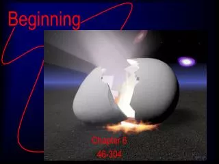
Beginning 3D Artist. The Big Picture: “Old West Test” by Jim Tibbitts. Part I. PREPERATION. I want to spend some time going through an art test did awhile ago.

E N D
Beginning 3D Artist The Big Picture: “Old West Test” by Jim Tibbitts
Part I PREPERATION
I want to spend some time going through an art test did awhile ago. • Sometimes a development team may have had bad experiences hiring people that might have misrepresented themselves or, even after looking at the portfolio aren’t sure they can do they job. • The goal was to create a building concept. As if it would be used in a game, an example of how I might do it.
Consider reference • I had been given a series of images of old west buildings. • Some images were from the same building, • while others were from other buildings. • Each building had it’s own structural style and surfaces. I chose the one I thought was the most interesting to build based on the style, the form and the detail
Other reference • It’s always a good idea to pick another game you like the look of for your style reference. • Since I already knew it was supposed to have an Old West theme, I obviously started looking at games that had been done in this era. After looking at several examples, I chose Rockstar Game’s Dead Red Revolver. I like this game in particular; it had the style, form and the right amount of detail.
Collect supporting reference • Once I had decided which building to create. I began a process of collecting supporting reference. • I looked for similar old west building images which contained other elements not contained in the original reference. And also ones which contained better detail on the elements I wanted to make. • wagon wheels • fences • dirt roads • signage • windows • walls • steps
Collect base texture reference • A base texture is the most basic part of a texture, which defines what the material is made of. • For example, if you want to make a wall, you might look for textures of plain boards or wood grain. This is the base material for the wall. • Or if you want to make a roof, you might search for images of shingles. • Collect as many images as you can, because it may take a lot of attempts until you find just the right base texture that works for your scene • There’s a lot of reasons why an image doesn’t work. • For example, it might be too low resolution, and look too fuzzy or blurry. Or it might not tile well. Or it might not have good form, and look noisy. • There is a lot to be gained from searching through image-search-engines on the internet. • I start with the most simple keywords, for example “wood”. • Once I am satisfied that I have collected the best images, I go back and run the search again with the word “texture” included. • This helps narrow the search to images that have possibly been used for computer graphics and games. • Usually I can’t use the textures “as-is”, but they provide a good place to start. • It’s important when looking for images, that you pick images that have certain qualities • they can be tiled. Avoid images that have perspective, shadows or lighting
Part II MAYA MODELS
The first step is block out the space, • Work in thirds; big, medium, small - working from biggest geometric shape to smallest. This is necessary the define the relative scale of the components. It also helps you define which are the most important textures you’ll be making. • I like to work in thirds. I start with the largest shapes, then add medium and smaller shapes too. This helps block out the space, and works out the relative scale. If not, things can go wrong in a hurry. • Blueprint – basically, its the blueprint which you’ll be working within. • I started with blocking out the largest shape, the basic form of the building itself. The most obvious primitive shape was a box, which I pulled up and in, to form the entire shape of the pitched roof.
Normals. • I want to show you how to deal with normals when you extrude faces. • I added the medium forms by pulling out the porch and the roof overhang. The porch was divided in half, making one side higher than the other. This matched the reference, plus it added some more visual interest to the basic form. • Next I blocked in a few cubes to make rails for the posts. • Last, I added a few details: steps and a bench.
The next step is to start adding base textures to see how the materials lie across the surfaces • This board texture was a good place to start. I painted it with a base texture to be low contrast, containing enough surface detail to be interesting, while not getting too busy. • Busy textures can look good up close, but bad from a distance because the form and style gets lost, and ends up looking “twinkly and noisy”. Good textures have a good balance between interesting detail while holding up solid form from a distance. You can already see the shape of the boards, and variations in color while the model is still in a basic stage. • It’s a good idea to make all your textures the same resolution, so they look balanced.
I also continued modeling some important shapes; the door frame and window frames. • It’s better to model those kind of shapes, opposed to painting them into the textures (unless they are only seen from a distance). When they are seen up close, they add visual interest and realism. The light will catch those surfaces, when they are modeled. It’s also an opportunity to develop the form and style of your scene. • Rather than model these objects completely as they appear in the reference, I started adding a slight curve to the edges and added extra bevels. • This is where the style really started to develop. I wanted to capture that little funky flair in the RockStar reference while also going for realism.
Then, I went to town on the modeling. • By the time I got to this point, all of the long edges also needed a slight bend in them to continue adding the style to the form. I didn’t want to add too many polygons or subdivisions, yet I needed enough to make the curves look smooth from a distance.
Extra shapes were added. Notice the bends, and style that continues to be integrated. • extended the edges of the roof, creating overhangs • duplicated the doors and windows • steps • signs • porch posts
Look at the edges. You will see how I modeled the objects. • You can see that I used subdivisions and edges only where I needed to, in order to define the form and the style.
Look at the wagon wheel. • See how I used more polygons to create a more complex shape. It’s good to balance out your scene with this detail, but use it sparingly. • It’s good to make some details more interesting.
See how the wagon wheels adds interest to the scene. • Additional modeling, texturing, and lighting progressed • added a shed to the side of the building • more textures were added, to enhance the visual form. • Initial lighting was added I duplicated the wagon wheel, to save on modeling time, and poly count. • If I didn’t need all the wheels, I could delete one or two.
I chose different styles of wood; going for a more course grain along the sides of the main building. • This was to develop the look of a façade along the front, as well as making the rest of the structure look older, rustic and weather worn. And it also created more visual interest to have the variety. Added a trim piece, splitting the walls into thirds.
Shingle texture was made. • It was important to make it tile properly. Shadows were important. • The direction of the shadow was also important.
Porch wood texture was added. • Used a wall texture to rough it in.
Again, additional modeling, texturing and lighting progressed. • as you can see, I really started working out the direction and feel of the lighting. • the angle • the contrast • the color • the shadows This image shows the lighting without textures.
Window textures began getting painted and mapped. • Rather than try to model the inside of the building, I decided to paint blinds in the window. • Many artists do this to obviously save time, texture space and valuable polygon count.
At this stage, I wanted to enhance the wood porch • I felt that simply tiling a texture across a flat plane wasn’t enough. • The light wasn’t catching the edges of the individual boards, to create a rickety, rustic feel that I was going for. So, although I had to sacrifice modeling time and poly-count, I began modeling each individual
Also, more about roughing in the shadows. • I used Maya’s vertex lighting, with shadows turned on. • Because of the low poly modeling, it created a soft shadow effect, which makes it look like a cloudy day.
Next, I started modeling the fence. • I started to model it as it would appear in reality. • I modeled with normal cubes and straight boards. This created a very bland impression. It was uninteresting and diminished the style within the scene. • By making the posts smaller at the bottom than at the top, and rounding off the tops also in an asymmetrical fashion, really helped capture the feel. • Then twisting and connecting the boards in an irregular way completed the composition.
I still wasn’t satisfied with how the porchlooked. It still needed more to capture the style. So I added more irregularity to the modeling. I made some boards higher than others, and some longer or shorter than others. This really helped. Now you can see the spaces between boards, and some of the edges. The old rickety, rustic funky flair was coming through.
Also, you can see some of the other details that I started working on. Like the boards over the doorway. Now it started looking more like a grain store. This was an easy way to get more mileage out of textures and objects.
And this is when I began adding shadows maps. • Instead of simply dropping in a couple lights, baking in the vertex colors and calling it good, I started cutting edges into the porch boards. Can anyone guess why?
One reason was because I wanted to simulate the look of a bright, sunny day in the desert. • Whenever there are clouds in the sky, shadows become blurry or nonexistent. • Often times vertex coloring, in games, creates this blurry shadow look. • So, it was necessary to cut into the geometry in places, so I could fake the crisp shadows. I used a layering technique in the materials to create this effect. • From the wall to the first edge was the wood texture combined with a darkening shadow texture that matched the darkness of the wall. • And from the edge out into the sun, was the same wood texture with another darkening shadow texture which blended to the first material, to create a nice soft transition. Here’s what that shadow’s alpha channel looks like.
As you can see, I added the same kind of shadow treatment under the roofs overhang. • I even continued the shadows across the signage, to create the realism I was looking for. Also, you can see that I had started painting rustic looking textures for the signs. • A slight wood grain bleeds through to simulate old fading paint.
And, notice the color balance that is forming. I wanted the scene to be stylized in the tones and hues. You can see that there are only 2 basic hues present; • The yellowish color for the walls and porch. • And the reddish tone for the roof shingles and the trim. I wanted an overall warm feel, with just the right contrast. Basically I wanted the scene to feel weather worn and sunbleached. Everything should have a colorful feeling, yet also be almost chalky in the color saturation.
More texturing was done. • The wanted poster came from various source images on the net and were combined in Photopshop.
In this file, you can see that I started adding a large shadow for the building itself. It was important to me to continue the direction of the light that I had established already in other shadows. Also, I wanted to keep the relative crispness of the shadows edges the same. But, I wanted to keep the size of the individual textures the same (128x128), so I settled for a somewhat blurrier edge.
The shadow treatment was continued onto the shed. It took some time to work out the texture mapping. In all, it took several textures and a lot of tweaking to get to the final point when I was satisfied. Often times, I’ll work on an area until I get it somewhat to a point where I am satisfied or when I feel like it’s taking too much time and I need to come back to it later. The placement of the shadows, the trim, the wagon wheels, I must have moved or tweaked a dozen times before I got to a point where I was satisfied. But by this point, I still had more tweaking still to do!
By this point, I had also been spending time improving an adding new textures, shadows all around the model. As I just mentioned, I approach the texturing at various times, making improvements, then coming back to them later. In order to achieve a good balance, I seem to find that I model, texture and light almost all at once, constantly going from one to another, while judging to scene as a whole. Sometimes you break these tasks up among more than one person, but in the end, they have to all work together to create an image that works.
Here’s an example of something I left as a “work in progress”. The shadow cast by the post. You can see that it hasn’t been mapped properly yet.
Next I wanted to balance out the scene and add another structure to the other side of the main building. But I didn’t want to simply make another shed, yet I didn’t want to spend to much time modeling either. So, I chose to create a simple storage area, where animals could seek rain protection, or where they might store hay. It was made quickly with existing geometry and textures. • A few posts and the roof from the porch were used. • The fence from the other side was also copied, and pushed and pulled a bit to avoid it looking mirrored. Then I added a few simple hay bales made from simple primitive cubes.
A primitive cube and a cylinder were used to make this chimney. • But notice the slight bevel at the top of the pipe, which keeps it from looking too much like just a cylinder and more realistic. A horse water trough and its shadow was added… Then a simple hitching post.
Part III POLISHING
This image shows how the wall textures were polished. • You can see the base texture….the grime layer…..then how they are combined .
This image shows how the porch was polished. • You can see the base texture….the grime layer…..then how they are combined .
This image shows how the road was polished. • You can see the base texture….the grime layer…..then how they are combined .