Conference Presentations
Creating an impactful conference poster is an art that combines clear organization with visual appeal. Aim for dimensions of 3x4ft or 4x5ft in landscape format, featuring essential elements such as title, authors, affiliations, research question, methods, results, and conclusions. Avoid common mistakes like excessive text, small font, and poor color choices; instead, utilize bullet points and ample white space for clarity. Incorporate visuals to enhance engagement while ensuring straightforward navigation. Learn to present your research creatively while sticking to the basics!
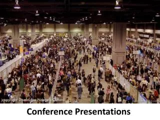

Conference Presentations
E N D
Presentation Transcript
Basic Details • Typically 3 x 4ft or 4 x 5ft; landscape Includes: • Title, Author(s), & Affiliation(s) • Research Question and/or Background • Hypotheses • Methods • Results (Tables/Figures) • Discussion/Conclusions • References (optional) • Acknowledgements (optional)
Include the basics… But be creative!
Problems: Too much text Small font Hard colors to read Odd organization
Strengths: Good organization Good use of photos Problems: Too much text Small font
Strengths: Short, too the point Lots of Results Problems: Cluttered by photos Hard to read; disorganized
Strengths: Boxes help with organization Bullet points keep it short Problems: Font could still be bigger Could still edit for shorter text
Strengths: Lots of White Space Arrows direct organization Interesting photos/infographics
Strengths: Lots of white space Clear organization; bullet points Problems: Small Title Still used small font
Strengths: Good organization; less text Good use of photos