Download
1 / 36
360 likes | 519 Views
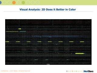
Visual Analysis: 2D Does it Better in Color. What are we going to cover?. “Theory” Problem Definition IDS Analysis Visualization Design Criteria Presentation Usability Data Structure Visualization Hang-ups Advanced Data Shaping Interactive Demo and Production Solution Example Q&A.

E N D
What are we going to cover? • “Theory” • Problem Definition • IDS Analysis • Visualization • Design Criteria • Presentation • Usability • Data Structure • Visualization Hang-ups • Advanced Data Shaping • Interactive Demo and Production Solution Example • Q&A
What are we NOT going to cover? • Writing your own visualization tool in the programming language of your choice • The technical ins and outs of talking to specific databases, SEM/SIM’s, or IDS’s • Will attempt to answer what questions I can • Why Foo tool may or may not be better than Bar tool: Concentration on effectiveness of exploratory data visualization • …although I *am* happy to entertain comment on other tools, these design principles should be the same across software packages
Things to Keep in Mind… • IDS Event Visualization should aid in… • Quickly and easily searching through large amounts of data to find THE important events • Seeing Incidents vs. Events • Removing Noise • Reducing IDS Event Analysis Learning Curve
What’s Wrong with IDS’s? (A short list) • IDS’s tend to assume that each security alert generated by the system correlates to an actual real security event • Problematic assumption when… • Signatures are too broad • Network is not known • Meta-data may affect alert confidence and meaning • Timing • Volume • Combination • Cross device/customer/etc correlation
What’s Wrong with IDS’s? IDS’ are audit mechanisms. Individual Events can *rarely* be *relied* on to provide the whole picture.
What’s wrong with IDS’s? • Because of these inaccuracies, analysts end up with many individual alerts which… • May not actually be identifying hostile activity • Are part of patterns which cannot be recognized by looking at small groups of events • Have no reliable or useful confidence factor • Are often still identifying *specific behaviors* • But could be combined into something which tells a more useful story • One bottle of Ephedrine….200 bottles of Ephedrine
What is the problem space Visualizations can address? • Result of problems: Analysts must have more context than just the past few IDS events • Conceptualization Issue • Analysts must understand large amounts of data in a way which highlights relationships, facts, and trends which are not inherent to any single event and which cannot easily be inferred “by hand” from a small data sample. • Time/Effort Issue • Analysts must be able to get the story quickly, succinctly, and must be able to ask the system questions
What is the problem space Visualizations can address? • Solution • Must build some type of anomaly/confidence system to identify these patterns and assist with looking at the larger context • Good News • Additional Meta-Data *is* available for use if large groups of events are compared to each other • Time, volume, history, etc. • Combined as audit events, provide much more value • Two choices • Calculate anomalies programmatically and display only the results of those calculations • Display all data in a way that highlights anomalies and allows Analysts to investigate those patterns which seem interesting to them • Both have a place
Why would you want to visualize security events? • Why don’t you just build/code an automatic anomaly detection system instead of a visualization system? • Good question. Let’s see YOU do it. • Network attack vector variety is almost as varied as human behavior will allow for • Esp. difficult on heterogeneous, multi-purpose networks • Because of this, you would need some verification or manual confidence system *anyway* • Humans are much better at seeing some types of anomalies than computers are • Visualizations allow additional context to be presented to analysts in a way which allows them to see anomalies
What other purposes could visualizations serve? • Not just for Incident Analysis/Detection • Data Mining (examples) • Need to create models or otherwise analyze data about which very little is known • Example - Sanitized network data from a carrier backbone • Packet or Protocol Anomaly Analysis • Subjective evaluation of packets or protocol flows to look for potentially new trends or patterns • Trending • Simple graphs may not show the trends • Can’t write models for every comparison • Write test cases based on initial gut feeling from the visual results
What other purposes could visualizations serve? • Tuning Individual Devices or Customers • Frequency Analysis • Common Pair Detection • Periodicity Evaluation • Could be done programmatically, but…
*Visualizations can be rapidly developed, deployed, and manipulated* What other purposes could visualizations serve?
Problems with typical display solutions: Text • Too much resolution • All event comparison work done in analyst’s head, on paper, in Excel, etc. • Not enough space for resolution • Fewer than 1,000 data points on this screen at once • No context • 1,000 rows could be only a few minutes worth of traffic • Have created Visualizations representing millions of rows on screen a once • Can be difficult to reposition data • Text Formatting and organization does not lend itself to “apples to apples” comparison
Problems with typical display solutions • 3D Displays • 3D used to simulate real life, not gain resolution • 3D on 2D *reduces* useable space • If comparing more data points, use more graphs • Complex Point to Point Graphs • Paraboxes • Require 2 points on screen for every *one* comparison • Data Constellations • Same issue as with paraboxes: require more points of representation than needed • Level of detail is either so high level it’s useless, or so low level it doesn’t add value
Problems with typical display solutions • EXAMPLES: DUMB.PPT
What Makes a Good IDS Visualization Tool? • Presents itself well • Effectively uses available space to communicate more information than is inherent to individual data points contained in the visualization • Interactive, Flexible, and Easy to Use • If you can’t interact with a visualization, manipulate it, search through it, and do all of this easily – you don’t have an effective tool. You have a management report. • Has good underlying data structure • One of THE most important things to think about when creating visualizations. To abuse a cliché, “You display what you have”. Displaying data alone does nothing for you
Designing Your Own • Presentation • Space Usage • Data Comparison Choices • Size and Color • Usability • Zoom and Focus • View Connectivity • Searching • Memory • Data Structure • Information Integrity • Pre-processing information • No solution • Advanced Data Shaping • IDS De-Tuning • More information is better only if it’s information
Designing Your Own: Presentation & Space Usage • Logical Distance does not have to be represented by real on-screen distance • Screens don’t have that much space to play with • Scaling does not have to be either linear or accurate • Logarithmic scales are useful when highlighting sections of data • Time: Current time may be more valuable than earlier times • Ports: Trusted ports account for only about 1/65 of available ports but tend to be most interesting • Counts: Lower counts tend to be denser and can (should?) be stretched
Designing Your Own: Presentation & Data Comparison • Make sure the data compared tells you something useful • Seems obvious, but people often compare things they • Already Know • Don’t Care to Know • Multiple graphs can add data depth without clutter • Hard to read visualizations tend to be a result of excess complexity or poor design more often than a lack of resolution or pixels
Designing Your Own: Presentation & Color • Color tends to be under-utilized and under-appreciated • The one method of communicating information in a 2D space that takes up *no* space • Color scale choice is not “just” aesthetics and should not be arbitrary • Poor color choice will hide information • Use categorical based color schemes for comparing data points not on a “scale” (like IDS events) • Use a light-to-dark range for data points which have higher/lower values • Use a rainbow-like range for data points who’s closeness matters, but one end is not “more” or “less” than the other
Designing Your Own: Presentation & Size • Ok, size should be obvious and it basically is • Easy way to compare values • Some pointers for interactive visualizations • Should be able to adjust scale of size differences to account for different data sets • Sometimes range is small enough that every difference shows up easily • In others, have to exaggerate differences to see them • Large values will cover (over-plot) smaller ones • Use random jitter to allow smaller values to peek out • If looking specifically for smaller values, consider subtracting the value from the max value and use the *difference* as the count value.
Designing Your Own: Usability & Zoom/Focus • Analysis is an iterative process • If you spend too much time/effort/mental capacity on the data manipulation, the threads and various trains of thoughts get lost • Process should never interfere with core purpose • Should be able to look at sub-selection of data within the same graph • Should be able to choose what actions to perform on highlighted data • Remove Selected • Add • Keep only Selected • Find Intersection • Etc. • All of these things are natural part of the analysis process. Making them hard makes analysis hard
Designing Your Own: Usability & View Connectivity • Analysis fundamentally involves working with a “data set” at any given time - not a particular “display” • Typically involves multiple displays of the same data • When selecting or zooming into data, the select should affect the base data set with which one is working, not just one display • The resulting data set should be the pool from which all views are tied • Sub-Selects should update *every* view • Analyst will lose track of the various states otherwise • This would interfere with the principle of don’t let the process overshadow the job.
Designing Your Own: Usability & Specificity • Searching is a key function of any analysis system • Text should always be available if needed to search a data set • Sometimes, a direct search is the only way to narrow the field • Memory • Should be able to revert back to given states or “saves” when doing subselects • It’s not fun to find something cool and not be able to trace it back • Sometimes, mistakes are made and things are incorrectly selected, or an investigative path doesn’t work out
Designing Your Own: Data Structure • Information Integrity • Numbers will lie if you don’t watch them carefully • “need headcount..here are the stats to justify them” • Make sure information is not lost in the selection/structuring process • Use destination port in the graph, but don’t aggregate on destination port when getting the data • Understand that you are almost always looking at a data subset • ALWAYS verify what your analysis theory with other data-point comparisons/graphs
Designing Your Own: Data Structure • Pre-processing information is the key to effective visualization • Visualization does not solve problems – just displays algorithm output • Data Structure is the “algorithm” used to compare data points • If you have a bad algorithm, you have a bad visualization • Almost always need more than one data structure • Have to have more data depth than 1x1: • Aggregate Information • Combine related data points into a single data-point • Preprocess numbers( std dev variation, averages, etc) and plot those data points against raw values
Designing Your Own: Visualization Hang-ups • Sometimes, there just isn’t that much of a story to tell • If you only get 100 events a day to 1 sensor, you won’t gain as much as with 10,000 events a day to 10 sensors • Visualizations will tend to miss the one-offs • You always need to review text or create a correlation engine for the “only tripped one signature ever” things • Not even text review or correlation engine will catch all of these • Poor Source Data • Some IDS’s tokenize behavior better than others • If behavior is not tokenized well, it will just look like noise. This is ok on the console if you have packet data available, but it will not work well for visualization purposes • Dragon Signatures are an example of this problem. Cannot handle two ports in the signatures, so has a huge false positive rate in a bad way – not only are the signatures broader than what they try and categorize, but they don’t even categorize a specific behavior well
Designing Your Own: Advanced Data Shaping • More information can be better • There’s always a battle between removing noisy false-positives and removing events which may end up being of value • Visualizations can allow you to run a slightly noisy IDS implementation and account for both of these • De-Tune the IDS’s: Make noise on purpose • IDS Signatures tokenize behavior • Consider writing, or turning on, extra signatures which do a good job of this • May end up seeing things which a well-tuned IDS would have completely missed
What Next? • Demand more from your IDS and SEM Vendors • Incorporate the idea of large data-set correlation into applicable situations • Many organizations and individuals still look at “the whole picture” as part of a specific investigation, not as a matter of course • This is wrong. More information and information sharing are good things • Write your own tools • I happen to work with a COTS tool because it suits my needs, but there are a number of toolkits available or under development currently to create visualizations • Tools to interactively deal with thousands or millions of events at once still seems to be very underdeveloped (or at least uncommon)
DEMO AND Q&A • Presentation Author: Jack Whitsitt/jofny • xaphan@violating.us • jwhitsitt@netsec.net • Tool Vendor: Advizor Solutions • www.advizorsolutions.com • Sponsor: NetSec • www.netsec.net