Download
1 / 14
140 likes | 312 Views
Preparing a Scientific Poster for Presentation. For additional detail goto http://www.tc.umn.edu/~schne006/tutorials/poster_design/practice_01.htm. What is a poster presentation?. To present your research in the form of a story to an audience that is passing through.

E N D
Preparing a Scientific Poster for Presentation For additional detail goto http://www.tc.umn.edu/~schne006/tutorials/poster_design/practice_01.htm
What is a poster presentation? • To present your research in the form of a story to an audience that is passing through. • The presenter stands next to the poster and engages in one-one-one discussions with individuals during scheduled poster sessions at scientific meetings. • WHY? • Scholarship, intrigue, dissemination, awareness, network, recognition, promotion,
Design Tip • Posters are not simply journal articles • Avoid presenting too much information • Stay on the main point • Target your audience. • Most people will be too intimidated/rushed to approach a poster that is overly complicated. • Posters that convey their message from a distance are more likely to draw attention.
Who is your audience • Physicians • Peds only • Subspecialists • Interdisciplinary • Other Medical scientists • Educators • IT • Administrators • Editors
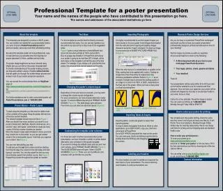
What is your take home message? • If the viewer only carries away one idea, what do you want it to be? • Statement (Title or subtitle) • Photo • Diagram, graph or table • Make this stand out from 10 feet away • 20-30% of your poster if possible
Choose Appropriate Fonts and Font Sizes • Guidelines to make your poster easy to read at a distance: • Title • 90-150 point bold • Author • 36-42 point bold • Section Headings (Sub-titles) • 36-54 point bold • Main Text • 28-32 point • References & Acknowledgements • 18-28 point • 30 point font size will accommodate 250 words per square foot. • Use Times New Roman or Arial font: • Avoid Serif fonts • AVOID: TEXT AND TITLES WRITTEN ENTIRELY IN CAPITALS • ARE HARDER TO READ • nothing beats black text on a light background. See Template below
Tips • Use bold section headings • Make sure your message stands out • Titles, Images, graphs, diagrams • Consider using a conclusion or statement in place of the traditional section heading. • For example, replace the heading "Results" with a heading that states the take-home message such as, "Transcription of XYZ is Light-Induced."
How do you get your audiences attention? • Images, graphs, diagrams • “picture is worth a thousand words” • Title • Catchy, Acronyms • Descriptive • Conclusion • Introduction/Abstract
Finishing touches • Edit, Edit, Edit ! • Have friends and mentors read/view it • Eliminate all but the vital elements. • Is everything? • Is there at least an inch of "white" space around the edge of the poster? • Don't forget "Spell Check”
Final Check before Printing Attracting Your Target Audience • If you encountered this poster at a poster session would you stop to look at it? • Is the poster directed to the target audience? • Is the title of the poster concise and does it stand out? • Is the poster's theme or take-home message quickly discernible? • Is the poster layout visually pleasing Delivering the Message • Is the research objective made explicit and highlighted under a heading such as "Objectives," "Aims," or " Goals?" • Are the main points explicitly labled (e.g., "Main Points," "Conclusion," "Results"). • Does the information flow logically? • Has the content been carefully edited? • Is the text legible in terms of font choice, size, color and spacing? • Does the title bar include the presenters' names and is the department or institution identified? • Is the poster free of curious acronyms and jargon?
Final Check before Printing Creating Visual Impact • Are the graphics large enough to be seen from a distance of 10 feet? 3 • Are the graphics attractive and relevant? • Have figure legends or captions been used to guide the viewer? • Does the poster have sufficient clear space? • Are text and graphics evenly balanced, with enough text to explain the graphics? • Have items been aligned?
Presenting Your Poster Tips for engaging your audience • Take the initiative to open up a conversation with an interested party • For example, you might ask: • "Would you like an overview of my poster?" • "Do you have a particular interest in this topic?" • "Would you like the short version or the long version?" • Time is very limited so most people will want the short version. • Don't just stand quietly beside the poster. Presenting your poster • Be prepared to give a brief, figure-by-figure summary of the poster. • Stop when you have finished • let the person move on if he or she pleases • Don't be offended at quick comings and goings. • If you become very engaged with someone, let others know that you are aware of them, and get to them as soon as possible. • Exchange email addresses, or arrange another meeting if it is clear that 5 minutes won't be enough time.
Preparing a Scientific Poster for PresentationCreated Jan 15, 2014 For additional detail goto http://www.tc.umn.edu/~schne006/tutorials/poster_design/practice_01.htm