Proximity
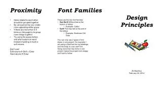
Proximity. Font. What is it? How close or far away items are from each other Grouping items close together shows relationships between items Organizes Tips: Group similar items together Good when you have a variety of subtopics within your main topic

Proximity
E N D
Presentation Transcript
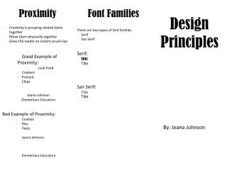
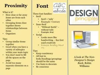
Proximity Font • What is it? • How close or far away items are from each other • Grouping items close together shows relationships between items • Organizes • Tips: • Group similar items together • Good when you have a variety of subtopics within your main topic • You don’t need to fill all the spaces on the page • Avoid too many separate elements on a page • Three font families: • Serif • Serif = ‘tails’ • Example: Century • Sans-Serif • “Without Serifs” – without tails • Example: Arial • Script • Looks more like handwriting – fun font used creatively • Example: Bradley Hand ITC • Tips: • Keep consistency • All font in body/headings/groupings should be the same • Use fonts to decorate • Be conscious A look at The Non-Designer’s Design Book, Robin Williams
Contrast Repetition Alignment • What is it? • Repeating elements to create patterns • Makes the piece look uniform • Consistency • Tips: • Repeat elements (such as fonts, color schemes, spacing, alignments, etc) • Don’t be over-repetitive to the point of looking overwhelming • What is it? • Add visual interest • Draws reader’s in • Lets readers quickly scan important points • Helps readers understand what brochure is about • Tips: • Use contrast • Font • Colors • Spacing • Sizing • Make elements VERY different if contrasting them • White space can create contrast as well • What is it? • Creates a solid impression • Lack of consistency creates a sloppy, weak impression • Unifies and organizes the page • Only use different alignments for contrast with 2 strong, different elements • Tips: • Keep consistency • Strong, share edges • Don’t place pictures/words randomly • Keep one alignment throughout project