Download
1 / 19
190 likes | 293 Views
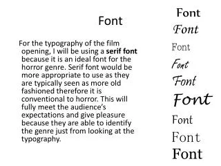
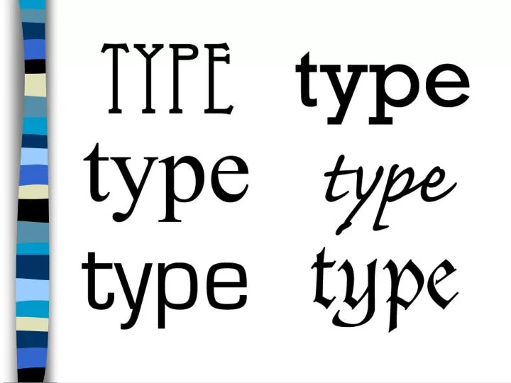
Font Classifications Learning to Identify Fonts. Typography is the art of expressing ideas in printed form through the selection of appropriate typefaces. Stroke. Curved and straight lines that create the character Stroke = Line.

E N D
Font ClassificationsLearning to Identify Fonts Typographyis the art of expressing ideas in printed form through the selection of appropriate typefaces.
Stroke • Curved and straight lines that create the character • Stroke = Line
SERIF: a short line at the end of the main strokes of a character T F T F
Serif aka Roman Characteristics: • Haveserifs • Have thick and thin strokes in same letter
Serif aka Roman When is it used… • Most common type • Reading material – books, magazines Personality • Traditional • Stability
Square Serif - also called Block or Slab serif Characteristics: • Have serifs(square or rounded) • Strokes of equal weight
Square Serif - also called Block or Slab serif When is it used… • large and bold headlines • EX. Western Themes, football, sports, etc. Personality… • masculine
Sans Serif Characteristics: • No serifs / sans means without • Strokes of equal weight • Sometimes referred to as Gothic
Sans Serif When is it used… • Signage • Legibility Personality… • Simple, traditional type • More modern than Serif
Textletter or Blackletter Characteristics: • Designed to look like monk’s scribingor calligraphy - came from handwriting of the early scribes • Fancy, Ornate, elegant • New York Times uses Textletter
Textletter or Blackletter When is it used… • Usually used on official documents • Because it is difficult to read, should not be used for body text Personality • Old, Aged
Script & Cursive Characteristics: • Looks like cursive handwriting • Script Letters connect (joined) • Cursive letters DO NOT connect
Script & Cursive When is it used… • Looks personalized – invitations (ex. wedding) • Do NOT use in ALL CAPS – difficult to read Personality • Feminine
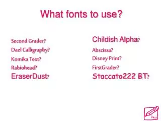
Novelty/Decorative Characteristics: • Type that does not fit in other classifications • Fancy, sometimes multi-colored
Novelty/Decorative When is it used… • Gives a quick impression based on the shapes of the characters • Is not usually easy to read • Should be used in small doses Personality… • Each has their own
BOLD THIN CONDENSED EXPANDED ITALIC Ways For Type to Stand Out
Questions • Which font would probably be found on a wedding invitation? • Which font has a lot of personality on its own? • What is a serif? • Which fonts have serifs? • What does “sans” mean? Script Novelty Decorative stroke on the main stroke Serif / Roman Square Serif without