Download

1 / 10
100 likes | 235 Views
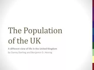
The Population of the UK. Chapter 1. A different view of life in the United Kingdom by Danny Dorling and Benjamin D. Hennig. Maps… a different view of the United Kingdom. Data source : Population: SEDAC Columbia University (2010); Topography: U.S. Geological Survey (2011).

E N D
The Populationof the UK Chapter 1 A different view of life in the United Kingdom by Danny Dorling and Benjamin D. Hennig Maps…a different viewof the United Kingdom
Data source: Population: SEDAC Columbia University (2010); Topography: U.S. Geological Survey (2011) People and Land in the United Kingdom The cartogram gives every person the same amount of space. Each grid cell on the cartogram relates to an equal-sized grid cell on the land area map. In the cartogram, each grid cell is resized according to the number of people living in that space. Maps…a different view of the United Kingdom Figure 1.1
Data source: European Constituencies obtained from the House of Commons Research Paper 98/102 The Constituencies that never were Major UK cities and the 1999 UK European Constituencies projected on a gridded population cartogram Maps…a different view of the United Kingdom Figure 1.2
People aged 18 • Counts by European Constituency area for the year 2000 • Data source: Estimated from school rolls of 15 year olds in 1997 and 2000 mid-year estimate for Northern Ireland Maps…a different view of the United Kingdom Figure 1.3
Proportion of people aged 18 • Counts by European Constituency area for the year 2000 • Data source: Estimated from school rolls of 15 year olds in 1997 and 2000 mid-year estimate for Northern Ireland Maps…a different view of the United Kingdom Figure 1.4
Proportion of 18 year oldsgoing to university • Data for the year 2000 • Data source: Successful UCAS under age 21 applicants from National Statistics website and estimated for Scotland and Northern Ireland Maps…a different view of the United Kingdom Figure 1.5
Educational participation rates at age 18 Data given for selected Western European countries Data source: Full-time participation in secondary education at age 18 in 1996, Social Trends 30 Maps…a different view of the United Kingdom Figure 1.6
People under 21 attending university by social class The six social classes shown above are based on the occupations of the parents of those young adults whose chances are being depicted – Data source: Social Trends 30, data from the National Statistics website (for GB) Maps…a different view of the United Kingdom Figure 1.7
Differences between observedand expected university entry rates • Allowing for the geography of children’s social class; Northern Ireland is excluded as no comparable census data was available • Data source: Successful UCCAs under age 21 applicants from National Statistics website Maps…a different view of the United Kingdom Figure 1.8
Key Point Summary • • It is helpful to look at the population of the UK with a map based on that that population • • Life chances can be shown on such a map, such as the chance of going to university • • Such chances alter over time, across space and are often influenced by social class Maps…a different view of the United Kingdom