Download
1 / 9
90 likes | 217 Views
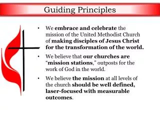
Guiding Principles of Making a Website. Nick Donnarumma. So How Do We Browse a Webpage?. We are either very lazy or very efficient because we tend not to read pages. We scan them instead to save time.

E N D
Guiding Principles of Making a Website Nick Donnarumma
So How Do We Browse a Webpage? • We are either very lazy or very efficient because we tend not to read pages. We scan them instead to save time. • We don’t figure out how things work. We muddle through. Therefore you have to make websites as simple as you can so people don’t get frustrated. • We don’t make optimal choices. We satisfice. People often would rather keep clicking things until they find what they want. They use trial and error because it is easier than figuring out how a webpage works and it could also be more fun. • Only the important things stick out to us. If we are looking to book a flight, the book a flight link will be the only thing we see.
Don’t Make People Think: • Where did this just take me? • Where should I begin? • Why did they put that there? • Where is the ____ that I’m looking for? • Why did they call it that? People should not have to think about these things! Be as obvious about things as possible to the users!!
Conventions are your friends • “As a rule, conventions only become conventions if they work. Well- applied conventions make it easier for users to go from site to site without expending a lot of effort figuring out how things work.” • If something makes a lot of sense it will become a convention and you will not be penalized for using one. Conventions are a safe bet. • There’s a reassuring sense of familiarity, for example, seeing a list of links to the sections of a site on a colored background down the left side of the pageor a search bar being found at the top or bottom of the page. • When in doubt, always use conventions!!
Keep the noise down Yes a webpage can have noise. Not just audio which you should be careful with too. In most case music shouldn’t automatically because people don’t want to be surprised by loud music that they may not like and then be forced to find the pause button! There is also visual noise. A common flaw of easy-to-grasp pages is visual noise. There are really two kinds of noise: • 1.Busy-ness. • -Too much writing and animations or other “noise” can be overwhelming. If you click on a page and instantly feel overwhelmed then there is too much busy-ness. Avoid clutter and having too many things trying to gain your attention. • 2. Background noise • -Avoid a distracting background, bad complement of colors or other overwhelming things.
Create a clear visual hierarchy • Elements should display a logical order and be clear to the user • The more important something is, the more prominent it is. Titles and headings should be in bigger bolder font because it sticks out more and attracts your attention. • Use conventions. They are convenient and people will be so used to them that they won’t have to think or wonder about why you did ___ in a certain way. • Things that are related logically are also related visually. You want people to not be confused by two elements next to each other that don’t make sense. For example a phone number should be found under a Contact Us section. • Things should be“nested” visually to show what’s part of what.
Break up pages clearly and make clickable objects obvious • Dividing the page into clearly defined areas is important because it allows users to decide quickly which areas of the page to focus on and which areas they can safely ignore. • Keep paragraphs short • -Use bulleted lists • -Highlight Key terms • Since a large part of what people are doing on the Web is looking for the next thing to click, it’s important to make it obvious what’s clickable and what’s not. • -Makes sense right? You will have much fewer people clicking on your links if they have no idea that it is a link. Conventions are blue text.
Finally • Make things as mindless and self-explanatory as possible. • Avoid lengthy instructions; everyone hates to read (Just think about how many people actually read the Terms and Conditions. “Ain’t nobody have time fodat!”) The longer something is, the more people who will avoid it and therefore avoid your website. • And remember: • DON’T • MAKE • PEOPLE • THINK!!!
Contact info • Name: Nick Donnarumma • Email: nickdonn@buffalo.edu • Phone: 914-260-2955


![[GP1] Guiding Principles](https://cdn1.slideserve.com/1689330/slide1-dt.jpg)