Download
1 / 15
150 likes | 174 Views
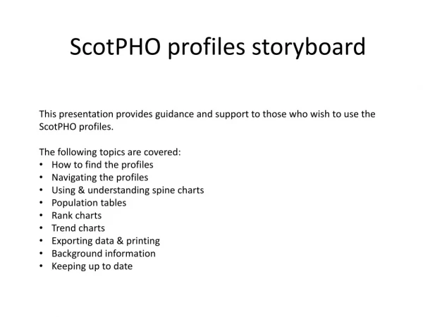
ScotPHO profiles storyboard. This presentation provides guidance and support to those who wish to use the ScotPHO profiles. The following topics are covered : How to find the profiles Navigating the profiles Using & understanding spine charts Population tables Rank charts

E N D
ScotPHO profiles storyboard • This presentation provides guidance and support to those who wish to use the ScotPHO profiles. • The following topics are covered: • How to find the profiles • Navigating the profiles • Using & understanding spine charts • Population tables • Rank charts • Trend charts • Exporting data & printing • Background information • Keeping up to date
How to find the profiles • Navigate to the ScotPHO website in your browser - www.scotpho.org.uk • Then select the ScotPHO profiles link
Navigation - 1 • You will be presented with a list of available profiles; at the top is the most recent update, followed by an alphabetical list. • To access the profiles, click on the button at the top of the page. • A new window will appear, which will allow you to select the geography of interest. • Scotland overview reports for each profile can also be accessed from this page.
Navigation - 2 • The first dropdown allows you to select your topic • The second dropdown allows you to select a chosen geography. • Click the ‘Select’ button to confirm selection.
On the next page you will be presented with a map detailing the geographies specified. • Use the dropdown, • or click on the name of a region to go to a profile. • On the health and wellbeing profiles, there is also a ‘view LA on map’ drop-down, which can be used to select intermediate zones by which local authority they are in. Navigation - 3 • You can use the map by clicking and dragging to move around, and by double clicking to zoom in.
Profile spine chart • This screen summarises the available indicators in the selected profile. • This is an overview of the data for the region you have selected. • The indicators are grouped into domains by topic, shown on the left of the profile. • The list of indicators appears in the middle of the profile, along with the corresponding data.
Spine chart - data • Hovering over the ‘i’ icon will describe the indicator in detail. • Columns provide various pieces of information, such as time period and a comparison against another area, which by default is the national average. (More info on this is in the technical report, which is covered later in this presentation.) • You can select the desired time period using the drop down menu on the top left.
Spine chart - data • The comparator column initially compares the values of the indicator with the national average. This can be changed by selecting a new region using the drop down. For this example, we will use Scotland. • The grey bar shows the national distribution, ranging from the 5th to 95th percentile. The dark grey bar shows the range from the 25th to 75th percentile. • The coloured dots show the statistical significance of the indicator value, and the colour shows if this is ‘better’, ‘worse’, or ‘not different’. For some indicators, the value can be significantly different, but we are unable to say if it is better or worse. Note that on some profiles a ‘doughnut’ shape will appear in place of an orange dot. • The technical report, which includes further detail on calculations and interpretation, can be accessed at the bottom of the page.
Spine chart - navigation • The buttons at the top of the screen help to navigate the data available in the profiles. • Clicking on ‘Home’ returns you to the profile and geography selection screen. • Clicking on ‘Profile’ returns you to the map screen. • Clicking on ‘Population’ directs you to the screen on the next slide.
Population table • This table displays the population of the area for a time period which can be selected using the dropdown menu. • Clicking on an indicator will drill down into a rank chart to provide more detail. • You can return to the spine chart using the button at the top of the screen.
Rank chart • Clicking on an indicator in the spine chart will show a ranked chart including each region in the geography you specified. • This allows a comparison against the national average and other regions • Selecting a geography from the dropdown, or clicking on a bar, takes you to the chart on the next page • The bars represent 95% confidence intervals. • Hovering over an area will display the value associated with it (both averages and confidence intervals).
Trend chart • This shows a time trend for your selected geography. • The blue line shows the indicator’s value over time, along with 95% confidence intervals. • The black line shows the comparator (in this case Scotland). • Hovering over a point or confidence interval will show values associated with it.
Exporting data & printing • You can export data to Excel from any part of the profiles (shown here with the spine chart page and the view after clicking on an indicator) using the ‘Export’ icon. You can also print charts using the ‘Print Chart’ icon.
Background information • For those interested in background information, navigating back to the profiles homepage provides other sources. • The various overview reports provide more information on the context and source of indicator data • The technical reports contain a range of information, including – • populations • interpreting charts • indicators • etc.
Keeping up to date • This page also provides information on changes and updates to the profiles • Clicking on the change log and caveats tab on the left will display details of any amendments or updates to the data. • Archived data can be found on the archive tab.