1 / 0

Drawing Supply and Demand Curves using Microsoft Excel

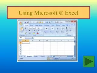
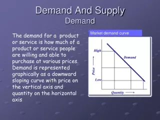
Drawing Supply and Demand Curves using Microsoft Excel. Rob Pryce, Lancaster University. Crucial first stage – we need supply and demand schedule!. Without selecting anything: Insert -> Scatter -> Scatter with smooth lines. You should get a blank chart like the one above.

kayo
Download Presentation

Drawing Supply and Demand Curves using Microsoft Excel

An Image/Link below is provided (as is) to download presentation Download Policy: Content on the Website is provided to you AS IS for your information and personal use and may not be sold / licensed / shared on other websites without getting consent from its author. Content is provided to you AS IS for your information and personal use only. Download presentation by click this link. While downloading, if for some reason you are not able to download a presentation, the publisher may have deleted the file from their server. During download, if you can't get a presentation, the file might be deleted by the publisher.

E N D

Presentation Transcript


  1. Drawing Supply and Demand Curves using Microsoft Excel

    Rob Pryce, Lancaster University
  2. Crucial first stage – we need supply and demand schedule!
  3. Without selecting anything: Insert -> Scatter -> Scatter with smooth lines
  4. You should get a blank chart like the one above. Not got a blank chart? Click here
  5. Click on the blank chart to select it, then choose “Select Data” Alternatively, right click and “select data”
  6. The following box will appear. Click add.
  7. Choose a series name. For example, demand. Then move to next box.
  8. We want Qd to be our x-values, so we select these. Now we need to select y-values.
  9. We want the y-values to be price (because we are economists not mathematicians). So we choose the price values as our y-values in the final box. The demand curve should appear. Click OK, and OK again to exit.
  10. The same process can be (roughly) repeated for supply, or shifted demand curves. To change the colour of the line, right click and change shape outline colour.
  11. The End.
  12. Right click on the line in the chart, select delete. Do the same for the other line. Continue with presentation
More Related