Download

1 / 31
310 likes | 440 Views
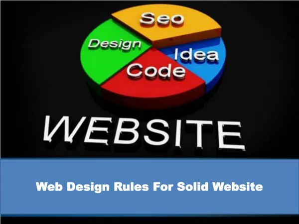
New Rules of Web Design. Jeff Wisniewski University of Pittsburgh jeffw@pitt.edu. Goals …. Challenge some assumptions Introduce some new research Food for thought. Design is an Inexact Science ….

E N D
New Rules of Web Design Jeff Wisniewski University of Pittsburgh jeffw@pitt.edu
Goals… • Challenge some assumptions • Introduce some new research • Food for thought
Design is an Inexact Science… • Yes, but there are several DECADES worth of research in usability, credibility, interface design, and HCI • Purple vs. Green? Can’t help ya…
Simplicity Rules • Rich and interactive • RIAs • The User Experience
Content is King • But design matters…ALOT • Novice users judge superficially, and quickly! • Professional design= credibility
All Content Is Created Equal • …but some content is more equal than other • Design for what your users are doing • Emphasize the highest priority tasks so that users have a clear starting point. Nielsen
By the numbers: • 3 Click Rule? • 600x800? • The Rule of Seven?
“The Rule of Seven” • Not a rule a guideline • Persuasive evidence both ways • The answer depends on context • More than 9…maybe your site lacks focus?
3 click “rule”… • …is dead • Design for SCENT • Users will happily click so long as they feel they are on the right path
Design for 800x600? • NO: Optimize for 1024x768 (Nielsen) • What of other platforms (phones, handhbelds, etc.)? Use CSS media types • Flexible as opposed to fixed design
Color me…colorful? • The majority of users browse with 24-bit color rendering • RIP websafe palette? • File size • Alternative platforms • “We are not sure how important this is now, since most computers today have the ability to display millions of different colors”- WC3 Schools
For Redesign Inspiration… • Check other library websites • Standards, conventions, and user expectations are established OUTSIDE of library land…see also Jacob’s Law
How Often to Redesign? • Constantly • Iterative, evolutionary change • Revolutionary chang is disruptive • A/B testing • Sometimes a tear down is required
Follow Your Own Conventions • Is reference “reference” on your website (N.B. it shouldn’t be!) • Wayfinding…Ask-a-Librarian both real and virtual • Style guidelines across physical and virtual, print and electronic
…But follow established web standards and conventions • “home” link • Clickable banner • Contact us link • Placement of navigation
Greater Bandwith=Design Freedom? • Two trends: more high speed access • More non-traditional devices on relatively slower networks (Apple iPhone)
I Must Support All Browsers • For basic content…YES! • Accessibility is critical and the right thing to do • For value added content, style, and interactivity? • Graded support aka progressive enhancement
Providing a text-only version of your homepage or site… Why is it needed? • Separation of presentation and content • XHTML + CSS
Avoid CSS for Layout…It’s Buggy • Well yes it is, sort of, but no longer enough to justify not using it • Be a <TABLE> hata
The Top of the Page is Prime Real Estate • Actually, it’s useless space…Banner Blindness… • Nielsen”: People have a tendency to never look at a slim rectangular area that's above the page's main headline.”
Pop goes the window! • Popups: • Will very likely be blocked by default..so nothing mission critical • Can be useful when linking to supporting information
Flash is Evil • Flash introductions are evil • Flash can be used for effective animation and interactivity • RIAs • Example: http://www.library.pitt.edu/etd_tutorials/etdtutorial.html
Mouseover menus… • …are still evil!…raise usability considerations • They’re : slower, not scanable (therefore preventing users from getting an overview of you sites content) and often require ninja-like mouse skills…
Opening links in a new browser window… • Is sometimes OK: external links, non-web documents: Word, PDF, etc. • Help files • TELL users • Tabbed browsers make this less of an issue
Never “Auto Forward…” It Breaks the Back Button • Server side redirects are best…but… • Set auto forward time high enough to allow users to use back
Scrolling is Bad • users scroll if there is a clue that there is something below the fold • Use the very fashionable “cut-off” look…
Keep It Above the Fold • Maybe… • 76% of users scrolled and that a good portion of them scrolled all the way to the bottom, despite the height of the screen … • http://blog.clicktale.com/2006/12/23/unfolding-the-fold/
Images of People… • Increase trust (unless they’re really good looking people) • Naturally draw attention…this may not be a good thing…distraction? • People, labeled, increase credibility the most
Resources • Google Website Optimizer http://services.google.com/websiteoptimizer/ • Large Web Sites Don't Change Much http://webdesign.about.com/od/webdesignbasics/a/aa010206.htm • OneStat screen resolution survey http://www.onestat.com/html/aboutus_pressbox51_screen_resolutions_internet.html • Forrester Research: Smackdown! Rich Internet Applications vs. HTML http://www.forrester.com/Research/Document/Excerpt/0,7211,40566,00.html • Web users judge sites in the blink of an eye http://www.nature.com/news/2006/060109/full/news060109-13.html • Stanford Guidelines for Web Credibility http://www.webcredibility.org/guidelines/ • Fancy Formatting http://www.useit.com/alertbox/fancy-formatting.html • Human Factors International Design Newsletter: From Bricks to Clicks…. http://www.humanfactors.com/ • Blasting the Myth of the Fold http://www.boxesandarrows.com/view/blasting-the-myth-of • Utilizing the Cutoff Look http://www.uie.com/brainsparks/2006/08/02/utilizing-the-cut-off-look-to-encourage-users-to-scroll/ • Yahoo! Graded Browser Support http://developer.yahoo.com/yui/articles/gbs/index.html • 10 Usability Nightmares You Should Be Aware Of http://www.smashingmagazine.com/2007/09/27/10-usability-nightmares-you-should-be-aware-of/ • Usability.gov Chapter 10 http://www.usability.gov/pdfs/chapter10.pdf