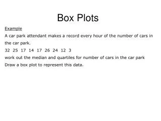
Box Plots
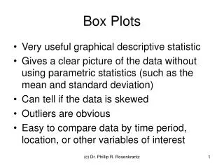
Box Plots. Very useful graphical descriptive statistic Gives a clear picture of the data without using parametric statistics (such as the mean and standard deviation) Can tell if the data is skewed Outliers are obvious

Box Plots
E N D
Presentation Transcript
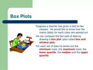
Box Plots • Very useful graphical descriptive statistic • Gives a clear picture of the data without using parametric statistics (such as the mean and standard deviation) • Can tell if the data is skewed • Outliers are obvious • Easy to compare data by time period, location, or other variables of interest (c) Dr. Phillip R. Rosenkrantz
Information Needed • Data Array • Minimum values • Maximum values • 25th percentile = q1 • 50th percentile = q2 = median • 75th percentile = q3 (c) Dr. Phillip R. Rosenkrantz
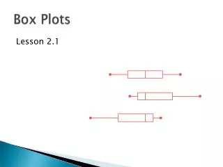
Box Plot (a.k.a. Box-Whisker Plot) (c) Dr. Phillip R. Rosenkrantz
Box Construction: q1 – q3 (c) Dr. Phillip R. Rosenkrantz
Non-parametric View of the Data Min Max (c) Dr. Phillip R. Rosenkrantz
Interquartile Range (H) = q3 – q1 (c) Dr. Phillip R. Rosenkrantz
“Fences” are calculated based on the interquartile range. (They are not included in the plot). (c) Dr. Phillip R. Rosenkrantz
“Whisker Construction” (c) Dr. Phillip R. Rosenkrantz
Outliers are beyond the “fences” (c) Dr. Phillip R. Rosenkrantz
Final Box Plot (does not include fences) (c) Dr. Phillip R. Rosenkrantz
Variations • All outliers look the same (no extreme outliers) • Whiskers go to maximum and minimum values (no recognition of outliers) • Mean shown as a “plus” sign • Quartiles designated as q1, q2 & q3 • Values shown on the plot • Boxes can be shown horizontally or vertically, depending on aesthetics (c) Dr. Phillip R. Rosenkrantz
Example of side-by-side Box Plots (c) Dr. Phillip R. Rosenkrantz