Download
1 / 22
220 likes | 239 Views
This visualization project explores the relationship between risk patterns of West Nile Virus and human cases. By analyzing daily risk maps and risk histories of human cases, the study aims to identify spatial and temporal patterns that can predict human infections. The visualization provides multiple linked views and allows for sorting and timeshifting of risk histories.

E N D
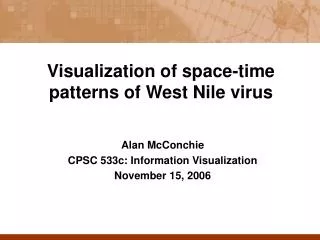
Visualization of space-time patterns of West Nile virus Alan McConchie CPSC 533c: Information Visualization December 14, 2006
West Nile Virus: brief review • WNV is dangerous to humans, but primarily transmitted between birds and mosquitoes • Dead bird surveillance programs are used to track areas of human WNV risk • Lag time exists between bird deaths and human infections • Lag is poorly characterized and may vary from region to region
West Nile Virus Risk Analysis • Dead bird tracking produces daily raster map of WNV activity • Binary risk/no risk classification (“lit” / “not lit”) • Given date and location of human cases in previous years: • What is the relationship between risk patterns and human cases? • Does the relationship vary spatially? • What patterns of risk are the best predictors of human infections?
Day 0 Day 1 Day 2 Day 3 A New Approach: Risk Histories For each human case, identify its raster cell Extract that pixel from each daily risk raster
Risk Days Human Onset No Risk Time Risk Histories For each human case, identify its raster cell Extract that pixel from each daily risk raster …result is a string of risk/no-risk values Day 0 Day 1 Day 2 Day 3
Risk Histories Risk histories can be juxtaposed in any order to look for similarities Comparisons no longer bound by spatial proximity
Risk Histories: Sorting Risk histories can be sorted in a number of ways:
Risk Histories: Sorting Risk histories can be sorted in a number of ways: Day of human onset:
Risk Histories: Sorting Risk histories can be sorted in a number of ways: Day of human onset: Total number of days at risk: 31 18 17 14
Risk Histories: Sorting Risk histories can be sorted in a number of ways: Day of human onset: Total number of days at risk: Averaged day of risk (center of gravity) 31 18 17 14
Risk Histories: Timeshifting Risk histories can also be shifted in time By aligning the dates of human onset, time values are now relative to human case, not relative to calendar time Comparisons no longer bound by temporal proximity
Risk Histories: Timeshifting Risk histories can also be shifted in time By aligning the dates of human onset, time values are now relative to human case, not relative to calendar time Comparisons no longer bound by temporal proximity
Visualization Goals • Provide means to view and explore risk histories • Non-geographic spatial juxtaposition via sorting • Non-calendar temporal juxtaposition via timeshifting • Multiple linked views • Provide context, links back to real-world space and time • Observed similarities in risk history view can be mapped back to real-world
Implementation • Creation and sorting of risk histories performed by a suite of command-line utilities written in Perl • Visualization created using Improvise • Java-based visualization environment • Visualizations are constructed interactively within Improvise • Live Properties provide multiply coordinated views and easy experimentation during visualization
Sorts First risk day Last risk day Average of risk days
Aligned Sorts First risk day Last risk day Average of risk days
Strengths and Weaknesses • Software • Improvise is powerful, but may limit future flexibility • Live Properties impose limits on interaction between views • Impossible for one view to modify certain attributes of another view, such as range of viewport. • Theory • What if risk in adjacent cells matters? • Difficult to extend this technique • Perhaps only useful for large-scale analysis • Too much random noise in the data • Too many contributing factors • Even if a similar risk pattern is found in several human histories, currently no way to see how many times that pattern appeared and did not result in a human case
User comments • Public health biologist working with West Nile virus • Really liked multiple views • Risk histories took some getting used to • Found the profile view the most informative • View was provided for context; cannot provide information about specific relationship between risk and human onset • However, it is a useful overall view, made interactive here for first time • My conclusion: the study of WNV lacks application of current infovis tools. Perhaps that needs to be remedied first before inventing new techniques.
Possible Future Improvements • Clustering based on string similarity • More flexible sorts, query-based selection • Example: sort by number of risk days in a 5 day window, 10 days before onset • Fit curve to the sorted results • obtain quantitative value for comparison between datasets • Integrate more geographical data • Select based on climate regions, population density • Selection based on county for public health officials