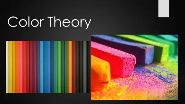
color theory
color theory. http://www.pixy.cz/apps/barvy/index-en.html. http://hort.ifas.ufl.edu/TEACH/floral/color.htm. http://www.colorvoodoo.com/cvoodoo4.html. http://www.wiu.edu/users/miart/courses/design/color.htm. http://www.art-rageous.net/colorwheel-LP.html. History of color theory

color theory
E N D
Presentation Transcript
http://www.pixy.cz/apps/barvy/index-en.html http://hort.ifas.ufl.edu/TEACH/floral/color.htm http://www.colorvoodoo.com/cvoodoo4.html http://www.wiu.edu/users/miart/courses/design/color.htm http://www.art-rageous.net/colorwheel-LP.html
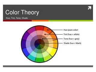
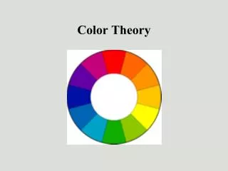
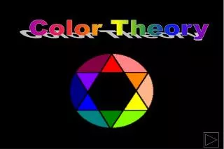
History of color theory The first color wheel was invented by Sir Isaac Newton. He split white sunlight into red, orange, yellow, green, cyan, and blue beams; then he joined the two ends of the color spectrum together to show the natural progression of colors.
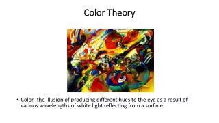
Pigment Color - (paint) reflected lightPigment color is created when a pigment absorbs certain light wave lengths and reflects others. For example, a blue shirt absorbs all wave lengths except blue, which is reflected. The color wheel based on the three primary colors: red, yellow and blue, was developed in 1666 by Sir Isaac Newton.
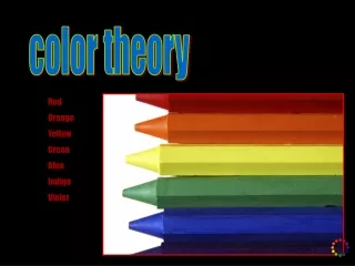
Primary pigment colors - red, yellow and blue are the primary colors. All other colors are derived from these three hues. Secondary pigment colors - green, orange and purple are created by mixing the primary colors.
Complementary colors - opposite colors on the color wheel (pigment color example: red-green) create a sense of excitement or disharmony Analogous colors - 'neighboring' colors on the color wheel (pigment color example: red-orange) create a sense of harmony.
Colors displayed on a computer monitor are called additive colors. They are created differently than printed or pigment colors. A color management system attempts to minimize this difference. Additive Color - (computer monitor, television, theater lighting) direct lightA computer monitor uses three phosphors that appear as red, green, and blue when activated. Other colors are made by combining different intensities of these three colors.
Primary additive colors - red green and blue (RGB) are the primary colors. They can not be created by any combination of other colors. Secondary additive colors - The secondary colors are cyan, magenta and yellow. Printing is based on CMYK color - the secondary colors of cyan, magenta, yellow and black (K)
HSB (Hue, Saturation and Brightness) - color can be defined by its hue (wavelength), saturation (chroma, purity or intensity) and brightness (value) Hue - is the color's name (orange, blue, etc.). It is located on the color wheel - expressed as a degree between 0° and 360°. Saturation - is the purity of the color. Saturation is the amount of gray in proportion to the hue - measured from 0% (gray) to 100% (fully saturated).Brightness - is the relative lightness or darkness of the color -measured from 0% (black) to 100% (white).
Different readings of the same color The small purple rectangle on the left appears to have a red-purple tinge when compared to the small purple rectangle on the right. They are both the same color.
All colors travel in waves within light. Color Complements have drastically different wavelengths and, consequently, cause some perception problems for a viewer if they are placed close to each other in a work of art. The cones and rods of the eye cannot handle so much information, so we sometimes detect a quivering or optical distortion when two complements are used near each other.
Nature provides a perfect departure point for color harmony. In the illustration above, red yellow and green create a harmonious design
The same red is used in the foreground of all four colored squares.Do you see the differences? Do you know why red on a black background is brighter than the same red on an orange background?
Red Red is the color of fire and blood, so it is associated with energy, war, danger, strength, power, determination as well as passion, desire, and love..
Orange Orange combines the energy of red and the happiness of yellow. It is associated with joy, sunshine, and the tropics. Orange represents enthusiasm, fascination, happiness, creativity, determination, attraction, success, encouragement, and stimulation.
Yellow Yellow is the color of sunshine. It's associated with joy, happiness, intellect, and energy. Yellow produces a warming effect, arouses cheerfulness, stimulates mental activity, and generates muscle energy.
Green Green is the color of nature. It symbolizes growth, harmony, freshness, and fertility. Green has strong emotional correspondence with safety. Dark green is also commonly associated with money. Green has great healing power. It is the most restful color for the human eye; it can improve vision.
Blue Blue is the color of the sky and sea. It is often associated with depth and stability. It symbolizes trust, loyalty, wisdom, confidence, intelligence, faith, truth, and heaven. Blue is considered beneficial to the mind and body. It slows human metabolism and produces a calming effect. Blue is strongly associated with tranquility and calmness..
Purple Purple combines the stability of blue and the energy of red. Purple is associated with royalty. It symbolizes power, nobility, luxury, and ambition. It conveys wealth and extravagance. Purple is associated with wisdom, dignity, independence, creativity, mystery, and magic. According to surveys, almost 75 percent of pre-adolescent children prefer purple to all other colors. Purple is a very rare color in nature; some people consider it to be artificial.
White White is associated with light, goodness, innocence, purity, and virginity. It is considered to be the color of perfection. White means safety, purity, and cleanliness. As opposed to black, white usually has a positive connotation. White can represent a successful beginning. In heraldry, white depicts faith and purity.
Black Black is associated with power, elegance, formality, death, evil, and mystery. Black is a mysterious color associated with fear and the unknown (black holes). It usually has a negative connotation (blacklist, black humor, 'black death'). Black denotes strength and authority; it is considered to be a very formal, elegant, and prestigious color (black tie, black Mercedes). In heraldry, black is the symbol of grief..
: Neutral colorsNeutral colors or earth tones are not seen on most color wheels. Black, gray, whites are neutral. • Browns, beiges and tans are sometimes neutral too.
A tint of a color is made by adding white.A shade is made by adding black.
Complementary - two hues are opposite each other on the color wheel
Split complementary - any hue and the two adjacent to its complement.
The *mistake* comes from the fact that there are *two* different color wheels, one for mixing light (sun...), and one for mixing pigment (like paints and inks). Take a look at the ink cartridge in a color printer. What colors do you see? Cyan, *not* an ultramarine blue. A magenta red, *not* a crayon or Christmas red. And yellow. *Those* are the colors that you need if you are going to create any other color by mixing pigments. Use a cyan blue color with a magenta type of red. Voila. You can come up with an amazingrange of clear and colorful purples. Try cyan with yellow, and you'll discover a range of wonderful clear greens. Purples made by using a Christmasy red turn muddy because that kind of red brings yellow into the mix.
Creative Color Wheels Student work…