3 Great Examples of Data Visualization
10 likes | 42 Views
Data visualization transforms raw data into visual elements that tell an actionable story. Itu2019s a powerful communication tool that combines aesthetic and user-friendly features to make research, analysis, and decision-making much quicker and more intelligent.

3 Great Examples of Data Visualization
E N D
Presentation Transcript
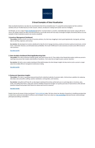
3 Great Examples of Data Visualization Data visualizationtransforms raw data into visual elements that tell an actionable story. It’s a powerful communication tool that combines aesthetic and user-friendly features to make research, analysis, and decision-making much quicker and more intelligent. At InfoCepts, we use a range of data visualizationapproaches to present data in a creative, actionableandaccurate manner using any BI tool of choice. By making complex raw data visual and interactive, we provide clients with new ways of seeingand usingthis information.Below are some examples of data visualization projects we recently completed: 1.Inventory Management Dashboard The problem: Without a bird's-eye view of inventory statistics, the client was struggling to meet upcoming demands, track goods, and keep tabs on cash flow, expenses, and revenue. Our solution: We developed an inventory dashboard to help the client manage inventory, predict and maintain optimum stock levels, control losses, make better decisions, and ultimately boost profitability. The result? A 58% boost in sales (inventory turnover) and a 28% increase in new customers. See what we did. 2. Store Analytics Dashboard (iPad App)forBoosting Sales The problem: The client isa discount clothing retailer with stores across the US. They relied on Excel-based data analysis, which was prone to reporting inaccuracies that created a dominoeffect of problems—from slow time to insight to poor customer retention. Our solution: We built a store analytics dashboard (iPad add) that gives the client deeper insights into key metrics (such as actual vs. target sales) that enabled efficient management and decision making. See what we did. 3. Restaurant Operations Insights The problem: The client is a growing restaurant brand that’s visited by hundreds of customers daily. It did not have a platform for analyzing data about sales and profits, staffing, customer satisfaction, running orders, and inventory. Our solution: Using Microsoft Power BI, we developed a dashboard that allows authorized users to easily keep tabs on inventory, sales, profit, and staffing information, along with customer feedback. Restaurant managers can quickly spot areas of improvement, while demand prediction helped chefs prepare their kitchens to reduce wait time for customers. See what we did. Ready to harness the power of data visualization? Talk to InfoCepts today. We have almost two decades of expertise in simplifying complex data to make them usable and actionable for different users and goals. Know more about our data storytellingsolutionand human-centered design philosophy by booking a consultation.