Download
1 / 15
150 likes | 244 Views
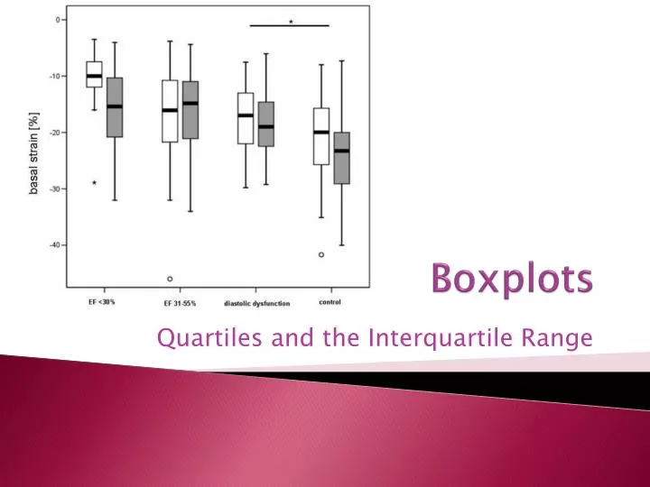
Boxplots. Quartiles and the Interquartile Range. When are boxplots useful?. Comparing shape, center, and spreads of two or more distributions Distribution has too many values for a stem plot or dot plot You don’t need to see individual values, even approximately

E N D
Boxplots Quartiles and the Interquartile Range
When are boxplots useful? • Comparing shape, center, and spreads of two or more distributions • Distribution has too many values for a stem plot or dot plot • You don’t need to see individual values, even approximately • You don’t need to see more than a five number summary, but would like outliers clearly indicated
Five-number summary • Minimum • Lower or 1st Quartile • Median • Upper or 3rd Quartile • Maximum
QUARTILES Lower quartile (Q1) = median of the lower half of the data set. Upper Quartile (Q3) = median of the upper half of the data set. The interquartile range (iqr), is a resistant measure of variability given by: Note: If n is odd, the median is excluded from both the lower and upper halves of the data.
EXAMPLE 1 • 15 students with part time jobs were randomly selected and the number of hours worked last week was recorded. 19, 12, 14, 10, 12, 10, 25, 9, 8, 4, 2, 10, 7, 11, 15 The data is put in increasing order to get 2, 4, 7, 8, 9, 10, 10, 10, 11, 12, 12, 14, 15, 19, 25
Upper Half Lower Half Upper quartile Q3 Lower quartile Q1 • With 15 data values, the median is the 8th value, which is ________. 2, 4, 7, 8, 9, 10, 10, 10, 11, 12, 12, 14, 15, 19, 25 Median The IQR =
OUTLIERS • An observation is an outlier if it is more than 1.5 IQR away from the closest end of the box (less than the lower quartile minus 1.5 IQR or more than the upper quartile plus 1.5 IQR. • Formulas:
Boxplots • A boxplotrepresents outliers by shaded circles. Whiskers extend on each end to the most extreme observations that are not outliers. • Calculator notes: • 1. Select the boxplot with the dots • 2. Hit ZoomStat (Zoom 9) • 3. Use the Trace button to locate the median, quartiles, upper and lower fences, and outliers (if present).
Smallest data value that isn’t an outlier Largest data value that isn’t an outlier Mild Outlier 0 5 10 15 20 25 Upper quartile + 1.5 IQR = 14 + 1.5(6) = 23 Lower quartile + 1.5 IQR = 14 - 1.5(6) = -1 Upper quartile + 3 IQR = 14 + 3(6) = 32 Boxplot Example • Using the student work hours data we have
Lower Quartile Median Upper Quartile Moderate Outliers Extreme Outliers Modified Boxplot Example • Consider the ages of 79 students. IQR = 22 – 19 = 3 Lower quartile – 1.5 IQR =14.5 Upper quartile + 1.5 IQR= 26.5 17 18 18 18 18 18 19 19 19 19 19 19 19 19 19 19 19 19 19 19 19 19 19 19 19 19 20 20 20 20 20 20 20 20 20 20 21 21 21 21 21 21 21 21 21 21 21 21 21 21 22 22 22 22 22 22 22 22 22 22 22 23 23 23 23 23 23 24 24 24 25 26 28 28 30 37 38 44 47
Largest data value that isn’t an outlier Smallest data value that isn’t an outlier Mild Outliers Extreme Outliers 15 20 25 30 35 40 45 50 Boxplot Example Here is the boxplot for the student age data.
50 45 40 35 30 25 20 15 Modified Boxplot Example Here is the same boxplot reproduced with a vertical orientation.
G e n d e r Males Females 100 120 140 160 180 200 220 240 Student Weight Comparative Boxplot Example By plotting boxplots of two separate groups or subgroups we can compare their distributional behaviors. Notice that the distributional pattern of female and male student weights have similar shapes, although the females are roughly 20 lbs lighter (as a group).
Discussion • What is another name for the 2nd quartile? • What would a boxplot look like for a data set that is skewed right? Left? Symmetric?