Download
1 / 29
370 likes | 1.13k Views
The Five-Number Summary And Boxplots. 1. 2. Chapter 3 – Section 5. Learning objectives Compute the five-number summary Draw and interpret boxplots. Traditional statistics is to collect data to analyze / test a particular conjecture

E N D
The Five-Number Summary And Boxplots
1 2 Chapter 3 – Section 5 • Learning objectives • Compute the five-number summary • Draw and interpret boxplots
Traditional statistics is to collect data to analyze / test a particular conjecture • Is there a correlation between Measurement 1 and Measurement 2? • Is Drug A more effective than Drug B? • Traditional statistics is to collect data to analyze / test a particular conjecture • Is there a correlation between Measurement 1 and Measurement 2? • Is Drug A more effective than Drug B? • A new approach, ExploratoryDataAnalysis (EDA) examines data to look for patterns • Are there patterns when comparing Group I to Group II to Group III to Group IV? • Are there patterns in people’s spending?
The five-numbersummary is the collection of • The smallest value • The first quartile (Q1 or P25) • The median (M or Q2 or P50) • The third quartile (Q3 or P75) • The largest value • These five numbers give a concise description of the distribution of a variable
Chapter 3 – Section 5 • The median • Information about the center of the data • Resistant • The median • Information about the center of the data • Resistant • The first quartile and the third quartile • Information about the spread of the data • Resistant • The median • Information about the center of the data • Resistant • The first quartile and the third quartile • Information about the spread of the data • Resistant • The smallest value and the largest value • Information about the tails of the data • Not resistant
Chapter 3 – Section 5 • Compute the five-number summary for 1, 3, 4, 7, 8, 15, 16, 19, 23, 24, 27, 31, 33, 54 • Calculations • The minimum = 1 • M = Find the middle value if even number average the two values (16 + 19) / 2 = 17.5 • Q1 =, Find the middle value of lower half, Q1 = 7 • Q3 = Find the middle value of upper half, Q3 = 27 • The maximum = 54 • The five-number summary is 1, 7, 17.5, 27, 54
1 2 • Learning objectives • Compute the five-number summary • Draw and interpret boxplots
The five-number summary can be illustrated using a graph called the boxplot • An example of a (basic) boxplot is • The middle box shows Q1, Q2, and Q3 • The horizontal lines (sometimes called “whiskers”) show the minimum and maximum
To draw a (basic) boxplot: Calculate the five-number summary 1,7, 17.5, 27, 54 Draw a horizontal line that will cover all the data from the minimum to the maximum label a scale on line. Draw a box with the left edge at Q1 and the right edge at Q3 Draw a line inside the box at M = Q2
To draw a (basic) boxplot: Calculate the five-number summary 1,7, 17.5, 27, 54 Draw a horizontal line that will cover all the data from the minimum to the maximum label a scale on line. Draw a box with the left edge at Q1 and the right edge at Q3 Draw a line inside the box at M = Q2 Draw a horizontal line from the Q1 edge of the box to the minimum and one from the Q3 edge of the box to the maximum
To draw a (basic) boxplot: Calculate the five-number summary 1,7, 17.5, 27, 54 Draw a horizontal line that will cover all the data from the minimum to the maximum label a scale on line. Draw a box with the left edge at Q1 and the right edge at Q3 Draw a line inside the box at M = Q2 Draw a horizontal line from the Q1 edge of the box to the minimum and one from the Q3 edge of the box to the maximum
Draw the middle box Draw in the median Draw the minimum and maximum • To draw a (basic) boxplot
An example of a more sophisticated boxplot is • The middle box shows Q1, Q2, and Q3 • The horizontal lines (sometimes called “whiskers”) show the minimum and maximum • The asterisk on the right shows an outlier (determined by using the upper fence)
The distribution shape and boxplot are related • Symmetry (or lack of symmetry) • Quartiles • Maximum and minimum • The distribution shape and boxplot are related • Symmetry (or lack of symmetry) • Quartiles • Maximum and minimum • Relate the distribution shape to the boxplot for • Symmetric distributions • Skewed left distributions • Skewed right distributions
Q1 Q3 Q1 Q3 Max Max Min Min Q3 Q1 Q1 Q3 M M M M • Symmetric distributions
Q1 Q1 Q3 Q3 Q1 Q1 Q3 Q3 Max Max Min Min M M M M • Skewed left distributions
Q1 Q1 Q3 Q3 Q3 Q3 Q1 Q1 Max Max Min Min M M M M • Skewed right distributions
Chapter 3 – Section 5 • We can compare two distributions by examining their boxplots • We draw the boxplots on the same horizontal scale • We can compare two distributions by examining their boxplots • We draw the boxplots on the same horizontal scale • We can visually compare the centers • We can visually compare the spreads • We can visually compare the extremes
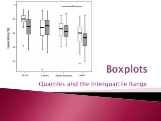
Center Spread Space rats and blood cell mass. Rats were sent into space known as the flight group. A control group was kept on earth. The mass of their red blood cells was measured. The data is drawn below in 2 boxplots. • Comparing the “flight” with the “control” samples
Comparing the “flight” with the “control” samples Notice all of the control group is above the lower 25% of the flight group
Comparing the “flight” with the “control” samples Almost 75% of the flight group is below the top 50% of the control group. Or Almost 50% of the control group is higher than 75% of the flight group.
Enter the data below into two separate lists and draw two box plots to compare the men to the women.
Notice the outlier is not really apparent in the histogram We can see this graph is mound shaped We can see this graph is skewed right
Summary • 5-number summary • Minimum, first quartile, median, third quartile maximum • Resistant measures of center (median) and spread (interquartile range) • Boxplots • Visual representation of the 5-number summary • Related to the shape of the distribution • Can be used to compare multiple distributions