Download
1 / 3

E N D
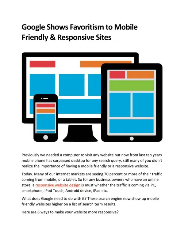
Google Shows Favoritism to Mobile Friendly & Responsive Sites Previously we needed a computer to visit any website but now from last ten years mobile phone has surpassed desktop for any search query, still many of you didn’t realize the importance of having a mobile friendly or a responsive website. Today. Many of our internet markets are seeing 70 percent or more of their traffic coming from mobile, or a tablet. So for any business owners who have an online store, a responsive website design is must whether the traffic is coming via PC, smartphone, iPod Touch, Android device, iPad etc. What does Google need to do with it? These search engine now show up mobile friendly websites higher on a list of search term results. Here are 6 ways to make your website more responsive?
Avoid Flash Avoid using slideshows, videos or images that don’t work properly without Flash support. Not only it does not supported by most mobile devices but also can hurt your SEO. Because google can penalize your website in search result if it contains technology not supported by mobile devices. Eliminate Need for Zooming We are currently working on a web design that doesn’t need to zoom in or out. If the visitors not able to read your website content properly it will produce inaccurate results.as it can be very annoying for a user to deal with. Think carefully of content, text, images, and icons you are going to put on your webpage keeping in mind the all screen size. Space Links Apart Google’s new ranking algorithm scoring a site that offers both easy-to-navigate and easy-to-read smartphone devices’ user experience. Avoid making text too small to read or messy clickable items up. It’s irritating for clients to continuously hitting the back button due to click on the wrong thing. Make it simpler for them to discover and tap on what they need. Use Correct Scaling Ideally when we design a website, we want our design to automatically scale down to fit the screen as much as is available, neither users nor Google like the horizontal scrolling. Put your important information at the top as vertical scrolling is fine. The Use of CSS Styles If you want to improve your search ranking, create responsive web design for all screen types and sizes. Use CSS or other technologies to change the style of a webpage based on the current requirements of any device on which the content is executed. You can change anything from the display type to resolution for better user experience. Take Mobile Friendly Test
Analyze your URL with the Google’s “mobile friendly” test that whether or not it meets Google’s criteria for a more responsive webpages. It will give you some idea of how to design and code properly for every single device available. Also keep in mind that we should constantly work with the new devices, technologies to improve the user experience. We are website design Toronto based company engaged in creating custom solutions for our users that helps them to stand out in competitive market.


![Intro to Adaptive Web Design [ChaDev Lunch]](https://cdn4.slideserve.com/7566148/intro-to-adaptive-web-design-dt.jpg)